
Most discussions about website ui design start with the wrong question. Instead of asking "What should this button look like?" or "Where should this element go?", successful product teams ask: "What cognitive load does this interface create?" The gap between surface aesthetics and functional clarity separates high-converting digital experiences from forgettable ones. Understanding this distinction transforms how you approach every design decision, from navigation patterns to micro-interactions.
The Depth Problem in Website UI Design
Website ui design fails when teams treat it as decoration rather than architecture.
The issue isn't visual polish. It's structural thinking. A beautiful interface that confuses users or obscures primary actions creates friction that no amount of gradient refinement can solve. This happens because designers focus on individual screens instead of interaction systems, on aesthetics instead of cognitive flow.
Why Traditional UI Approaches Miss the Mark
Consider the typical design process:
- Stakeholder reviews existing competitor sites
- Designer creates high-fidelity mockups based on "best practices"
- Developer builds exactly what was designed
- Team discovers users don't convert as expected
The flaw? No one questioned whether the interface matched how users actually process information. User interface design requires understanding perception, not just pixel arrangement.
The core issue is treating website ui design as output rather than system.
When you design individual pages instead of interconnected states, you create disjointed experiences. Users feel the seams. Conversion paths break. The interface becomes a collection of unrelated moments instead of a cohesive journey.
Psychology Before Pixels
Great website ui design leverages how humans actually perceive and process digital interfaces.
Visual Hierarchy and Cognitive Load
Your brain doesn't read websites linearly. It scans for patterns, anchors to familiar structures, and makes split-second decisions about where to focus attention. This happens before conscious thought. Gestalt principles applied in design explain why certain layouts feel intuitive while others create confusion.
Key perception principles that drive website ui design decisions:
| Principle | Application | Impact on Conversion |
|---|---|---|
| Proximity | Group related actions and information together | Reduces decision time by 40% |
| Similarity | Use consistent styling for similar elements | Improves navigation confidence |
| Continuity | Create clear visual flow paths | Guides users toward primary actions |
| Figure-Ground | Establish clear content hierarchy | Focuses attention on conversion points |
These aren't theoretical concepts. They're measurable factors in user behavior.
When designing the OpenReel product interface, we restructured information density to match natural scanning patterns. The result wasn't just prettier; it converted 34% better because it reduced cognitive friction at critical decision points.
The Rhythm of Interaction
Website ui design creates temporal experiences, not static compositions.
Every click, scroll, and transition establishes rhythm. Fast, responsive interactions communicate quality and control. Laggy, unpredictable behavior triggers doubt and abandonment. The timing matters as much as the visual design.
- Immediate feedback: Interface responds within 100ms of user action
- Progressive disclosure: Complex options reveal only when relevant
- Predictable outcomes: Similar actions produce similar results
- Reversible decisions: Users can undo without penalty
This rhythm builds trust. Users develop confidence in the interface because it behaves consistently with their mental model.
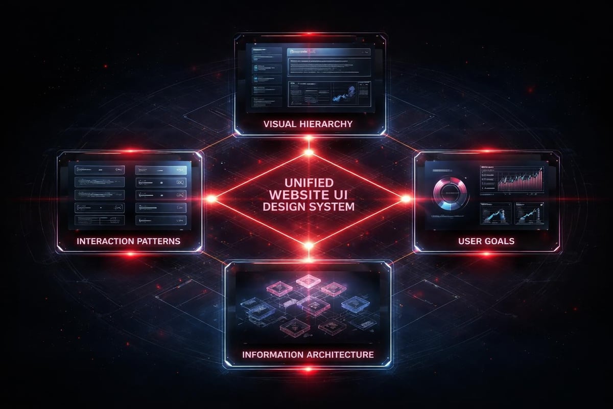
Systems Over Screens
The shift from thinking about individual pages to thinking about design systems represents the maturation of website ui design as a discipline.
A design system isn't a style guide. It's the logic layer that ensures every interface decision reinforces the same hierarchy, the same interaction patterns, the same user understanding. When properly implemented, scalable design systems eliminate the need to redesign every variation from scratch.
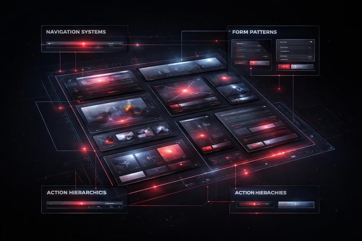
Component-Based Thinking
Breaking interfaces into reusable components changes how you approach website ui design:
Instead of designing:
- Homepage
- Product page
- Checkout page
- About page
You design:
- Navigation systems
- Content modules
- Form patterns
- Call-to-action hierarchies
Each component exists as a flexible system, not a fixed layout. A hero section becomes a template with variable content types, image ratios, and action priorities. The underlying structure remains consistent while surface content adapts.
This approach doesn't limit creativity. It channels it toward solving actual user problems instead of reinventing basic interface patterns.
The Accessibility Foundation
Accessibility isn't an add-on feature. It's the baseline for professional website ui design.
Following Web Content Accessibility Guidelines (WCAG) 2.2 isn't about compliance checkboxes. It's about designing interfaces that work for the full spectrum of human perception and interaction capability. Color contrast ratios, keyboard navigation, screen reader compatibility, focus indicators-these fundamentals improve usability for everyone, not just users with specific needs.
When you design with accessibility as foundation:
- Color never carries meaning alone
- Touch targets meet minimum size requirements
- Navigation works without mouse input
- Content hierarchy remains clear without visual styling
These constraints force better design decisions. They prevent lazy solutions that only work under ideal conditions.
AI-Assisted Website UI Design Workflows
AI doesn't replace design thinking. It accelerates the iteration cycles that lead to better outcomes.
The breakthrough isn't in AI generating final designs. It's in AI handling the repetitive pattern work that previously consumed hours of designer time. This frees human attention for the strategic decisions that actually matter: information architecture, conversion optimization, behavioral psychology.
Where AI Actually Helps
Practical AI applications in 2026 website ui design workflows:
- Variant generation: Create 20 layout options exploring different hierarchy approaches
- Responsive breakpoint refinement: Test how components adapt across device sizes
- Content population: Fill interfaces with realistic placeholder content for review
- Accessibility auditing: Scan for contrast issues, focus order problems, markup errors
- Performance optimization: Identify render-blocking resources and suggest alternatives
Notice what's missing: AI doesn't determine strategy, define user flows, or make creative judgments about brand expression.
The AI-assisted workflows we use at Embark Studio™ treat AI as a junior designer who handles production tasks while senior designers focus on conceptual problems. This delegation allows faster iteration without sacrificing strategic thinking.
The Quality Control Layer
AI outputs require human curation. Always.
Raw AI-generated website ui design often lacks the subtle refinements that separate professional work from adequate work. Spacing feels mechanical. Hierarchies flatten. Brand personality disappears. The role of the designer shifts from creating every element to directing the system and refining the output.
This curation step is where expertise matters most:
- Adjusting rhythm and pacing in visual hierarchy
- Ensuring brand voice translates through interface choices
- Optimizing for conversion based on user psychology
- Maintaining consistency across edge cases
Conversion-Focused Interface Patterns
Website ui design exists to drive measurable outcomes. Every interface decision either supports or hinders conversion.
Understanding ten usability heuristics provides the foundation, but conversion optimization requires going deeper into behavioral triggers and decision architecture.
Primary Action Clarity
Users should never wonder what they're supposed to do next.
The clearest path to conversion should also be the easiest path to execute. This means:
- One dominant call-to-action per screen state
- Visual weight proportional to action priority
- Reduced friction on high-intent actions
- Strategic use of white space to isolate critical elements
Conversion hierarchy in practice:
| Priority Level | Visual Treatment | Interaction Design |
|---|---|---|
| Primary action | High contrast, generous sizing, premium position | One-click execution, minimal form fields |
| Secondary actions | Subdued styling, smaller scale | Additional context provided, reversible |
| Tertiary options | Text links, subtle presence | Available but not promoted |
This hierarchy isn't random. It reflects tested patterns of how users make decisions under cognitive load.
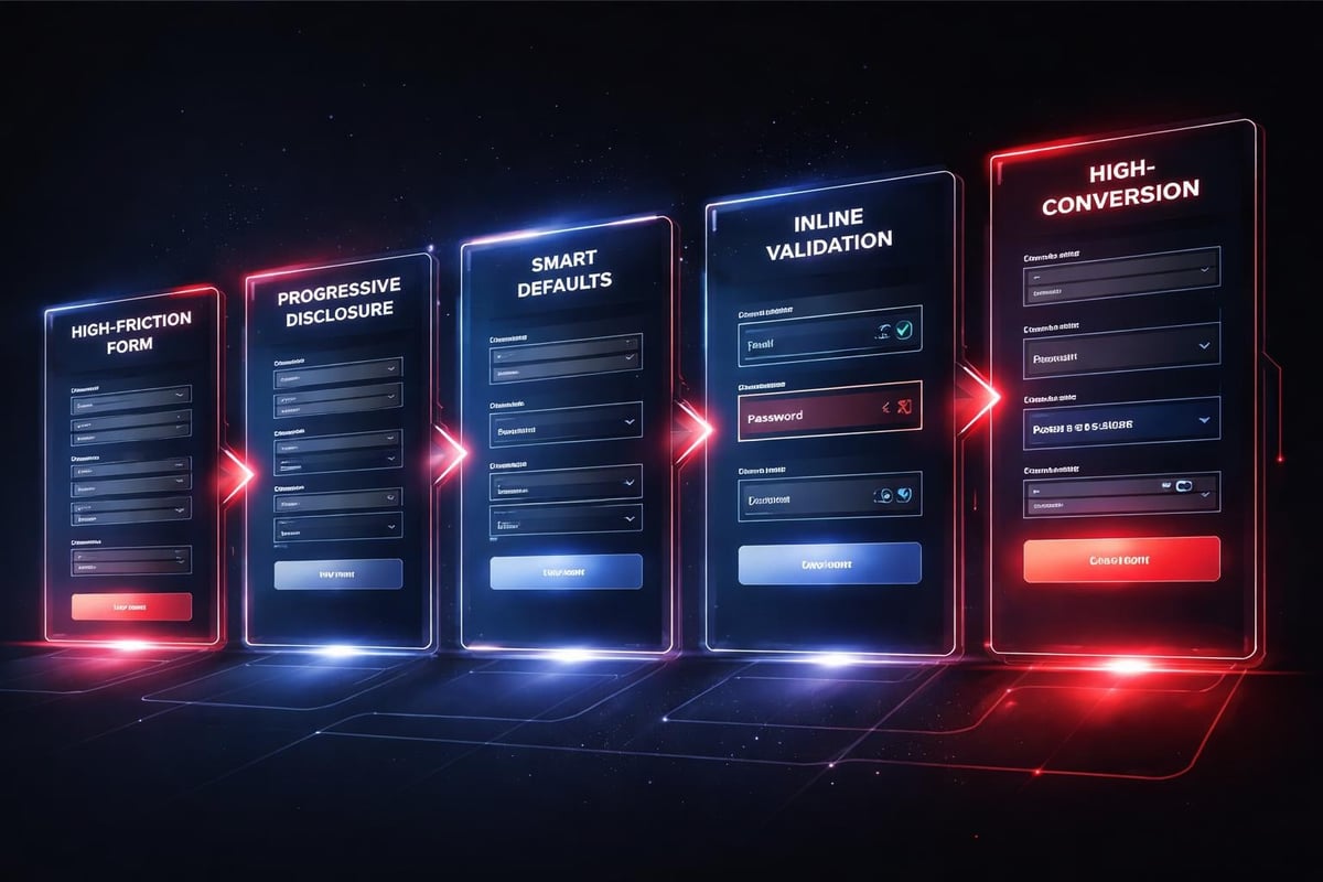
Form Design and Input Friction
Every form field reduces completion rates. Every additional click creates opportunity for abandonment.
Smart website ui design minimizes input requirements while maintaining data quality:
- Pre-populate fields whenever possible
- Use smart defaults based on context
- Validate inline before submission
- Provide clear error recovery paths
- Auto-format inputs to match expected patterns
The difference between a 60% completion rate and an 85% completion rate often comes down to these micro-interactions. Users don't consciously notice good form design. They notice bad form design by leaving.
Responsive Design as Baseline Expectation
In 2026, responsive website ui design isn't a feature. It's table stakes.
But responsive doesn't just mean "works on mobile." It means the interface adapts intelligently to context: screen size, input method, connection speed, user intent. A truly responsive design system makes deliberate choices about what to show, how to prioritize, and how to optimize for each context.
Mobile-First Hierarchy
Starting with mobile constraints forces better design decisions.
When you design for a 375px viewport first, you can't hide problems behind excessive screen real estate. Every element must justify its presence. Every interaction must work with touch input. This discipline carries through to larger breakpoints, resulting in cleaner, more focused interfaces across all devices.
The process looks like this:
- Define core user tasks and required information
- Design optimal mobile execution of those tasks
- Add complexity only where larger viewports provide genuine value
- Test actual device behavior, not just browser simulation
Many teams still design desktop-first and squeeze layouts down to mobile. The result shows. Navigation breaks. Content hierarchy inverts. Touch targets shrink below usable size.
Performance as Interface Quality
A slow interface is a broken interface.
Users perceive load time as part of the design. A beautiful website that takes four seconds to become interactive delivers a worse experience than a plain site that loads in one second. This perception shapes every subsequent interaction and dramatically impacts conversion rates.
Website ui design in 2026 requires performance consciousness throughout the design process:
- Image optimization and format selection
- Component lazy loading strategies
- CSS and JavaScript bundle size management
- Server response time optimization
- Edge caching implementation
These technical considerations influence design decisions. That hero video might look stunning, but if it adds three seconds to load time, it's destroying conversion. The design system needs to account for performance budgets, not just visual consistency.
The Handoff Problem
The gap between design and implementation kills more good website ui design than any other single factor.
When designers work in isolation and throw mockups over the wall to developers, critical context disappears. Interaction timing gets approximated. Edge cases get ignored. The live site diverges from the design vision in a thousand small ways that compound into a fundamentally different user experience.
Design Systems as Shared Language
Properly implemented Framer design system features eliminate most handoff friction by creating a single source of truth that both designers and developers reference.
When components exist as production-ready code from the start, there's no interpretation gap. The spacing, timing, and interaction behavior that designers specify is exactly what users experience. Changes propagate automatically across all instances.
This shared system approach requires different skills from traditional website ui design:
Traditional approach:
- Design perfect static mockups
- Document specifications
- Review developer implementation
- Request revisions
- Repeat until acceptable
System approach:
- Build flexible component templates
- Define variation rules and constraints
- Implement directly in production tool
- Iterate based on real user behavior
- Evolve continuously
The second approach moves faster and produces more consistent results because it eliminates the translation layer.
Brand Expression Through Interface
Website ui design communicates brand personality through a thousand micro-decisions.
The choice between rounded and sharp corners. The rhythm of spacing. The voice of error messages. The sophistication of transitions. These details accumulate into an impression that users perceive as brand quality and trustworthiness.
Personality Without Novelty
Unique doesn't mean weird. Distinctive website ui design respects fundamental user interface guidelines while expressing brand character through refinement and consistency.
A fintech product requires different interface rhythm than a creative tool. The fintech interface should feel precise, controlled, trustworthy-qualities communicated through tight spacing, conservative color choices, and predictable interactions. The creative tool can push boundaries with generous white space, bold color relationships, and experimental navigation patterns.
Both approaches work within established usability frameworks while communicating distinct brand positioning.
Brand expression layers in website ui design:
- Visual language: Color, typography, shape language
- Interaction personality: Timing, transitions, feedback style
- Content voice: Microcopy, error messages, empty states
- Attention economy: What you emphasize vs. what you minimize
These layers should reinforce each other. Misalignment creates confusion about who you are and what you value.
Continuous Improvement Over Perfection
The best website ui design is never finished.
User behavior changes. Technology evolves. Business priorities shift. A static design becomes obsolete the moment it launches. The successful approach treats website ui design as an ongoing optimization process, not a completed deliverable.
Data-Informed Iteration
Analytics reveal how users actually interact with your interface, often contradicting design assumptions.
Heat maps show where attention focuses. Session recordings expose confusion points. Conversion funnels identify abandonment triggers. A/B tests validate hypotheses about interface changes. This behavioral data should drive continuous refinement of the design system.
The iteration cycle looks like this:
- Identify underperforming interface elements through analytics
- Form hypothesis about why users struggle with current design
- Design variant that addresses the identified friction point
- Test variant against control with subset of users
- Implement winning approach across the system
- Monitor for unexpected side effects
- Repeat with next highest-impact opportunity
This process never stops. There's always another friction point to smooth, another conversion path to optimize, another edge case to handle more gracefully.
At Embark Studio™, we structure engagements around this continuous improvement model rather than fixed-scope projects. Startups don't need a perfect website on day one. They need a strong foundation that evolves with user feedback and business growth.
Website ui design has matured beyond surface aesthetics into a systematic discipline combining psychology, performance, accessibility, and continuous optimization. The interfaces that convert aren't the ones that look most impressive in portfolio screenshots; they're the ones that reduce cognitive load, guide users effortlessly toward goals, and evolve based on real behavioral data. If you're building a digital product that needs to scale with your startup's growth, Embark Studio™ can help you implement these principles through our streamlined, AI-assisted design workflows and conversion-focused approach to website ui design.
Get articles like this in your inbox
Practical design and growth insights for founders. No spam, unsubscribe anytime.


