
Most startups think ui design is about making things look good. That's the problem. Beautiful interfaces that confuse users don't convert. Clean layouts without clear hierarchy don't guide decisions. The real purpose of ui design isn't decoration. It's creating a system that makes complex products feel inevitable, where every tap, click, and transition feels like the only logical choice. That requires understanding why certain patterns work, not just copying what looks modern.
The Core Principle: Clarity Creates Momentum
Great ui design removes friction at the cognitive level. Users shouldn't think about where to click or what happens next. They should feel guided through a sequence that makes sense before they consciously process it.
This isn't about simplicity for its own sake. It's about reducing decision fatigue at every interaction point. When someone lands on your product, they're evaluating dozens of micro-signals: button hierarchy, type scale, spacing rhythm, color contrast, interactive states. Each element either builds confidence or creates hesitation.
Why Visual Hierarchy Matters More Than Style
Visual hierarchy isn't about bigger fonts or brighter colors. It's about creating a reading order that matches user intent.
- Primary actions should be visually dominant without being aggressive
- Secondary paths should remain accessible but subordinate
- Context and labels should support without competing for attention
Consider a SaaS dashboard. The primary CTA might be "Create New Project." Secondary actions like "Import" or "View Templates" need clear presence but shouldn't fight for the same visual weight. Tertiary elements like settings or profile access fade into consistent, predictable locations.
This layering creates scannable interfaces where users extract meaning in seconds. Apple's official UI design guidelines emphasize this principle: make the next action obvious without cluttering the current context.
| Hierarchy Level | Visual Treatment | User Expectation |
|---|---|---|
| Primary | High contrast, filled state, prominent placement | Main action path, highest confidence |
| Secondary | Medium contrast, outlined or ghost state | Alternative actions, contextual choice |
| Tertiary | Low contrast, icon-based or text-only | Utility functions, settings, navigation |
The mistake many teams make is treating every feature as equally important. This creates what we call visual democracy, where everything screams for attention and nothing gets it. Users abandon interfaces that make them work too hard to find the path forward.
The Psychology Behind Effective Interfaces
ui design leverages predictable human behavior patterns. Understanding these patterns transforms interface decisions from subjective preference to strategic choice.
Recognition Over Recall
Users shouldn't need to remember how your interface works. They should recognize familiar patterns and apply existing mental models. This is why platform conventions matter. iOS users expect navigation at the bottom. Web users expect primary menus in the header or left sidebar.
Breaking conventions requires a compelling reason. When Spotify redesigned their interface in 2024, they maintained core navigation patterns while evolving the visual language. Users didn't need to relearn the product.
Consistency compounds familiarity. When buttons behave the same way across your product, users build confidence. When similar actions look different in different contexts, users hesitate. This extends to interaction patterns, transitions, and feedback states.
Research on UI design best practices shows that consistent interfaces reduce task completion time by up to 40% compared to inconsistent alternatives. That's not just convenience. That's measurable conversion impact.
Feedback Loops and Perceived Performance
Every interaction needs acknowledgment. Click a button, see a state change. Submit a form, get confirmation. Delete an item, watch it disappear. This isn't about adding animation for style. It's about closing the feedback loop between user intent and system response.
The absence of feedback creates interaction anxiety. Users click again, unsure if their first action registered. They abandon processes mid-flow, uncertain if the system is working. Clear feedback states transform this uncertainty into confidence.
- Loading states show progress and prevent duplicate actions
- Success confirmations validate completed tasks
- Error messages explain what went wrong and how to fix it
- Hover and focus states preview interactive elements before commitment
Smart ui design doesn't just show that something happened. It shows what happened, why it happened, and what comes next. This creates a conversational flow between user and interface, building trust through transparency.
From Theory to Application: Building Systems That Scale
Understanding principles is step one. Applying them systematically is where most teams struggle. ui design at scale requires thinking in systems, not individual screens.
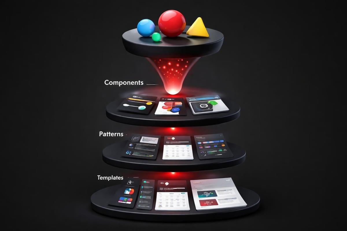
Component Libraries as Design Infrastructure
A design system isn't a Figma file with color swatches. It's a living product that defines how your interface communicates across every touchpoint. The principles behind scalable design systems show how component libraries enable consistency while accelerating production.
Start with atomic elements:
- Typography scales (heading hierarchy, body text, captions, labels)
- Color systems (primary, secondary, semantic states, neutral grays)
- Spacing tokens (padding, margins, gap values in 4px or 8px increments)
- Interaction states (default, hover, active, disabled, loading, error)
These atoms combine into molecules: buttons, form fields, cards, navigation items. Molecules assemble into organisms: headers, forms, data tables, modal patterns. Organisms create templates, and templates populate with content to become pages.
This hierarchical thinking prevents design debt. When you need to update button styles globally, you change the component definition once. When you add a new product feature, you compose it from existing patterns before creating new ones.
| System Level | Examples | Design Decision |
|---|---|---|
| Tokens | Colors, spacing, typography | Define once, reference everywhere |
| Components | Buttons, inputs, cards | Consistent behavior, flexible content |
| Patterns | Navigation, forms, modals | Proven solutions to common problems |
| Templates | Page layouts, flows | Structure that scales across features |
The Embark Studio™ approach treats ui design as infrastructure, not decoration. We build systems that support rapid iteration without fragmenting the user experience.
Real-World Example: Conversion-Focused Navigation
Consider a B2B SaaS product with multiple user types: admins, managers, and end users. Each role needs different primary actions, but all share the same interface shell.
Poor ui design creates role-specific dashboards that feel like different products. Users struggle when they switch roles. Training documentation multiplies. Support tickets increase.
System-driven ui design uses the same navigation structure with contextual visibility. Admins see management tools. End users see creation tools. The framework remains consistent, but content adapts to permission level.
This requires:
- Modular navigation components that show/hide based on user context
- Consistent placement so muscle memory transfers across roles
- Visual continuity that maintains brand recognition
- Clear role indicators so users always know their current context
The result is a single interface that serves multiple audiences without fragmenting the experience. This reduces development overhead, simplifies maintenance, and improves user confidence across role transitions.
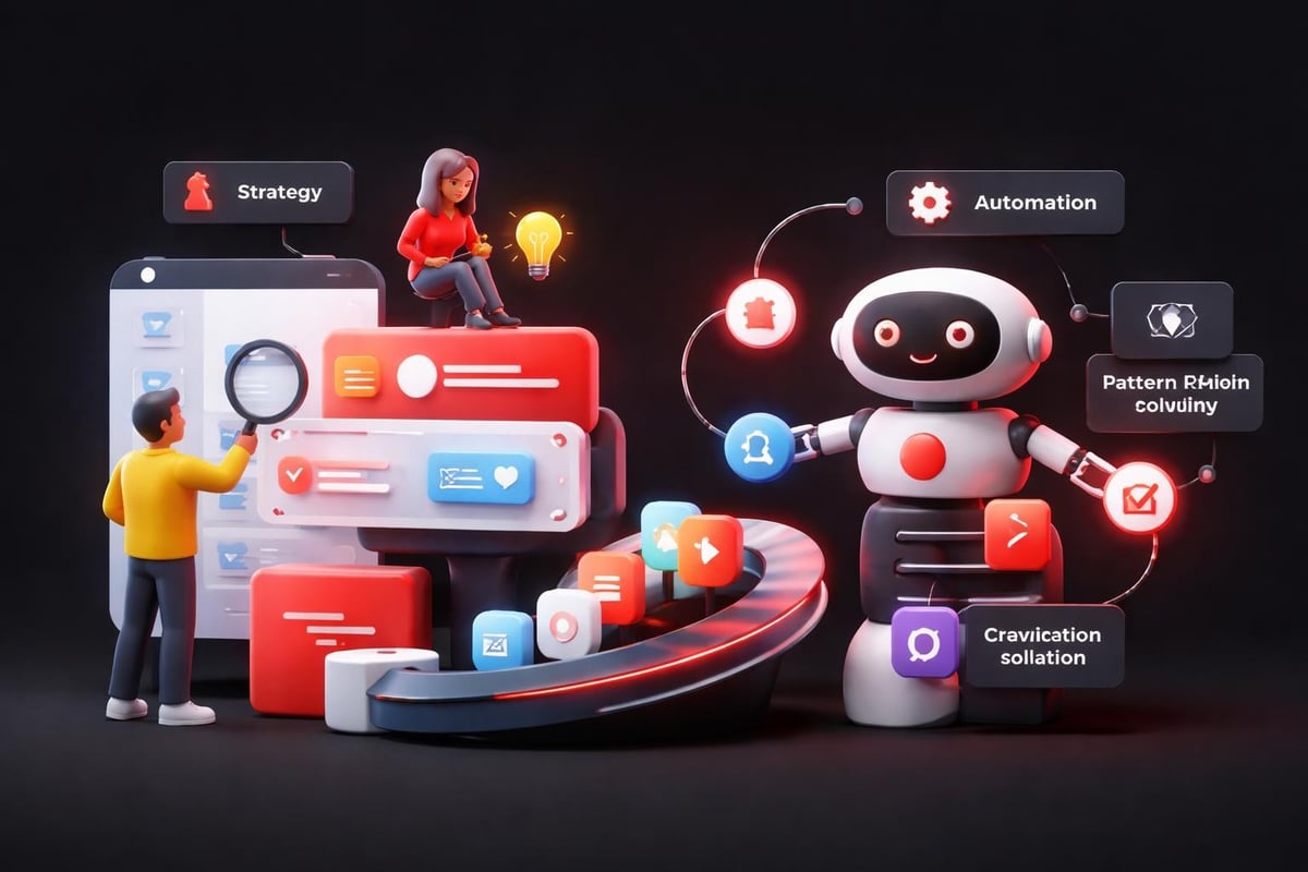
How AI Accelerates UI Design Workflows
AI doesn't replace ui design thinking. It removes repetitive tasks and surfaces pattern insights faster than manual analysis. This shifts designer time from production to strategy.
From Manual Repetition to Smart Automation
Creating responsive variants for every component used to mean duplicating and adjusting layouts manually. Modern AI-assisted tools in platforms like Framer analyze component structure and generate breakpoint variations automatically. Designers review and refine rather than rebuild from scratch.
The same applies to accessibility testing. AI scans contrast ratios, checks focus order, validates ARIA labels, and flags potential issues before human review. Human-centered AI design principles show how this augmentation improves quality without replacing judgment.
AI excels at pattern recognition. Feed it user session recordings, and it identifies interaction drop-off points faster than manual heatmap analysis. Show it competitor interfaces, and it extracts common patterns while highlighting differentiation opportunities. Give it your component library, and it suggests consolidation opportunities where similar elements could merge.
Rapid Prototyping Without Sacrificing Quality
Traditional ui design workflows moved linearly: wireframe, mockup, prototype, handoff, development. Each phase created friction. Changes required backing up through multiple stages.
AI-assisted prototyping in tools like Framer collapses this timeline. Modern web design workflows show how designers build production-ready interfaces directly, testing interactions in real-time without developer handoff for validation.
This doesn't eliminate developers. It eliminates throwaway work. Designers validate interaction patterns with real data and user feedback before engineering invests in implementation. When development begins, the specification is proven, not theoretical.
The workflow becomes:
- Define the system (tokens, components, patterns)
- Build interactive prototypes with real content and logic
- Test with actual users in production-like environments
- Refine based on behavior using session replays and analytics
- Hand off validated specifications that reduce implementation risk
AI supports each phase by automating repetitive tasks, suggesting improvements based on learned patterns, and validating adherence to accessibility and usability standards. How AI transforms product design workflows demonstrates measurable time savings while improving output quality.
Platform-Specific Considerations in Modern UI Design
Great ui design respects platform conventions while maintaining brand consistency. Users bring expectations shaped by their environment: iOS, Android, web, desktop apps. Meeting these expectations reduces cognitive load.
Web vs. Native Patterns
Web interfaces prioritize discoverability and progressive disclosure. Navigation is persistent or easily accessible. Information density can be higher because screen real estate is larger and interaction precision is greater with mouse/trackpad input.
Mobile native interfaces emphasize thumb-reachability and gestural navigation. Primary actions cluster in bottom thirds of screens. Swipe patterns replace click-heavy interactions. Context menus hide complexity until needed.
The mistake isn't choosing one approach. It's applying the same solution regardless of context. A desktop data table with 12 columns might compress to vertical cards on mobile. A mobile bottom-sheet modal might become a centered dialog on desktop. The pattern adapts to the platform while maintaining functional consistency.
Essential UI design guidelines emphasize platform adherence not as limitation but as leverage. When you work with user expectations instead of against them, adoption accelerates.
Responsive Design as Default
Responsive ui design isn't about shrinking desktop layouts. It's about context-aware adaptation. The same product serves different use cases on different devices. Calendar management might be admin-heavy on desktop but view-focused on mobile. The interface should reflect that context shift.
This requires:
- Flexible grid systems that reflow content intelligently
- Adaptive component variants that change structure, not just size
- Progressive enhancement where advanced features appear when screen space supports them
- Touch-friendly targets (minimum 44×44px) on all mobile breakpoints
Modern frameworks handle much of this automatically, but the design decisions still matter. Which content prioritizes on mobile? What interactions simplify or combine? How does navigation transform across breakpoints? These questions require human judgment informed by user research and analytics.
The Business Impact of Strategic UI Design
ui design directly influences conversion metrics. Every friction point costs users. Every moment of confusion creates abandonment opportunity. Improving interface clarity isn't aesthetic preference. It's revenue optimization.
Measuring What Matters
Track these metrics to quantify ui design impact:
| Metric | What It Measures | UI Design Influence |
|---|---|---|
| Task Completion Rate | % of users finishing intended flows | Clarity of paths, reduction of dead ends |
| Time on Task | Speed of completing key actions | Efficiency of layouts, intuitiveness of controls |
| Error Rate | Mistakes or incorrect inputs | Quality of feedback, clarity of labels |
| Click Depth | Steps to reach primary goals | Information architecture, navigation design |
| Return Usage | Frequency of repeat engagement | Memorability, consistency, satisfaction |
A/B testing reveals which ui design decisions drive behavior change. Button color might not matter, but button placement often does. Label specificity can double conversion on CTAs. Adding progress indicators to multi-step forms reduces abandonment by 30-40%.
These aren't vanity metrics. They connect interface decisions to business outcomes: sign-up conversion, feature adoption, customer retention, support cost reduction.
Design as Competitive Differentiation
In crowded markets, ui design creates perception gaps between similar products. Users attribute quality, reliability, and sophistication to interfaces that demonstrate attention to detail. This perception influences trust, especially in high-stakes contexts like financial software or healthcare platforms.
Consider two project management tools with identical features. One uses generic UI patterns with inconsistent spacing and clunky interactions. The other demonstrates cohesive design language, smooth transitions, and thoughtful microcopy. Users perceive the second as more professional, even if underlying functionality is equivalent.
This extends to investor perception. High-end web design signals market positioning and operational maturity. Startups raising capital benefit from interfaces that demonstrate product-market fit through refined execution, not just feature checklists.
Building UI Design Systems That Evolve
The best ui design systems anticipate change. Products evolve. Features add. User needs shift. Systems that resist modification become bottlenecks. Systems that encourage thoughtless variation fragment experiences.
Documentation as Single Source of Truth
Every design system needs clear documentation that answers:
- When to use each component (and when not to)
- How to combine components into consistent patterns
- What flexibility exists within component constraints
- How to propose changes when existing patterns don't fit new needs
UNICEF's design system guidelines demonstrate comprehensive documentation that serves designers, developers, and stakeholders. It shows not just what components exist, but why they were created and how they solve specific user problems.
Documentation prevents pattern proliferation, where teams create custom solutions instead of using existing ones because they don't know what's available. It also prevents pattern rigidity, where teams force inappropriate patterns because they fear breaking consistency.
The right balance: consistency in principle, flexibility in application. Buttons follow the same hierarchy rules, but specific implementations can adapt to context without violating the underlying system.
Governance Without Gatekeeping
Healthy design systems need governance processes that maintain quality without slowing progress. This typically involves:
- Clear ownership (who maintains the system and reviews proposals)
- Contribution guidelines (how to suggest new components or patterns)
- Review criteria (what makes a proposed pattern worth adding)
- Deprecation policies (how old patterns phase out gracefully)
The Embark Studio™ model treats design systems as collaborative products, not designer dictatorships. Product teams contribute insights from real use cases. Designers synthesize those insights into scalable patterns. Everyone benefits from the resulting consistency and speed.
The Studio Approach: Systems Over Screens
Most agencies think in deliverables: mockups, prototypes, handoff files. This creates project-based design that solves immediate needs but accumulates debt over time. Each new feature becomes harder to integrate. The product experience fragments as different designers solve similar problems differently.
System-based design inverts this model. Start with infrastructure that supports continuous evolution. Build the component library, define the interaction patterns, establish the visual language. Then compose products from these building blocks.
This front-loads investment but compounds value over time. New features assemble faster because the building blocks exist. Quality remains consistent because patterns are proven. Maintenance simplifies because changes propagate through the system.
At Embark Studio™, we partner with startups to build these foundational systems using Framer and modern workflows. Our process:
- Audit existing interfaces to identify patterns worth keeping
- Define design principles that align with business strategy
- Build component libraries that balance consistency with flexibility
- Implement in production using platforms built for iteration
- Collaborate continuously as products evolve and scale
This isn't ui design as a service project. It's ui design as ongoing partnership, where the system grows with your product and team capabilities. Explore our approach to product design to see how strategic interface thinking drives measurable business outcomes.
The difference shows in conversion rates, user retention, and engineering velocity. Products built on solid ui design systems scale faster, adapt easier, and maintain quality as complexity increases. That's the foundation investor-backed startups need to capture and defend market position.
Great ui design isn't about following trends or copying successful products. It's about building systems that make your specific product feel inevitable to your specific users. Understanding the psychology, implementing the patterns, and evolving the infrastructure transforms interface design from aesthetic preference to strategic advantage. Embark Studio™ works alongside founding and product teams to build these conversion-focused systems using Framer and AI-assisted workflows that eliminate handoffs and accelerate growth. Ready to transform your product experience? Partner with Embark Studio™ to build interfaces that scale with your ambition.
Get articles like this in your inbox
Practical design and growth insights for founders. No spam, unsubscribe anytime.


