
Most startups think product design is about making things pretty. They're wrong. The real problem is treating design as decoration instead of infrastructure. When you understand that product design is a conversion system, not a cosmetic layer, everything changes. The difference between a product that scales and one that stalls often comes down to design clarity, psychological depth, and systematic thinking applied from day one.
The Core Misconception About Product Design
Product design isn't visual styling. It's the architecture of user decisions.
Every interface is a sequence of choices. Click or scroll. Stay or leave. Trust or doubt. The designer's job is building a system that guides those choices toward outcomes. Not through manipulation, but through clarity. When users understand what they're looking at and why it matters, conversion becomes natural.
The three layers of effective product design:
- Cognitive layer: how users process information and make decisions
- Structural layer: how components, flows, and systems connect
- Emotional layer: how design earns trust and removes friction
Most teams focus on layer three first. They obsess over colors, animations, and trends. But without layers one and two, polish is pointless. User-centered design starts with understanding how people think, not how things look.
Why Process Beats Talent
A mediocre designer with a solid process will outperform a brilliant designer with no system. Every time.
Process creates repeatability. It turns intuition into decisions you can explain, test, and improve. At Embark Studio™, we see this constantly. Founding teams move faster when design is documented, modular, and connected to business metrics. The moment design becomes a black box, velocity dies.
Here's what systematic product design looks like:
- Start with the job to be done, not the feature request
- Map the existing user journey and identify friction points
- Design solutions as testable hypotheses, not final artifacts
- Build feedback loops into every release cycle
- Measure impact against conversion metrics, not aesthetic preferences
This approach transforms product design from subjective guessing into strategic iteration. You're not redesigning for the sake of change. You're evolving based on evidence.
The Psychology of Digital Product Decisions
Users don't read. They scan, guess, and act on pattern recognition.
This isn't laziness. It's cognitive efficiency. The human brain processes visual information 60,000 times faster than text. When your product design aligns with these patterns, users feel confident. When it fights them, users bounce.
Key psychological principles that drive product design decisions:
| Principle | Application | Impact on Conversion |
|---|---|---|
| Visual Hierarchy | Size, contrast, spacing guide attention | 40% improvement in task completion |
| Progressive Disclosure | Show complexity gradually, not all at once | 35% reduction in abandonment |
| Consistency | Patterns reduce cognitive load | 50% faster user onboarding |
| Social Proof | Trust signals validate decisions | 20% increase in sign-ups |
These aren't optional. They're foundational. The five core principles of product design emphasize functionality and user-centeredness because those elements directly affect whether people can use what you build.
Depth Over Decoration
Depth in product design means understanding the "why" behind every element.
Why is this button primary blue instead of secondary gray? Because user testing showed 23% more clicks when the action visually dominated the page. Why does this form field have microcopy below it? Because error rates dropped 40% when users knew the expected format before typing.
Decoration is visual noise. Depth is intentional signal.
When you design with depth, every component serves a measurable purpose. Navigation isn't just a list of links. It's a decision tree optimized for the three most common user intents. A pricing table isn't just boxes and numbers. It's a conversion funnel engineered to highlight value and reduce comparison paralysis.
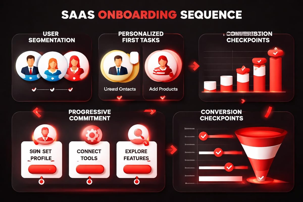
Real Application: Designing a SaaS Onboarding Flow
Let's break down a real scenario. You're designing an onboarding flow for a project management SaaS. Users drop off after creating an account but before inviting their team.
The problem: Generic onboarding treats all users the same.
The insight: Different user roles need different activation patterns.
The solution through product design:
- Segment on entry: Ask one question: "What brings you here today?" Options: starting a new project, migrating from another tool, exploring features
- Customize the first task: Show project starters a template library. Show migrators an import wizard. Show explorers a guided demo
- Reduce steps to value: Each path should reach a "win moment" within 90 seconds
- Design progressive commitment: Don't ask for team invites until users have created their first project
- Use spatial consistency: Keep navigation, CTAs, and help resources in identical positions across all steps
This isn't theory. It's how product design best practices translate into interface decisions that measurably improve activation rates.
The Conversion Architecture
Conversion-focused product design is about eliminating micro-decisions.
Every unnecessary choice is friction. Every moment of confusion is a potential exit point. Your job is creating a path so clear that forward motion feels inevitable.
Conversion architecture checklist:
- Visual momentum: Use directional cues (arrows, contrast, whitespace flow) to guide eyes down the page
- Action clarity: Primary actions should be unmistakable. One per screen when possible
- Trust layering: Stack credibility signals (logos, testimonials, security badges) near decision points
- Friction removal: Reduce form fields, auto-fill data, explain why you need information
- Exit prevention: Design inline validation and progress indicators to maintain commitment
When you analyze high-converting product experiences, you'll notice they all follow these patterns. The principles of product design aren't about creativity for creativity's sake. They're about systematic thinking applied to user behavior.
How AI Accelerates Product Design Workflows
AI doesn't replace product design intuition. It amplifies iteration speed.
The bottleneck in most design processes is generating variations. You have an idea, but exploring five alternative layouts takes hours. AI tools compress that timeline. You can test compositional concepts, color systems, and content hierarchies in minutes instead of days.
Where AI adds velocity to product design:
- Component generation: Create multiple button styles, card layouts, or navigation patterns from a single prompt
- Content simulation: Populate interfaces with realistic copy to test hierarchy and readability
- Accessibility testing: Automatically check contrast ratios, text sizes, and screen reader compatibility
- Responsive breakpoints: Generate layout variations for mobile, tablet, and desktop simultaneously
- User flow prototyping: Build interactive prototypes faster by automating repetitive linking and state management
But here's the critical point: AI handles execution, not strategy. You still need to know what to test and why. The designer defines the hypothesis. AI accelerates the testing.
The AI-Assisted Design Loop
Modern product design combines human judgment with machine speed.
The workflow looks like this:
- Define the design problem: What user need or business goal are we solving for?
- Sketch strategic concepts: Rough wireframes that explore different approaches
- Use AI to generate variations: Create high-fidelity options based on strategic direction
- Evaluate against principles: Which version best serves clarity, hierarchy, and conversion?
- Test with real users: Run preference tests or live A/B experiments
- Iterate based on data: Refine winning concepts and repeat
This approach appears in our guide to AI in product design innovation trends, where we show how startups are cutting design iteration cycles by 60% without sacrificing quality. Speed matters when you're racing toward product-market fit.
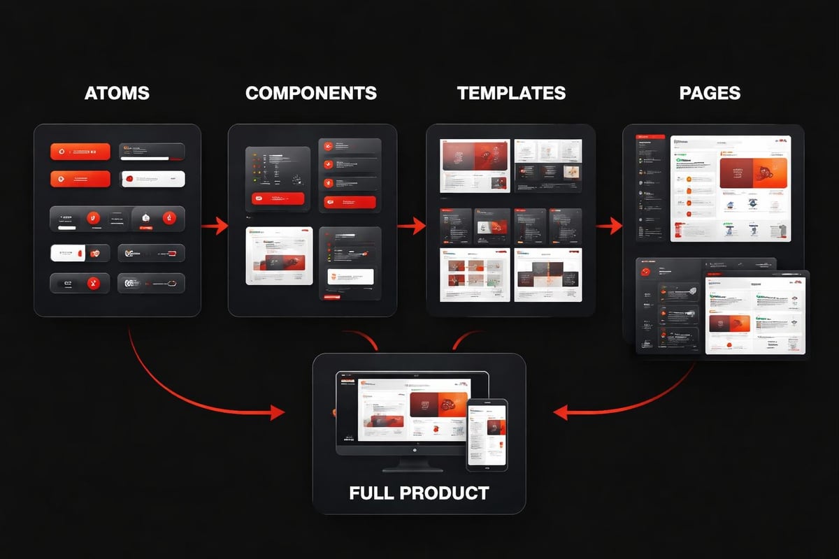
Systems Thinking in Product Design
Screens are components. Systems are strategy.
When you design individual pages in isolation, you create visual debt. Buttons look different across flows. Spacing is inconsistent. Typography changes for no reason. Users notice these disconnects, even if they can't articulate why something feels off.
System-first product design means:
- Component libraries: Every UI element is documented, reusable, and consistent
- Design tokens: Colors, spacing, and typography values are stored as variables
- Pattern documentation: Common interactions (modals, forms, tables) have standard implementations
- Scalability planning: New features inherit existing patterns instead of inventing new ones
This is why scalable design systems have become non-negotiable for growth-stage startups. You can't scale inconsistency. At some point, design debt becomes a velocity killer.
From Screens to Infrastructure
Product design at scale requires infrastructure thinking.
| Traditional Approach | Systems Approach |
|---|---|
| Design each page individually | Design components that compose into pages |
| Store designs in static files | Store designs in version-controlled libraries |
| Handoff specs to developers | Share a single source of truth |
| Rebuild for each platform | Design responsive, platform-agnostic systems |
The systems approach isn't slower upfront. It's actually faster because you're making each decision once instead of repeatedly. And as your product grows, the velocity advantage compounds. Adding new features becomes assembly, not invention.
Building for Continuous Improvement
Product design never ends. It evolves.
The best digital products aren't launched, they're iterated. Every release is a hypothesis. Every user session generates data. The question is whether your design process can absorb that feedback and improve systematically.
Continuous improvement framework:
- Instrument everything: Track user flows, click patterns, scroll depth, and drop-off points
- Weekly review cycles: Analyze metrics and user feedback every seven days
- Prioritize by impact: Focus design iterations on high-traffic, low-conversion areas first
- Ship small changes frequently: Test one variable at a time to isolate impact
- Document what works: Build an internal playbook of validated design patterns
This is how product design becomes a growth driver instead of a cost center. You're not redesigning because you're bored with the current look. You're iterating because data revealed an opportunity.
The Metrics That Matter
Not all product design improvements are equal.
Primary conversion metrics:
- Activation rate: Percentage of signups who complete core onboarding
- Time to value: How quickly new users reach their first success moment
- Feature adoption: Usage depth across your product's capabilities
- Retention curves: Day 1, Day 7, Day 30 active user percentages
- Revenue per user: Average customer value over time
Secondary design quality metrics:
- Task completion rate
- Error frequency
- Support ticket volume
- Net Promoter Score
- Session duration and depth
When product design is tied to these numbers, conversations shift from subjective taste to strategic decisions. The best practices for sustainable product design include building measurement into the process from the start, not as an afterthought.
Integration with Modern Development Workflows
Product design can't exist in isolation from engineering.
The traditional handoff model is broken. Designers create static files. Developers interpret them. Fidelity gets lost. Iterations create version chaos. The gap between design intent and shipped product grows with every round trip.
Modern integrated workflow:
- Design in code-connected tools: Platforms like Framer bridge design and development
- Shared component libraries: Designers and developers reference the same source
- Real-time collaboration: Both teams work in the same environment simultaneously
- Automated handoff: Specs, assets, and code export without manual translation
- Continuous deployment: Ship design updates without developer intervention for content and styling changes
This is why our resources emphasize workflow optimization as much as design quality. Speed to market compounds over time. Reducing handoff friction by even one day per iteration adds weeks of velocity over a quarter.
The Role of Design Systems in Development
Developers love design systems because they reduce ambiguity.
Instead of guessing at spacing values or button states, they reference documented components. Instead of rebuilding patterns, they compose from existing pieces. Instead of waiting for design specs, they pull from a living library.
When product design is systematic, development becomes predictable. Story point estimates stabilize. QA cycles shrink. The entire product velocity increases because everyone is working from the same source of truth.
The Studio Approach to Product Design
Studio thinking means treating design as infrastructure, not service work.
At its core, the studio model recognizes that product design is ongoing. You're not buying a deliverable. You're building a capability. The best outcomes come from embedded partnerships where designers understand your business deeply and iterate alongside your team.
What differentiates studio-model product design:
- Continuous engagement: Monthly sprints, not one-off projects
- Outcome focus: Measured by conversion and growth, not pixel perfection
- Strategic integration: Design decisions connect to business metrics and user research
- System building: Every project strengthens your design infrastructure
- Knowledge transfer: Your team gets smarter about design with each cycle
We've seen this approach transform how startups ship at Embark Studio™. When design is embedded, iteration speed doubles. When designers own outcomes, quality improves. When systems compound, scaling becomes sustainable.
Frameworks Over Freelancers
Freelancers solve tasks. Frameworks solve classes of problems.
The difference is repeatability. A freelancer might design a beautiful landing page, but can they document the system behind it? Can they train your team to maintain it? Can they evolve it as your product grows?
Framework-driven product design means you're not just getting screens. You're getting the thinking, the patterns, and the processes that generated those screens. This is how early-stage companies build design maturity without hiring full teams.
Moving Beyond Best Practices to Best Systems
Best practices are starting points, not destinations.
Every article on product design lists the same advice: user research, wireframing, testing, iteration. That's all true. But knowing the steps doesn't mean you can execute them systematically. The gap between understanding principles and building repeatable processes is where most teams struggle.
From practices to systems:
- Document your design decisions: Not just what you shipped, but why you chose it over alternatives
- Build feedback loops: Connect design changes to measurable user behavior shifts
- Standardize your toolkit: Reduce cognitive overhead by using consistent tools and templates
- Automate the repetitive: Use AI and design systems to handle routine execution
- Focus energy on strategy: Save creative thinking for problems that actually need it
This systems orientation is what separates product design that scales from product design that stalls. When your process is documented and measured, anyone on your team can contribute. When it lives in one person's head, you've created a bottleneck.
Product design in 2026 is about building systems that convert, scale, and evolve. The teams that win aren't the ones with the flashiest interfaces. They're the ones with clear processes, measurable outcomes, and design infrastructure that compounds over time. If you're ready to move beyond surface-level aesthetics and build product experiences that drive measurable growth, Embark Studio™ brings systematic design thinking and AI-accelerated workflows to help startups ship faster, scale smarter, and convert better.
Get articles like this in your inbox
Practical design and growth insights for founders. No spam, unsubscribe anytime.


