
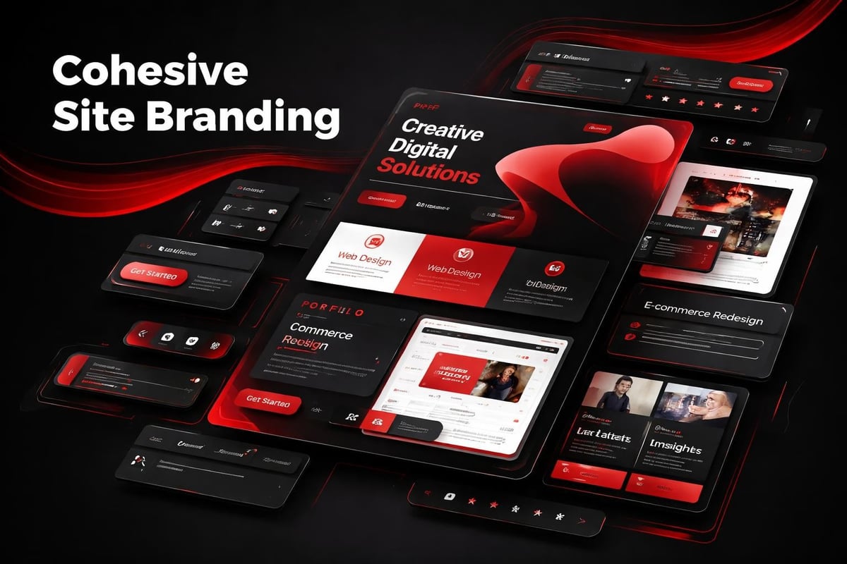
Most startups treat site branding as a logo placement exercise. They spend weeks debating typefaces and color palettes, then scatter these elements across pages without a governing system. The result feels generic, forgettable, and visually inconsistent. Real site branding is architectural. It's a deliberate framework that guides every visual decision, from navigation patterns to micro-interactions, creating recognition before a single word is read.
The misconception runs deep. Founders confuse brand identity (your positioning, voice, values) with site branding (how that identity manifests in UI decisions). One lives in strategy decks. The other lives in hover states, spacing scales, and component hierarchies. When these disconnect, users sense it immediately.
The Psychology Behind Consistent Visual Systems
Site branding works because human perception craves pattern recognition.
When users land on your homepage, their brain begins cataloging visual cues within milliseconds. Typography weight. Color temperature. Spatial rhythm. Navigation structure. These elements combine into a mental model of your brand's reliability and attention to detail.
Consistency builds cognitive fluency. When your About page uses the same heading hierarchy, color logic, and spacing system as your Product page, users process information faster. They trust the environment. Cognitive load decreases. Strong website branding relies on this principle, turning repeated exposure into familiarity.
Inconsistency triggers the opposite response.
If your CTA buttons shift from rounded to sharp corners across pages, or your paragraph line-height changes section to section, users notice. Not consciously, but viscerally. The experience feels unfinished, like you rushed to market without care. Perception of product quality drops accordingly.
The Four Layers of Site Branding Architecture
Site branding operates across distinct but interconnected layers:
- Visual identity layer - typography, color, iconography, illustration style
- Structural layer - grid systems, spacing scales, breakpoint logic
- Interactive layer - hover states, transitions, loading patterns, micro-animations
- Content layer - tone of voice, messaging hierarchy, image treatment
Each layer needs internal consistency and cross-layer harmony.
A startup might nail their color palette (visual identity) but deploy twelve different button sizes across their site (structural failure). Or they establish beautiful typography but pair it with generic stock photos that undermine brand personality (content misalignment). Case studies in effective design consistently show that breakthrough brands synchronize all four layers.
Building Site Branding Systems That Scale
The best site branding doesn't emerge from isolated design decisions. It grows from foundational systems.
Start with constraints. Not limitations, strategic boundaries that accelerate decisions and maintain coherence as your product evolves. Define a type scale with five to seven sizes maximum. Establish a spacing system based on multiples of eight. Limit your palette to three primary colors plus neutrals. These constraints become liberating once internalized.
Typography as Brand Architecture
Your type system is load-bearing infrastructure.
Choose one typeface family with enough weights to establish hierarchy without chaos. A well-structured corporate brand identity typically uses one sans-serif for UI and headings, occasionally pairing with a serif for editorial content. More fonts create fragmentation, not sophistication.
Map each weight to a specific function:
- Regular (400) - body copy, descriptions, secondary navigation
- Medium (500) - emphasized text, card titles, labels
- Semibold (600) - section headings, CTA buttons, feature titles
- Bold (700) - hero headlines, primary page titles
Lock these mappings into your design system. Never use Regular for headings because it "looks nice here." That exception compounds into visual entropy.
Line height follows the same logic. Body text gets 1.6 line-height for readability. Headings drop to 1.2 for visual impact. Short UI labels can go as tight as 1.1. These ratios remain constant whether you're designing a pricing page or a dashboard panel.
Color Systems Beyond Palettes
Amateur site branding treats color as decoration. Professional systems treat it as information architecture.
Your primary color should appear in 5-10% of the interface. It signals action, emphasis, key pathways. When everything is branded blue, nothing stands out. Secondary colors support categorization (product types, status indicators, content themes), not random visual interest.
Establish semantic meaning:
| Color Role | Function | Usage Frequency |
|---|---|---|
| Primary | CTAs, links, key actions | 5-10% |
| Secondary | Supporting elements, icons | 10-15% |
| Neutral | Backgrounds, borders, text | 70-80% |
| Semantic | Success, warning, error states | As needed |
Build each color with five to seven shades, from near-white to near-black. This creates adaptability across contexts without introducing new hues. A button can use your primary-600 in light mode and primary-400 in dark mode while maintaining brand recognition.
Test your colors for accessibility from the start. WCAG AA contrast ratios (4.5:1 for text, 3:1 for UI elements) aren't optional nice-to-haves. They're fundamental to site branding that works for all users.
Components as Brand Carriers
Site branding lives or dies in component design.
Buttons, cards, forms, navigation menus, these repeated patterns accumulate into your brand's visual signature. When components share DNA (corner radius, shadow depth, padding logic), users perceive intentionality. When they don't, your site feels stitched together from disparate templates.
The Anatomy of Branded Components
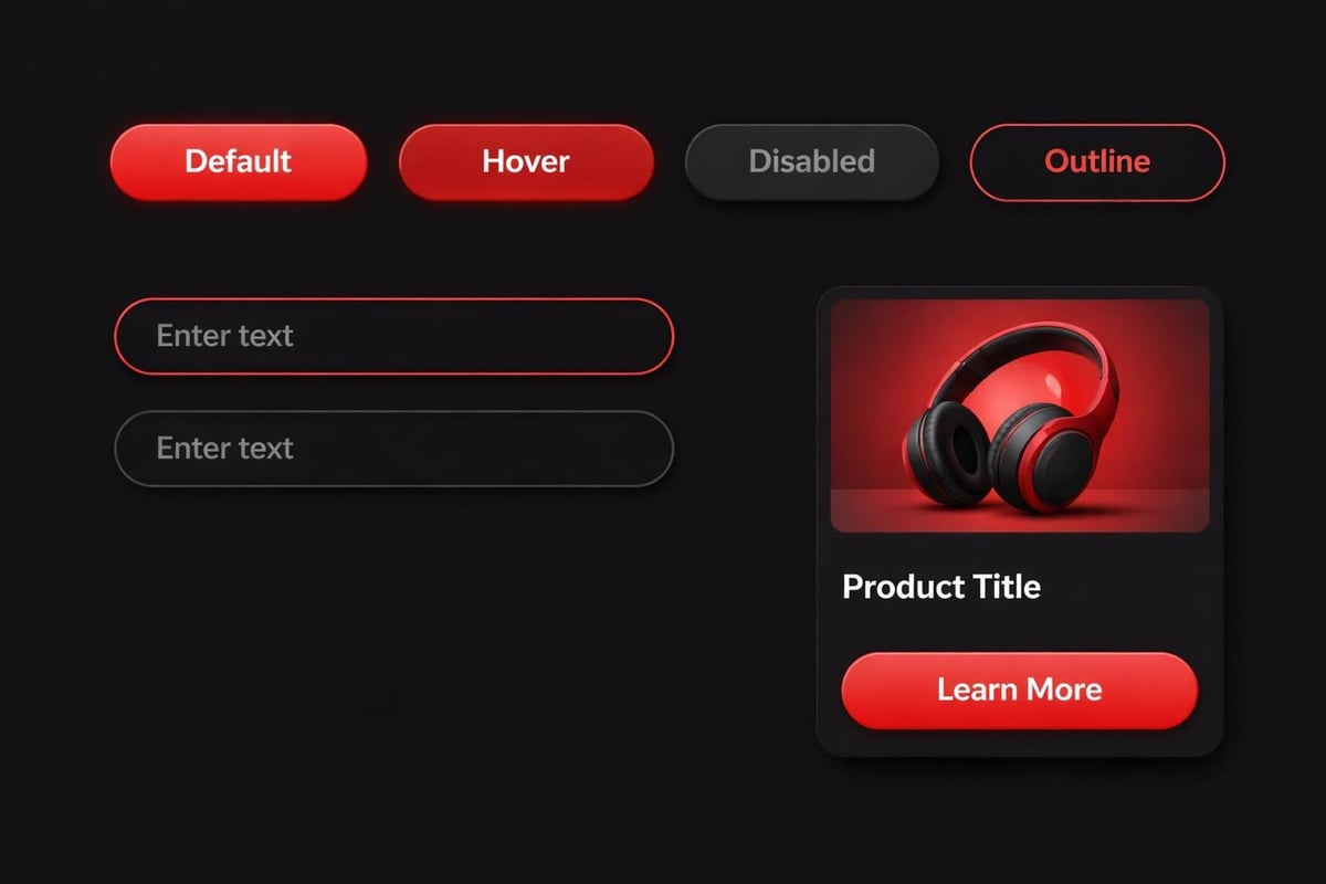
Consider a simple button component. Site branding determines:
- Corner radius - 4px feels technical, 8px balanced, 16px friendly
- Padding ratio - horizontal padding typically 2-3x vertical for optical balance
- Border treatment - present, absent, or appearing only on hover/focus
- Typography weight - medium creates presence without aggression
- State variations - default, hover, active, disabled, loading
These decisions cascade. If your primary button uses 8px radius, your input fields, cards, and modals should likely follow suit. Consistency creates rhythm. Rhythm builds recognition.
Examining real case studies reveals how top brands enforce these rules rigorously. A single team might design fifty page types, but they're built from twenty components with iron-clad specifications.
Spacing and Rhythm: The Invisible Brand Language
Most people can't articulate why certain sites "feel premium" while others don't. The answer usually lives in spacing.
Site branding requires a mathematical spacing system, not eyeballed gaps. Start with a base unit (typically 8px) and build a scale:
- 4px - tight inline spacing, icon-to-text gaps
- 8px - default component padding, list item spacing
- 16px - section element spacing, form field gaps
- 24px - related content group spacing
- 32px - subsection breaks
- 48px - major section spacing
- 64px+ - hero sections, page breaks
Apply these values exclusively. No 18px margins because it "looks better." That 2px difference accumulates into dozens of unique spacing values across your site, destroying the rhythm that makes site branding work.
Vertical Rhythm and Baseline Grids
Advanced site branding aligns all elements to a baseline grid.
If your body text uses 16px size with 1.6 line-height, your baseline grid is 25.6px (round to 24px or 28px for clean math). Every element - headings, images, buttons, dividers - should align to multiples of this baseline. The effect is subtle but powerful, creating vertical harmony that feels "designed" even to untrained eyes.
This approach appears in high-performance design systems because it scales effortlessly. Add a new section type, apply the baseline grid, maintain brand coherence automatically.
AI-Assisted Site Branding Workflows
AI doesn't design your site branding. It removes friction from enforcing it.
Modern AI tools excel at pattern recognition and consistency checking, the exact tasks that make site branding labor-intensive at scale. Use them strategically:
Design token generation. Describe your brand parameters (color values, type scale, spacing system) and ask AI to generate design tokens in JSON or CSS custom properties. Review and refine, but let AI handle the syntax and mathematical progressions.
Component variation mapping. Feed your primary button design to AI with specifications for all interactive states. It can generate hover, active, disabled, and loading variations while maintaining your brand logic, which you then audit and adjust.
Accessibility testing at speed. AI can rapidly check contrast ratios across your entire color system, flagging combinations that fail WCAG standards before they ship. This catches site branding errors that manual review might miss.
Content-aware image treatment. Describe your image strategy (black-and-white with 10% brand color overlay, or saturated with subtle grain texture) and AI can batch-process imagery to match your site branding guidelines.
The workflow becomes: define the system, use AI to execute repetitive applications, review outputs for brand alignment, refine the system based on edge cases discovered. AI-assisted design workflows should accelerate craft, not replace discernment.
Navigation and Site Branding Integration
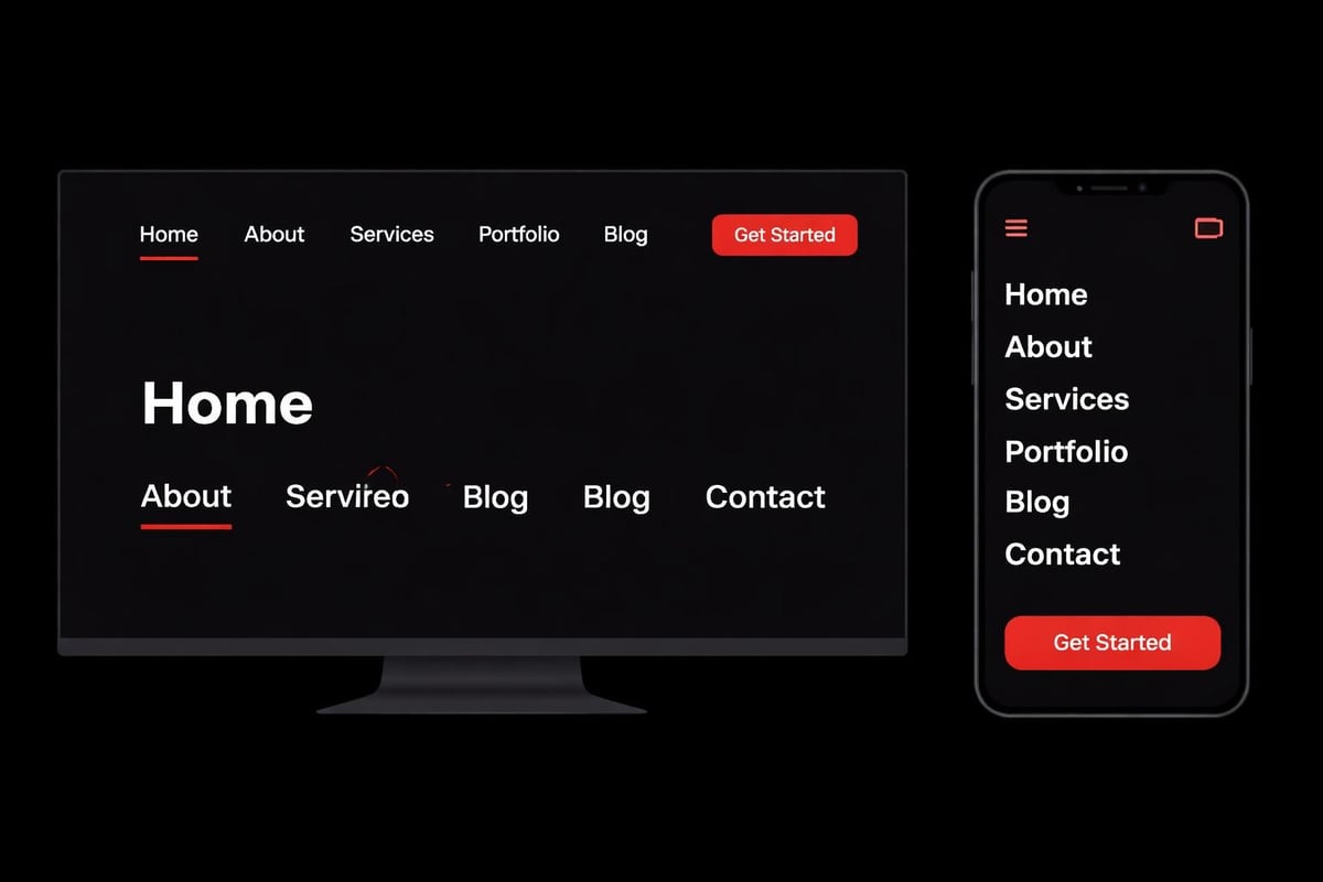
Your navigation is often the first branded touchpoint users encounter.
Site branding here means more than logo placement. It's about how navigation adapts across breakpoints while maintaining identity. How hover states reflect your interaction philosophy. Whether mobile menus animate or snap. Each decision either reinforces or dilutes brand perception.
Desktop Navigation Patterns
Traditional horizontal navigation still dominates for content-heavy sites, but site branding determines execution:
- Link styling - underlines on hover, color shifts, background pills, or subtle borders
- Active state indication - color change, weight increase, or position marker
- Dropdown behavior - instant appearance, fade-in, slide-down, or mega-menu expansion
- Sticky behavior - persistent, hide-on-scroll-down, or static
Choose patterns that match your brand personality. A fintech startup might use precise, minimal hover states (1px underline, no animation). A creative agency might deploy bold color fills with smooth transitions. Corporate website development often balances professional restraint with memorable interaction details.
Mobile Navigation as Brand Opportunity
Mobile menus are where many site branding systems collapse.
Desktop navigation uses your carefully crafted spacing and typography. Then mobile collapses everything into a hamburger menu with completely different visual rules. The disconnect is jarring. Strong site branding maintains family resemblance:
- Use the same type hierarchy - just adjusted for smaller screens
- Maintain color semantics - primary actions stay primary-colored
- Apply consistent spacing - smaller scale, same proportional relationships
- Match animation personality - smooth and considered, or snappy and efficient
The mobile menu should feel like the desktop navigation's smaller sibling, not a completely different design language.
Content Pages and Site Branding Consistency
Every content page is a brand touchpoint, from case studies to blog posts to legal pages.
Site branding means these pages share foundational patterns even as content varies. Your blog shouldn't look like it belongs to a different company than your product pages. Yet many startups create beautiful marketing sites, then bolt on generic blog templates with mismatched typography and spacing.
Article and Content Typography
Long-form content tests your typographic system's versatility.
Your hero headline might use 48px semibold at 1.1 line-height on marketing pages. That same treatment feels aggressive in article contexts. Site branding provides the system, not rigid rules. Article headlines might step down to 36px with 1.2 line-height while maintaining the same typeface and weight logic.
Reading comfort requires wider line length (60-75 characters) and generous line-height (1.6-1.8 for body text). But these adjustments happen within your established scale, not as random exceptions. A well-documented branding pages guide shows how leading brands adapt their systems to content-heavy contexts.
Pull quotes, code blocks, and callout sections need deliberate styling that reinforces site branding. Use your secondary color for quote bars. Apply your spacing system to code block padding. Maintain your corner radius on callout containers. These details accumulate into cohesion.
Image Treatment as Brand Language
Photography and illustration styles are often overlooked site branding elements.
You can use perfect typography, color, and spacing, but if your imagery clashes stylistically, the brand feels fragmented. Establish clear image guidelines:
- Photography style - environmental context, studio isolation, or lifestyle scenarios
- Color treatment - full color, selective desaturation, overlays, or filters
- Framing and composition - centered subjects, rule of thirds, asymmetric balance
- Consistency across contexts - product shots, team photos, feature illustrations
Some brands use black-and-white photography with color accents as a signature. Others lean into saturated, high-contrast imagery. Strategic branding case studies often reveal that image treatment discipline separates memorable brands from forgettable ones.
Icon systems follow similar logic. Choose a style (outlined, filled, rounded, geometric) and apply it universally. Mixing icon styles across your interface undermines site branding as much as mixing typefaces randomly.
Footer as Final Brand Impression
Users often scroll to footers when seeking specific information or verifying legitimacy.
Site branding in footers means maintaining your visual system where many sites abandon it. The footer isn't a dumping ground for legal links and social icons. It's your final opportunity to reinforce brand coherence.
Apply your:
- Typography scale - smaller sizes, same typeface and hierarchy logic
- Color system - often inverted (light footer on dark sites, dark footer on light)
- Spacing system - tighter vertical rhythm, consistent horizontal gaps
- Component patterns - newsletter signups, link lists, contact forms using established styles
A well-branded footer feels intentionally designed, not template-default. It uses your brand colors thoughtfully, organizes content with your spacing scale, and includes CTAs styled according to your button system.
Site Branding Audits and Maintenance
Site branding isn't set-and-forget. It requires active maintenance as products evolve.
Schedule quarterly audits:
- Screenshot every page type - homepage, product pages, articles, forms, dashboards
- Review for consistency - do components match specs, is spacing systematic
- Check new additions - features launched since last audit, one-off pages
- Document deviations - intentional exceptions vs. drift from standards
- Update design system - incorporate learnings, deprecate unused patterns
This process catches entropy early. One team builds a modal with custom spacing. Another creates a form with new input styles. Left unchecked, these variations multiply into systemic inconsistency. Regular audits keep site branding sharp.
Building Site Branding That Compounds
The difference between good and great site branding is compounding consistency.
Each correctly applied component reinforces the system. Each page that follows the spacing scale strengthens user pattern recognition. Each image that matches your treatment guidelines builds brand cohesion. This compounds over time and across touchpoints.
Conversely, inconsistency compounds negatively. One mismatched button creates a 1% brand dilution. Ten scattered across key pages becomes noticeable drift. Fifty variations across your site destroys the coherence that makes site branding work.
The best approach treats site branding as living infrastructure, not static deliverables. Build the foundational systems. Document them rigorously. Enforce them through design tooling and code architecture. Review regularly. Evolve deliberately.
Your site branding becomes your competitive advantage, creating instant recognition, perceived quality, and user trust that generic competitors can't replicate through clever copy or feature lists alone. The system becomes inseparable from the product.
Site branding transforms scattered design decisions into coherent systems that scale with your product. It's the architectural difference between startups that look assembled versus intentionally crafted. At Embark Studio™, we build these foundational systems alongside founding teams, creating site branding frameworks that compound as your product evolves, reducing decision fatigue while accelerating growth through consistent, conversion-focused experiences.
Get articles like this in your inbox
Practical design and growth insights for founders. No spam, unsubscribe anytime.


