
Most product websites fail not because of poor aesthetics but because they lack structural clarity. Teams often confuse visual polish with strategic design, building pages that look expensive but convert poorly. The difference between a product website that drives revenue and one that burns marketing spend lies in how deliberately it guides attention, builds trust through information architecture, and removes friction from decision-making paths.
The Core Problem: Random Screens vs. Systematic Design
A product website isn't a collection of beautiful pages. It's a conversion system with predictable inputs and measurable outputs.
Too many teams approach product website design by assembling components without understanding the underlying structure. They add features because competitors have them, not because users need them. This randomness creates cognitive overload and decision paralysis.
The psychology is straightforward:
- Users arrive with specific intent (research, comparison, purchase)
- Your product website either matches that intent immediately or loses them
- Every element either accelerates or disrupts their progress toward conversion
Consider how user-friendly product page design centers on removing obstacles rather than adding decoration. The best product website experiences feel inevitable, not clever.
Why Visual Hierarchy Determines Conversion Rate
Your product website communicates priority through size, contrast, spacing, and sequence. When hierarchy is weak, users scan randomly and leave confused.
Strong hierarchy creates a reading order:
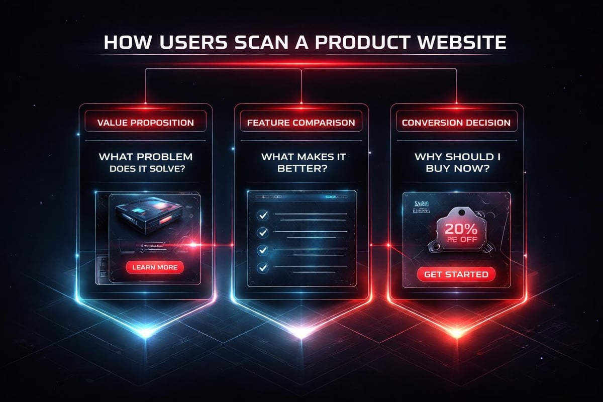
- Primary value proposition (what you solve, for whom)
- Visual proof (product imagery, social proof, metrics)
- Feature differentiation (why this matters compared to alternatives)
- Friction removal (pricing clarity, guarantee, next step)
Each layer should answer the question forming in a user's mind at that exact moment in their evaluation process. This isn't about creativity; it's about empathy expressed through structure.
Building Depth Without Complexity
Depth means providing the right information at the right moment. Complexity means showing everything at once.
A high-performing product website reveals detail progressively. Surface-level views communicate core benefits quickly. Deeper layers satisfy research-driven buyers who need specifications, comparisons, or technical validation.
Progressive disclosure structure:
| Layer | Purpose | Content Type |
|---|---|---|
| Hero | Instant clarity | Value prop + visual anchor |
| Features | Differentiation | Benefit-driven descriptions |
| Proof | Credibility | Case studies, testimonials, metrics |
| Details | Validation | Specs, FAQs, documentation |
| Conversion | Commitment | Clear CTA with friction removers |
This isn't linear navigation; it's a choose-your-own-depth model. Quick buyers convert from the hero section. Research-heavy buyers explore deeper before committing. Your product website should serve both without compromising either path.
The Role of Visual Rhythm in User Confidence
Rhythm isn't decoration. It's the pattern of density and space that makes information feel scannable versus overwhelming.
Break visual rhythm into three speeds:
- Fast: Headlines, key metrics, CTAs (instant comprehension)
- Medium: Feature descriptions, benefit statements (15-30 second scan)
- Slow: Detailed comparisons, technical specs, long-form proof (deep research mode)
When these speeds are balanced across your product website, users feel in control. They can move quickly when ready or slow down when they need more conviction. Effective e-commerce design practices emphasize this rhythm through intentional spacing and content chunking.
How AI Accelerates Product Website Workflows
AI doesn't design your product website. It removes repetitive friction from the design process so you can focus on strategic decisions.
Where AI provides genuine leverage:
- Content generation for product descriptions: Start with AI-drafted copy, then refine for brand voice and specificity
- A/B test variant creation: Generate headline alternatives or CTA variations in seconds
- Image optimization and resizing: Automate responsive image generation across breakpoints
- Accessibility audits: Identify contrast issues, missing alt text, or structural problems faster
The key is using AI as a multiplier for your creative judgment, not a replacement. When designing for high-performance startup websites, we use AI to compress timelines, not to abdicate design decisions.
Real Application: Product Detail Page Structure
Consider a SaaS product detail page. The traditional approach involves multiple review cycles, endless wireframe iterations, and delayed decisions about what to include.
AI-accelerated workflow:
- Feed existing customer conversations into an AI tool to extract common questions
- Use those questions to structure your information hierarchy
- Generate initial copy for each section based on product documentation
- Design the visual system manually (spacing, typography, component behavior)
- Use AI to create description variants for A/B testing
- Iterate based on real conversion data, not opinions
This workflow maintains human control over strategic choices while eliminating hours of administrative work. Your product website benefits from faster iteration cycles and data-informed refinement.
Systems Thinking for Product Websites
A product website isn't a single page; it's an interconnected system where changes ripple across experiences.
When you adjust your value proposition on the homepage, that language should cascade into:
- Product category pages
- Individual product detail pages
- Pricing comparison tables
- Checkout confirmation messaging
- Post-purchase onboarding emails
Building systematic consistency:
| Element | System Rule | Why It Matters |
|---|---|---|
| Messaging | Core benefit repeated in different contexts | Reinforces value at each decision point |
| Visual language | Consistent component behavior across pages | Reduces cognitive load, builds familiarity |
| Data presentation | Uniform metric formatting and hierarchy | Makes comparisons effortless |
| Trust signals | Social proof positioned before commitment | Addresses objections proactively |
Design systems built for scalability ensure that your product website maintains coherence as you add products, features, or entire business lines.

Conversion-Focused Product Page Architecture
Product pages are where research converts to action. Every element either builds confidence or creates doubt.
Essential product page components in priority order:
- Product name and category context (orientation)
- Primary image with zoom capability (visual validation)
- Price with any promotional clarity (economic reality check)
- Key differentiating features (why this vs. alternatives)
- Add to cart or demo request CTA (conversion mechanism)
- Social proof or customer validation (credibility)
- Detailed specifications (for research-driven buyers)
- Related products or upsells (basket value optimization)
The sequence matters more than individual quality. A stunning image positioned after a weak headline performs worse than a decent image following a compelling value statement. Optimizing product pages for conversions requires this structural discipline.
Designing for Multiple Buyer Personas
Different customers need different information depth. Your product website should accommodate both without forcing everyone through the same linear path.
Persona-based navigation patterns:
- Quick buyers: Prominent CTA above fold, minimal scroll required
- Researchers: Tabbed content (overview, specs, reviews, support) for deep dives
- Comparison shoppers: Side-by-side product tables, filtering by key attributes
- Visual learners: Gallery views, video demos, interactive product visualizations
This isn't about building separate pages for each persona. It's about layering information so different users can extract what they need without wading through what they don't.
The Trust Layer in Product Website Design
Trust isn't a component you add at the end. It's woven throughout your entire product website architecture.
Where trust signals appear:
- Navigation: Security badges near payment information
- Product pages: Customer reviews, ratings distribution, purchase counts
- Checkout: Guarantees, return policies, shipping transparency
- Post-purchase: Order confirmation, tracking, support accessibility
E-commerce design best practices emphasize positioning these elements where doubt typically emerges, not just where they fit visually.
Social Proof That Actually Converts
Generic five-star ratings don't move the needle. Specific, contextualized proof does.
High-impact social proof formats:
- Reviews mentioning specific use cases or solved problems
- Customer photos showing product in real environments
- Metrics showing usage scale (customers served, problems solved, time saved)
- Brand logos for B2B credibility (with permission)
- Before/after comparisons demonstrating tangible outcomes
Place this proof adjacent to friction points. When users hesitate about price, show ROI metrics. When they question reliability, surface technical validation. Your product website should anticipate objections and resolve them pre-emptively.

Navigation That Serves Intent, Not Organization
Most product website navigation reflects internal company structure rather than customer mental models. Users don't think in terms of your departments; they think in terms of their problems.
Intent-based navigation structure:
| User Intent | Navigation Label | Destination |
|---|---|---|
| Solve specific problem | By Use Case | Solution-focused landing pages |
| Compare options | By Product Type | Category pages with filtering |
| Validate credibility | Customer Stories | Case studies, testimonials |
| Get support | Help Center | Documentation, chat, contact |
| Make purchase | Pricing or Shop | Product catalog or pricing page |
This approach surfaces what users actually need rather than forcing them to decode your business model. Clear navigation hierarchy reduces bounce rates and improves time-to-conversion significantly.
Mobile-First Product Website Strategy
Mobile isn't a separate consideration; it's the primary experience for most product website traffic in 2026.
Mobile-specific design considerations:
- Touch target sizing (minimum 44x44px for interactive elements)
- Thumb-zone optimization (critical actions within easy reach)
- Progressive image loading (performance over initial quality)
- Simplified forms (minimize typing, maximize selection)
- Sticky CTAs (persistent conversion path as users scroll)
The constraint isn't screen size; it's attention span and context. Mobile users often browse during downtime with partial attention. Your product website must communicate value in 3-5 seconds of scattered focus or lose them permanently.
Responsive Breakpoint Strategy
Breakpoints aren't about device categories; they're about where your content breaks.
Design your product website at three widths:
- 320px: Absolute minimum (oldest devices, extreme zoom)
- 768px: Tablet transition point (multi-column becomes viable)
- 1440px: Desktop optimization (maximum comfortable reading width)
Everything between these points should flex gracefully using relative units and container queries. Responsive design for product experiences requires testing at weird sizes (411px, 915px) where most layouts reveal structural weaknesses.
Content Strategy for Product Pages
Copy on your product website isn't marketing fluff; it's conversion architecture expressed through language.
Writing that converts follows this pattern:
- Headline: Outcome, not feature (what changes for the user)
- Subhead: Specific mechanism (how it delivers that outcome)
- Body: Social proof or technical validation (why believe it)
- CTA: Clear next step with friction removed (how to get it)
Avoid jargon unless your audience uses it. Write like you're explaining the product to a friend who has the problem but doesn't know solutions exist yet. Building clarity through content means choosing precision over cleverness.
Performance as a Conversion Variable
A slow product website bleeds revenue invisibly. Users don't report performance issues; they just leave.
Performance targets for 2026:
| Metric | Target | Impact |
|---|---|---|
| Largest Contentful Paint | < 2.5s | First impression formation |
| First Input Delay | < 100ms | Interaction responsiveness |
| Cumulative Layout Shift | < 0.1 | Visual stability, trust |
| Time to Interactive | < 3.5s | Usability threshold |
Every 100ms of delay costs approximately 1% of conversion rate. Your product website might be beautifully designed but commercially ineffective if it loads slowly. High-performance website development treats speed as a feature, not an afterthought.
Optimizing Without Compromising Experience
Performance optimization isn't about removing features; it's about loading smarter.
Techniques that maintain quality while improving speed:
- Lazy load below-fold images and videos
- Serve next-gen formats (WebP, AVIF) with fallbacks
- Implement critical CSS inlining for above-fold content
- Use CDN edge caching for static assets
- Compress and minify all text-based resources
- Preload fonts and critical path resources
Modern frameworks make most of this automatic, but understanding the principles helps you make informed trade-offs when custom functionality is required.
Analytics That Inform Design Decisions
A product website without measurement is just expensive guesswork. Track what matters, ignore vanity metrics.
Essential product website metrics:
- Conversion rate by traffic source: Which channels deliver quality visitors
- Product page bounce rate: Where interest dies
- Add-to-cart vs. purchase completion: Checkout friction identification
- Average session depth: Engagement level before conversion
- Revenue per visitor by segment: Who converts most profitably
Use heatmaps and session recordings to understand behavior that analytics can't explain. Watch real users navigate your product website; you'll discover friction you'd never imagine from aggregate data alone.
The Studio Approach to Product Websites
At Embark Studio™, we build product websites as conversion systems, not pixel-perfect mockups.
Our process starts with understanding:
- What specific action constitutes success
- What objections prevent that action
- What information resolves those objections
- How to structure that information for maximum clarity
Then we design the minimal architecture that delivers those outcomes repeatably. No decoration. No randomness. Just deliberate hierarchy, progressive disclosure, and relentless focus on removing friction.
The frameworks we're developing address:
- Component libraries that enforce consistency without constraining creativity
- Information architecture templates based on conversion psychology
- Performance budgets that balance richness with speed
- Analytics instrumentation that reveals hidden friction points
These aren't templates you install; they're systematic thinking you apply. Every product website has unique constraints and opportunities. The system provides structure; your strategy provides direction.
Building a product website that actually converts requires more than visual polish-it demands systematic thinking about hierarchy, progressive disclosure, trust architecture, and performance optimization. When you approach each element as part of a conversion system rather than isolated design decisions, you create experiences that guide users from curiosity to commitment with minimal friction. If you're ready to build a product website grounded in design systems that scale with your business, Embark Studio™ partners with startups to design, build, and continuously optimize high-performance digital experiences using modern frameworks and AI-accelerated workflows.
Get articles like this in your inbox
Practical design and growth insights for founders. No spam, unsubscribe anytime.


