
Most teams obsess over conversion rate optimization tactics like button colors and headline variations while ignoring the foundational issue: their website lacks a coherent system. A high conversion website isn't the result of A/B testing alone. It's built on deliberate architecture, psychological clarity, and rhythmic user flow that guides visitors toward action without friction or noise.
The misconception runs deep. Founders pour resources into traffic acquisition while their landing experiences scatter attention across competing messages, buried value propositions, and visual chaos that undermines trust. Conversion isn't a finish line you sprint toward with clever copy tricks. It's the natural outcome of systematic design thinking applied to every layer of the experience.
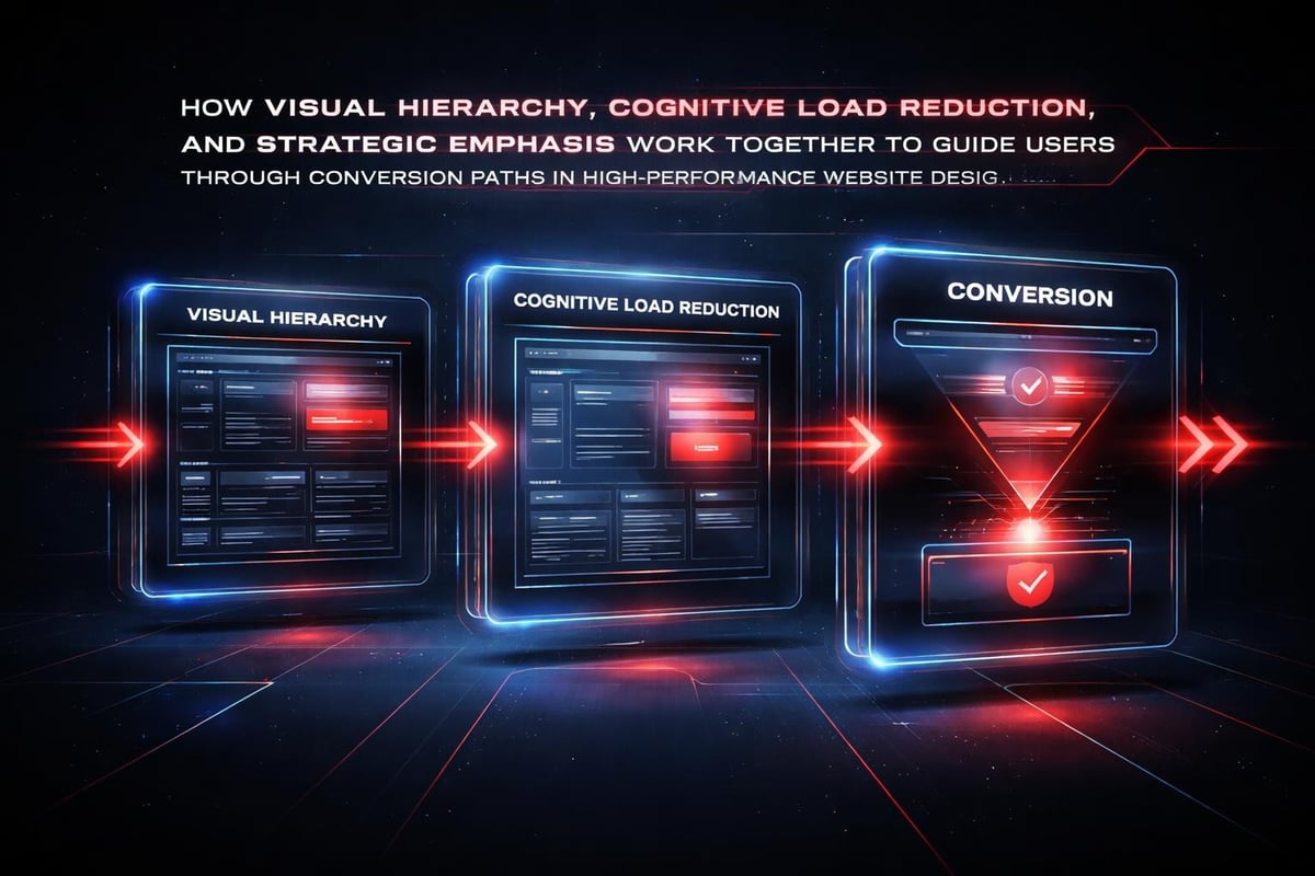
The Psychology Behind High-Converting Experiences
Conversion happens when cognitive load disappears and clarity emerges.
Every decision a visitor makes on your site consumes mental energy. The human brain processes visual information 60,000 times faster than text, which means your interface architecture speaks before your words do. When hierarchy breaks down, when calls-to-action compete for attention, when navigation paths fragment, you're asking users to work harder than they're willing to invest.
Strategic visual hierarchy functions as a conversion multiplier through three core mechanisms:
- Selective attention guidance that directs eye movement toward high-value actions
- Cognitive fluency that reduces processing effort and increases perceived trustworthiness
- Decision architecture that eliminates choice paralysis through progressive disclosure
The relationship between visual weight and conversion intent isn't arbitrary. Research on maximizing user conversion without compromising experience demonstrates that balanced visual intensity creates optimal conditions for action. Too aggressive, and you trigger resistance. Too subtle, and the path forward becomes unclear.
Depth Over Decoration
Surface-level aesthetics won't save a structurally flawed experience.
A high conversion website prioritizes information architecture before visual polish. This means mapping user intent to content depth, organizing navigation around actual jobs-to-be-done, and eliminating decorative elements that don't serve the conversion narrative.
Consider how strategic CTA placement and visual hierarchy shape user behavior. Primary actions should carry the heaviest visual weight, supported by whitespace that creates breathing room for decision-making. Secondary paths exist but don't compete. Tertiary elements recede into the background structure.
| Design Element | Low-Conversion Approach | High-Conversion Approach |
|---|---|---|
| Hero Section | Generic imagery, vague headline | Outcome-focused value prop, clear next step |
| Navigation | Feature-based categories | Benefit-based journey paths |
| CTAs | Multiple competing actions | Single primary action per context |
| Content Density | Wall of text or sparse emptiness | Rhythmic content blocks with visual breaks |
Building Conversion Architecture Into Your Design System
Systems thinking transforms one-off optimizations into scalable performance.
When you approach your website as a design system built for continuous improvement, every component becomes reusable, every pattern becomes testable, and every iteration compounds. This isn't about creating a static design library. It's about encoding conversion principles into the DNA of your interface components.
A conversion-oriented design system includes:
- Component variants pre-optimized for different conversion contexts (awareness, consideration, decision)
- Spacing scales that create natural rhythm and guide visual flow
- Typography hierarchies that establish information priority instantly
- Color semantics that reinforce brand trust while highlighting action paths
- Layout grids that maintain coherent structure across device contexts
Modern tools like Framer enable teams to build these systems without engineering bottlenecks. Our work at Embark Studio™ demonstrates how design systems accelerate iteration cycles while maintaining conversion-focused consistency across every touchpoint.
The Mobile-First Conversion Reality
Desktop optimization is table stakes. Mobile determines whether you're actually converting.
Over 60% of web traffic originates from mobile devices, yet most websites treat mobile as an afterthought adaptation rather than the primary experience. A high conversion website inverts this priority. Start with the constrained canvas. Force yourself to prioritize ruthlessly. Then enhance for larger viewports without diluting the core conversion path.
Mobile optimization and visual content strategy reveals patterns that translate across devices: faster load times, thumb-friendly interaction zones, progressive information disclosure that respects limited screen real estate.
The constraints of mobile design actually strengthen desktop experiences. When you've refined your message to work in 375 pixels of width, expanding to 1440 pixels becomes an opportunity for enhancement, not dilution.
Strategic Content That Converts
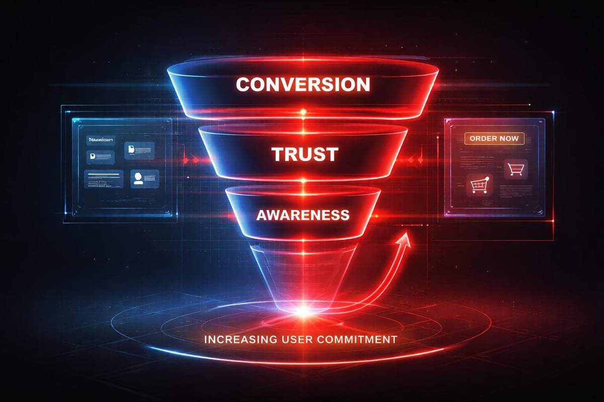
Conversion-focused content architecture follows psychological progression, not marketing templates.
Your homepage isn't a brochure. It's a decision-making environment that should guide visitors through awareness, comprehension, trust-building, and action in a natural sequence. This requires understanding the best practices for high-converting homepage design and adapting them to your specific user journey.
Effective content progression follows this cognitive map:
- Immediate value recognition within 3 seconds of landing
- Problem-solution framing that validates visitor intent
- Social proof integration at moments of doubt or hesitation
- Objection handling before friction points arise
- Clear next-step articulation that removes decision ambiguity
Generic benefit statements don't convert. Specific outcome promises paired with credible proof do. Instead of "We help businesses grow," try "Investor-backed startups using our design system see 40% faster time-to-market." The difference lies in specificity and verifiability.
Trust Signals That Actually Work
Social proof isn't about plastering logos everywhere. It's about contextual credibility.
The psychology of trust in digital environments demands strategic deployment of validation signals. Place customer testimonials near points of friction. Show case study results adjacent to capability claims. Position security badges at checkout moments. Each trust element should answer a specific doubt that arises naturally in the conversion journey.
CRO best practices for homepage conversion emphasize minimizing pop-ups and friction while maximizing authentic social proof. This doesn't mean removing all interruption, it means timing intervention strategically based on user behavior signals.
Authenticity matters more than volume. One detailed case study with measurable outcomes outperforms ten generic testimonials. Real client names, specific metrics, and verifiable results build credibility that generic praise cannot.
AI-Assisted Workflows for Conversion Optimization
Artificial intelligence accelerates iteration cycles but never replaces strategic thinking.
The role of AI in product design workflows has evolved beyond automated generation toward intelligent assistance. AI tools help product teams analyze user behavior patterns, identify conversion bottlenecks, generate content variations for testing, and predict performance outcomes before deployment.
AI enhances high conversion website development through:
- Behavioral pattern recognition across thousands of user sessions
- Variant generation for A/B testing headlines, CTAs, and layout configurations
- Performance prediction modeling based on historical conversion data
- Automated accessibility auditing that ensures inclusive design
- Content optimization suggestions grounded in semantic analysis
The critical distinction lies in application. AI shouldn't design your conversion strategy. It should help you test hypotheses faster, identify blind spots in your user journey, and surface insights buried in behavioral data. Human designers still define the strategic intent. AI compresses the feedback loop.
Our AI-assisted design approach maintains creative control while leveraging computational analysis for continuous improvement. This hybrid model produces better results than either pure automation or manual optimization alone.
Real-Time Adaptation Based on User Signals
Static websites leave conversion opportunities on the table.
A high conversion website responds dynamically to user behavior signals without becoming unpredictable. This means showing different content paths based on referral source, adjusting messaging based on scroll depth, or surfacing relevant case studies based on visitor industry signals captured through form interactions.
Modern platforms enable this contextual personalization without complex engineering. The key lies in strategic implementation that enhances rather than disrupts the core experience. Personalization should feel like helpful guidance, not surveillance.
| Personalization Trigger | Conversion Application | Implementation Method |
|---|---|---|
| Referral Source | Industry-specific messaging | Dynamic content blocks |
| Scroll Depth | Progressive CTA emphasis | Behavior-triggered elements |
| Time on Page | Exit intent value reinforcement | Smart modal timing |
| Previous Visits | Continuation of interrupted journey | Cookie-based state |
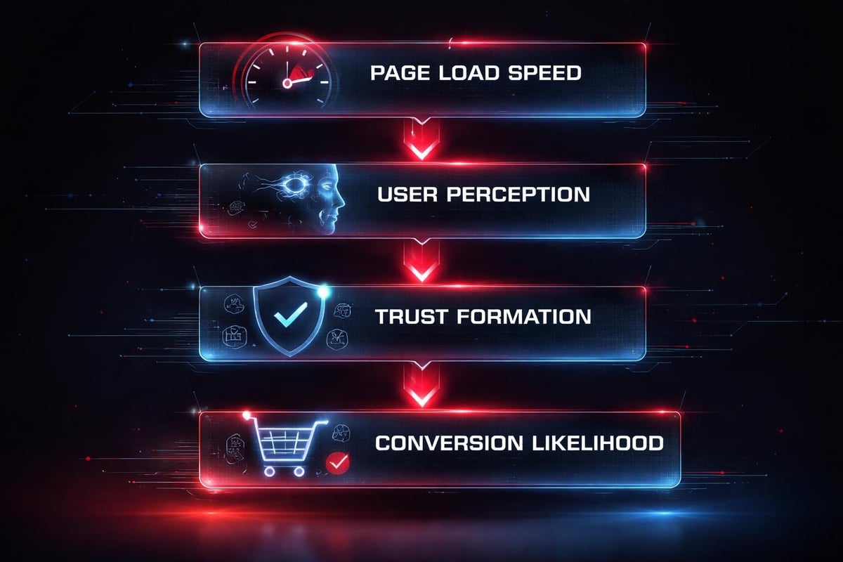
Performance Foundations for Conversion
Speed isn't a feature. It's a conversion prerequisite that compounds every optimization.
Every additional second of load time decreases conversion rates by approximately 7%. A high conversion website loads instantly, responds immediately to interaction, and maintains perceived performance even during processing. This requires technical discipline across asset optimization, code efficiency, and infrastructure decisions.
Core performance principles for conversion optimization:
- Critical path rendering that displays above-fold content within 1.5 seconds
- Image optimization using modern formats and responsive sizing
- JavaScript efficiency that prioritizes interaction readiness over feature bloat
- Caching strategies that eliminate repeat visitor wait times
- CDN distribution that reduces geographic latency
Web design tips for high-converting experiences emphasize the relationship between technical performance and user trust. Slow sites signal unprofessionalism regardless of visual polish. Fast experiences create confidence before any content loads.
Tools like Framer provide performance optimization built into the platform, eliminating common bottlenecks through intelligent asset handling and edge deployment. This allows design teams to focus on conversion strategy rather than technical optimization details.
The Continuous Improvement Mindset
Launching isn't finishing. A high conversion website evolves through systematic iteration.
The most successful teams treat their websites as living products rather than completed projects. This means establishing conversion analytics, running structured experiments, gathering qualitative feedback, and implementing improvements based on evidence rather than opinion.
Sustainable optimization cycles follow this pattern:
- Baseline measurement of current conversion performance across key funnels
- Hypothesis formation based on behavioral data and user research
- Variant design that tests one variable while controlling others
- Statistical validation that distinguishes signal from noise
- Implementation of winning variants and documentation of learnings
This approach compounds over time. Small improvements stack into significant gains when applied systematically. The difference between 2% and 4% conversion might seem marginal, but it represents a 100% increase in business outcomes from the same traffic investment.
Systems Over Screens
Sustainable conversion growth comes from systematic thinking, not isolated tactics.
The temptation to optimize individual pages independently creates a fragmented experience that undermines overall conversion performance. Users don't experience your website as disconnected screens. They move through a continuous journey where each interaction shapes the next.
Building a high conversion website requires orchestrating this entire system toward coherent outcomes. Your navigation should support the conversion narrative. Your content hierarchy should guide natural progression. Your design components should reinforce consistent mental models across every touchpoint.
This systems perspective reveals opportunities that page-level optimization misses. Sometimes the highest-leverage conversion improvement isn't changing your landing page, it's fixing the jarring transition between marketing site and product interface. Or clarifying the value proposition in navigation labels. Or reducing form fields in your contact flow.
At Embark Studio™, we approach every engagement through this systematic lens. Our collaborative design process treats conversion as an emergent property of coherent system design rather than a feature to bolt on after the fact.
Implementation Without Handoff Friction
The gap between design and deployment kills conversion momentum.
Traditional agency models create artificial boundaries between design decisions and technical implementation. By the time designs move through handoffs, stakeholder reviews, and development sprints, the strategic intent often gets diluted or lost entirely.
Modern workflows eliminate this friction. Tools like Framer enable designers to build production-ready experiences directly, maintaining strategic coherence from concept through deployment. This doesn't mean designers become developers. It means the gap between design intent and user experience shrinks to near zero.
The conversion impact manifests in subtle details: spacing that actually matches the design system, interactions that feel purposeful rather than generic, loading states that maintain engagement during transitions. These refinements only survive when the person making strategic decisions can implement them directly without translation loss.
Building a high conversion website demands systematic thinking that connects visual design, user psychology, technical performance, and continuous improvement into a coherent whole. Generic templates and tactical optimizations can't replace strategic architecture designed around how humans actually make decisions.
At Embark Studio™, we partner with startups to build conversion-focused experiences that scale with your growth. Our process integrates design systems thinking with modern implementation tools, enabling rapid iteration without sacrificing strategic depth. If you're ready to transform your website from a static brochure into a conversion engine that drives measurable growth, let's talk about how our approach can accelerate your trajectory.
Get articles like this in your inbox
Practical design and growth insights for founders. No spam, unsubscribe anytime.


