
Most product teams treat design systems as component libraries. They see it as a collection of buttons, form fields, and color variables. That's not a design system. That's a UI kit with documentation. The real power of design systems UX lies in creating a shared language between design, development, and product strategy, where every decision compounds rather than conflicts. When executed properly, design systems eliminate the friction that kills momentum in fast-moving startups.
The Core Misconception About Design Systems UX
Design systems fail when teams focus on artifacts instead of outcomes.
Building a library of 200 components feels productive. It looks impressive in stakeholder presentations. But if those components don't reduce decision fatigue, speed up feature development, or improve product consistency, they're architectural debt disguised as progress.
The psychology behind effective design systems UX centers on three principles:
- Cognitive load reduction through familiar patterns
- Decision delegation via predefined constraints
- Visual rhythm that creates product cohesion
Each principle requires intentional design thinking, not just documentation. When users encounter consistent interaction patterns across your product, their working memory isn't taxed by relearning navigation. Their attention stays focused on task completion rather than interface comprehension.
This is where most teams stumble. They document what exists rather than systematizing what should exist. The difference determines whether your design system becomes a reference tool or a growth engine.
Why Traditional Component Libraries Miss the Point
A button component with eight variants isn't a system. It's option paralysis wrapped in code.
Real design systems UX establishes decision frameworks that tell teams which button variant to use when. Context matters more than choice. Your primary CTA should signal importance through visual weight, not because a designer remembered to apply the right class name.
Consider how design systems shape product consistency at the foundational level. They're not about standardizing aesthetics. They're about encoding product strategy into reusable patterns that reinforce user mental models with every interaction.
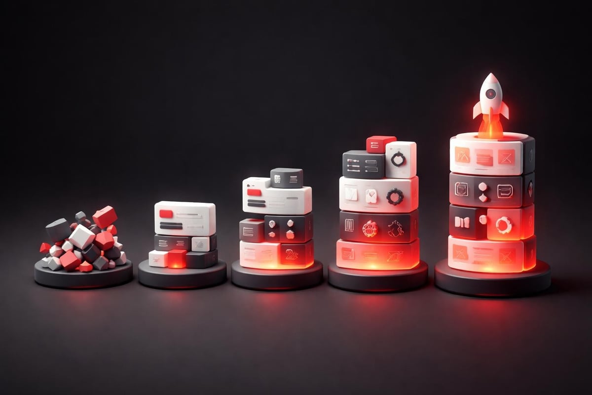
Building Design Systems UX That Scale With Growth
Scalability isn't about handling more components. It's about maintaining coherence as complexity increases.
Early-stage products can succeed with inconsistent UI because the core value proposition carries the experience. But as features multiply and teams grow, that inconsistency becomes friction. Users notice. Conversion rates suffer. Development velocity slows because every new feature requires custom design work.
The transition from ad-hoc design to systematic thinking happens in phases:
- Recognition that inconsistency is costing velocity
- Audit of existing patterns and pain points
- Abstraction of repeatable design decisions
- Implementation of the first system version
- Adoption through team buy-in and documentation
- Evolution based on real-world usage
Most teams rush from phase 1 to phase 4, skipping the critical thinking work that makes systems valuable. The audit phase reveals which patterns actually serve users versus which exist because a designer had time to explore.
The Role of Design Tokens in System Architecture
Design tokens are the atomic units of design systems UX. They translate design decisions into technology-agnostic values that propagate across platforms.
A color isn't just #2563EB. It's color.primary.600, which carries semantic meaning. When brand guidelines shift, that token updates everywhere simultaneously. No find-and-replace across 47 files. No missed instances that create visual inconsistency.
| Token Type | Purpose | Example Value | Impact |
|---|---|---|---|
| Color | Brand consistency | primary.500 | Unified visual language |
| Spacing | Layout rhythm | space.4 (16px) | Predictable hierarchy |
| Typography | Information hierarchy | text.heading.lg | Reading comprehension |
| Border radius | Visual softness | radius.md (8px) | Brand personality |
This abstraction layer creates maintenance efficiency that compounds over time. More importantly, it enables systematic thinking about design decisions. When you define spacing as a scale (4, 8, 16, 24, 32, 48, 64) rather than arbitrary pixel values, designers work within constraints that create visual rhythm automatically.
The principles that drive successful design systems emphasize this token-based approach because it separates presentation from meaning. Your primary button doesn't need to be blue. It needs to signal primary action. The token system ensures that signal remains clear regardless of implementation details.
Implementing Design Systems UX in Product Workflows
Theory without application is just expensive documentation.
The real test of design systems UX comes during feature development. Can a product designer mock up a new flow without inventing new patterns? Can a developer implement that design without waiting for style specifications? Can a product manager understand user flows by referencing system documentation?
Integration happens through deliberate workflow design:
- Discovery uses existing patterns as starting points
- Design extends the system only when gaps exist
- Development pulls from documented components
- Review catches deviations before deployment
- Contribution feeds learnings back into the system
This cycle ensures the system evolves with product needs rather than becoming a static artifact that teams work around. At Embark Studio™, we've seen startups accelerate dramatically when design systems become embedded in daily workflows rather than quarterly initiatives.
How AI Accelerates Design System Development
AI doesn't replace design thinking. It eliminates repetitive translation work that slows system adoption.
Generating component variations used to require manual duplication and adjustment. Now, AI-assisted tools can create responsive breakpoints, accessibility variations, and state changes from a single base design. This shifts designer time from mechanical work to strategic decisions about when patterns should vary and why.
The workflow transformation looks like this:
Traditional approach: Designer creates button, documents 8 states manually, updates Figma library, writes implementation specs, syncs with development, maintains documentation.
AI-assisted approach: Designer defines button logic and constraints, AI generates state variations and responsive behavior, system auto-documents implementation details, developers pull ready-to-use code.
The time saved isn't the primary benefit. It's the consistency guarantee that comes from algorithmic generation. Human error during manual component creation creates subtle inconsistencies that compound into user confusion. AI-generated variations maintain mathematical precision in spacing, color progression, and state transitions.
This aligns with broader trends in how AI supports product design workflows without replacing creative decision-making. The system still requires human judgment about what components should exist and how they should behave. AI handles the expansion of those decisions into production-ready assets.

Design Systems UX and User Psychology
Consistency isn't about aesthetics. It's about cognitive efficiency.
When users encounter familiar patterns, their brain processes interactions pre-attentively. They don't think about clicking a button because that button matches their mental model from previous interactions. This automatic processing frees cognitive resources for task completion rather than interface comprehension.
Design systems UX leverages this psychology through:
Pattern recognition: Repeated exposure to consistent UI elements builds stronger neural pathways, making interactions feel effortless.
Expectation matching: When interfaces behave predictably, users develop accurate mental models that reduce errors and increase confidence.
Visual hierarchy: Systematic use of size, weight, and color creates scannable layouts that communicate information priority without requiring conscious analysis.
The behavioral science behind design systems reveals why consistency matters at the foundational level. Each inconsistent interaction forces users to shift from automatic to controlled processing, which feels like friction. That friction accumulates into abandonment when users face too many novel patterns in a single session.
Measuring Design System Impact on Product Metrics
Design systems UX should move business metrics, not just design metrics.
Component library completeness feels measurable. Documentation coverage is trackable. But neither correlates directly with business outcomes. The metrics that matter reveal how systems improve product performance:
| Metric Category | What to Measure | Why It Matters |
|---|---|---|
| Development velocity | Feature ship time | Faster builds = faster learning |
| Design consistency | Pattern deviation rate | Lower deviation = better UX |
| User comprehension | Task completion time | Faster tasks = higher conversion |
| Maintenance burden | Update propagation time | System changes should be instant |
| Team efficiency | Design-to-dev handoff time | Less handoff = more momentum |
These metrics connect design system maturity to startup growth directly. When building scalable design systems, the goal isn't perfection. It's measurable improvement in how quickly teams ship high-quality experiences.
Startups can't afford to build systems for systems' sake. Every hour invested should compound into faster product iteration or better user outcomes. This pragmatic view shifts focus from comprehensive documentation to strategic systematization of high-impact patterns.
Adapting Design Systems UX for Modern Development
Modern development environments demand different system architectures than traditional web products.
Component-based frameworks like React created new possibilities for design system implementation. Design tokens can map directly to CSS variables or JavaScript objects. Components become truly reusable across contexts rather than copy-paste templates that diverge over time.
The technical architecture considerations for 2026:
- Token-first design that separates values from implementation
- Headless component libraries that work across frameworks
- Automated documentation generated from code comments
- Version control for design system updates and rollbacks
- Testing infrastructure that validates component behavior
This technical sophistication serves a simple goal: making the right design choice the easiest development choice. When pulling a system component is faster than building custom UI, teams naturally gravitate toward consistency.
The intersection of design systems and modern development frameworks is explored thoroughly in resources like UXmatters' design system discussions, which showcase how leading teams structure systems for maximum development velocity.
Platform-Specific Considerations for Design Systems UX
Web, iOS, and Android each impose different constraints on design system implementation.
A responsive web component might use CSS Grid for layout flexibility. That same logical component on iOS needs Auto Layout constraints. Android requires a different approach with ConstraintLayout. The design system must define the behavioral logic that each platform implements natively.
This is where systematic thinking separates from rigid templating. Your design system shouldn't prescribe pixel-perfect implementation. It should define:
Spatial relationships: How components relate to each other and their containers
Interactive behavior: How components respond to user input across devices
Visual hierarchy: How importance is communicated through design decisions
Content adaptation: How components handle varying content lengths and types
Platform-specific implementations then honor these principles while leveraging native capabilities. A bottom sheet on mobile might become a modal on desktop. Both serve the same system function, but with appropriate platform patterns.

The Studio Approach to Design Systems UX
Systems thinking beats screen thinking every time.
Most design engagements optimize individual screens. They make the homepage convert better or the onboarding flow smoother. That's tactical work. It improves metrics but doesn't build leverage. Each new feature requires the same level of design effort because there's no system extracting reusable patterns.
Studio-level thinking asks different questions:
- What patterns appear repeatedly across user flows?
- Which design decisions could we make once and reuse everywhere?
- How do we encode product strategy into interface conventions?
- What constraints would speed up design while improving consistency?
These questions surface the systematization opportunities that create compounding value. When you solve a navigation pattern once and reuse it across 20 features, that's 19x leverage on the original design thinking.
Looking at examples from established design systems reveals this pattern. Companies like Airbnb, IBM, and Shopify didn't build comprehensive systems because they had unlimited resources. They built systems because growth demanded it. As products scale, systematic thinking becomes the only sustainable path forward.
Future-Proofing Design Systems for Product Evolution
Design systems UX must evolve without breaking existing implementations.
This requires architectural thinking from day one. Your first system version won't anticipate every future need. But it can establish patterns for extension that prevent breaking changes.
Version management strategies that maintain stability:
- Semantic versioning for component updates (major.minor.patch)
- Deprecation warnings that give teams migration runway
- Backward compatibility layers for gradual transitions
- Feature flags that enable progressive rollouts
- Documentation archives that preserve historical context
This infrastructure prevents the common trap where design systems become too rigid to evolve or too chaotic to trust. Teams need confidence that adopting system components won't create future technical debt when the system inevitably changes.
The comprehensive resources on design systems emphasize this evolutionary approach. Systems are never finished. They're living artifacts that mature alongside product understanding and user needs.
Connecting Design Systems UX to Business Outcomes
Executive buy-in requires business-language explanations.
Designers understand the value of consistency intuitively. Developers appreciate the velocity benefits of reusable components. But leadership needs to see how design systems UX connects to revenue, conversion, and growth.
The business case translates system benefits into outcomes:
Reduced development costs: Features ship faster when teams reuse validated patterns instead of designing from scratch each time. This compounds into significant cost savings as the product scales.
Improved conversion rates: Consistent, familiar interfaces reduce user confusion and increase task completion. Every percentage point improvement in conversion multiplies across all traffic.
Faster market response: When new features can be assembled from existing system components, competitive response time shrinks dramatically. This agility advantage matters in fast-moving markets.
Lower maintenance burden: Systematic design means updates propagate automatically. A brand refresh that once required touching hundreds of files now updates through token changes.
These outcomes matter more than design quality metrics. When you can demonstrate that design systems UX drove a 15% reduction in feature development time or a 3% lift in conversion rates, system investment becomes an obvious business decision.
Practical Implementation for Startup Teams
Startups face unique constraints when building design systems UX.
You don't have dedicated system teams or unlimited design resources. You need pragmatic approaches that deliver value quickly without creating maintenance nightmares. The key is starting with high-leverage patterns that appear frequently across your product.
A practical startup approach to design systems:
- Start with 5-7 core components that represent 80% of your UI
- Document the why behind each pattern, not just the what
- Build adoption into workflows through templates and defaults
- Create feedback loops that capture pain points and improvements
- Evolve based on usage rather than theoretical completeness
This focused approach prevents the analysis paralysis that kills system initiatives. You're not building a comprehensive design language. You're systematizing the patterns that create the most friction when inconsistent.
Teams working within modern frameworks like Framer have advantages here. Built-in component architecture and style inheritance make it easier to establish systematic patterns without heavy technical infrastructure. The tool supports the thinking, but the thinking still requires intention.
Avoiding Common Design System Pitfalls
Most design system failures follow predictable patterns.
Over-engineering the first version: Building comprehensive systems before you understand actual product needs creates elaborate structures nobody uses. Start small. Expand based on real requirements.
Forgetting adoption strategy: The best system in the world fails if teams don't use it. Adoption requires documentation, training, and removing barriers to implementation.
Optimizing for completeness: A 60% complete system that teams actually use beats a 95% complete system that sits unused. Ship value incrementally.
Ignoring contribution paths: Systems controlled by a single designer become bottlenecks. Create clear processes for teams to propose additions and improvements.
Measuring the wrong metrics: Component count and documentation pages don't correlate with business value. Track adoption rates and development velocity instead.
Examining how successful teams structure their design systems reveals these lessons repeatedly. The teams that succeed focus on user outcomes and team velocity rather than system purity.
Design Systems UX as Competitive Advantage
In 2026, systematic design thinking separates fast-moving startups from stagnant competitors.
Markets reward teams that can iterate quickly while maintaining quality. Design systems UX enables this combination by encoding best practices into reusable patterns. Your team ships features faster because they're assembling validated components rather than solving solved problems.
This compounds into sustained competitive advantage. While competitors rebuild navigation patterns for each new feature, your team focuses on differentiated product value. While they debug inconsistent state management, your systematic approach eliminates entire categories of UI bugs.
The velocity difference becomes stark over quarters. A team shipping 30% faster doesn't just launch more features. They learn faster, respond to market shifts quicker, and maintain momentum that attracts talent and investment.
This strategic view of design systems UX aligns with how product design drives innovation in investor-backed environments. Systems aren't overhead. They're infrastructure that enables ambitious product visions to ship reliably.
Design systems UX transforms how teams build products by encoding strategic thinking into reusable patterns that scale with growth. The shift from ad-hoc design to systematic thinking eliminates friction that slows startups and creates consistency that improves user outcomes. If you're ready to build product experiences that scale efficiently while maintaining design excellence, Embark Studio™ specializes in creating design systems integrated with modern development workflows that accelerate startup growth through strategic, systematic product design.
Get articles like this in your inbox
Practical design and growth insights for founders. No spam, unsubscribe anytime.


