
Most ecommerce sites look sharp, but many struggle to turn visitors into buyers. Why does this conversion gap persist?
The answer goes beyond visuals. Great design is a system—one that guides decisions, builds trust, and moves users to act. In 2026, framer ecommerce empowers brands to blend clarity, rhythm, and the science of conversion into every digital touchpoint.
This article unpacks seven advanced design ideas, each rooted in psychology, process, and proven UI patterns. You'll see how real stores use these principles to boost sales and outpace the competition.
If you want actionable frameworks and a system that scales, you're in the right place. Let’s rethink ecommerce design for the future—one system at a time.
The Psychology of Conversion-Driven Ecommerce Design
Understanding Why Design Succeeds (or Fails)
Why do so many framer ecommerce websites look impressive but still struggle to convert visitors into buyers? The answer lies deeper than surface-level visuals. Effective design for framer ecommerce is about crafting a decision-making environment, not just decorating a digital storefront.
Clarity is the foundation. When shoppers land on a framer ecommerce page, the first screen captures 70% of their initial focus, according to eye-tracking studies. If the message is muddled or the layout is cluttered, users hesitate or bounce. Rhythm—the careful pacing of content and whitespace—guides the eye and reduces friction. Visual hierarchy ensures the most important elements stand out, directing users toward key actions.
Consider micro-interactions: subtle animations, feedback on button taps, or hover effects. These small touches add polish and reinforce trust. A tiny bounce on an "Add to Cart" button signals responsiveness, making the experience feel alive and credible. Even the color of a call-to-action or the spacing between elements can nudge a user closer to purchase.
Let’s compare two checkout flows in framer ecommerce:
| Cluttered Checkout | Streamlined Checkout | |
|---|---|---|
| Steps | 6+ | 3 |
| Fields | All visible | Collapsed, progressive |
| Feedback | Minimal | Clear, real-time |
| Drop-off | High | Low |
In the cluttered flow, users face cognitive overload. Too many fields, unclear steps, and lack of feedback cause hesitation. In the streamlined flow, each step is revealed only as needed, reducing anxiety and building confidence. Consistent design elements—like persistent navigation and progress bars—create a sense of reliability across the entire framer ecommerce journey.
Supporting research, like The Psychology of UX Design and Its Impact on E-Commerce Sales, highlights how these principles drive measurable results. Sites that prioritize clarity and feedback see higher engagement and conversion rates.
AI now accelerates this process. In framer ecommerce builds, AI tools can analyze user flows, highlight friction points, and suggest layout improvements. However, only human designers can craft the narrative and emotional cues that move shoppers from browsing to buying. AI is the compass, but creative intent sets the course.
The real advantage comes from intentional, process-driven design systems. Instead of treating each page as a one-off, high-growth teams create modular systems in framer ecommerce that repeat successful patterns, deliver rhythm, and maintain clarity at scale. This approach outperforms isolated screens because consistency breeds trust.
At Embark Studio™, we believe in building frameworks that let your brand evolve and grow. The future of framer ecommerce is not just about looking good—it’s about designing systems that drive decisions, build trust, and unlock sustained growth.
7 Framer Ecommerce Design Ideas to Boost Sales in 2026
Why do so many framer ecommerce stores look impressive, yet struggle to convert? The answer lies in design systems built for clarity, rhythm, and psychology—not just surface-level visuals. The following seven design ideas are inspired by real-world UI patterns, process-driven thinking, and the latest Framer templates. If you're seeking deeper inspiration, the Advanced Framer templates guide showcases some of the best ecommerce patterns in action.
Story-Driven Product Pages: Using Narrative to Build Desire
Most framer ecommerce sites treat product pages as static catalogs. The brands that win in 2026 are those that turn every product page into a cinematic experience. Story-driven pages use modular blocks—hero images, customer testimonials, and ingredient spotlights—to guide shoppers through a narrative arc.
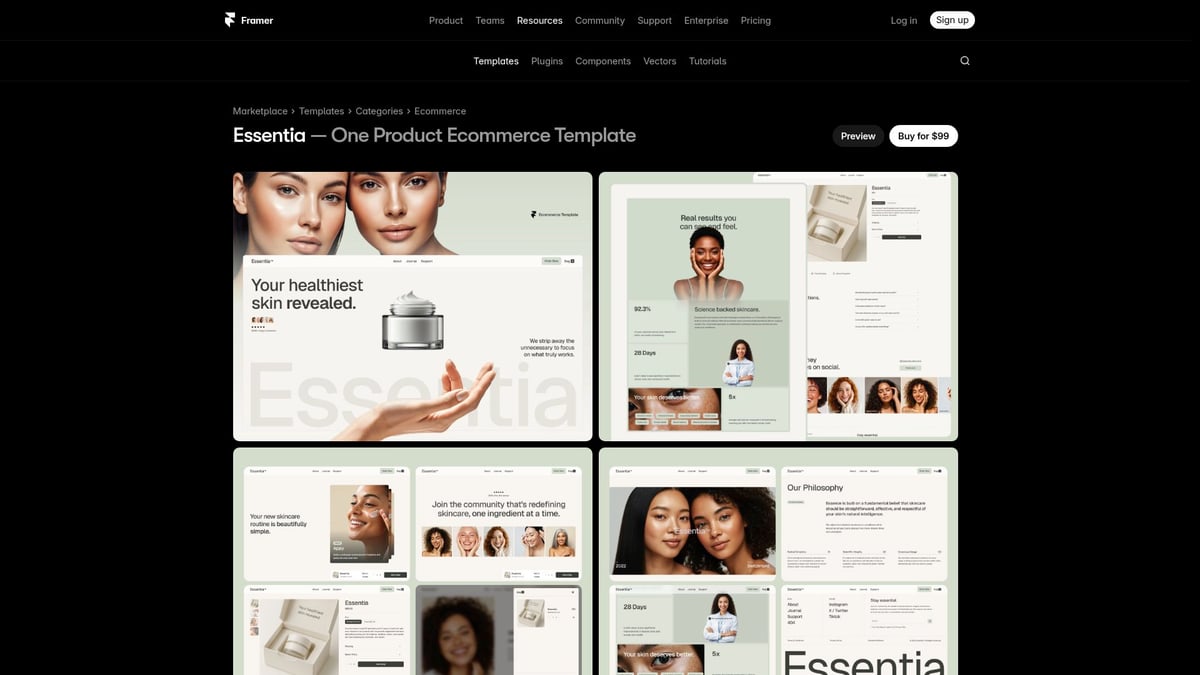
Take the Essentia template. Its framer ecommerce approach centers on a single product story, using large visuals and compelling copy to create emotional engagement. This structure increases time-on-page and builds desire, especially for DTC or luxury brands.
Why does this work? Humans respond to stories, not lists. Narrative layouts guide attention, reduce friction, and build trust. The challenge: success depends on strong copy and curated images.
AI can help by generating tailored product stories, but always refine for authenticity. In your studio, think system: build reusable storytelling blocks, not just one-off pages, so every launch feels intentional and on-brand.
Conversion-Optimized Navigation & Checkout Flows
Navigation and checkout are where most framer ecommerce sites lose sales. Persistent nav bars, sticky carts, and progress indicators keep users oriented. The Kanva template exemplifies this with its mobile-first, frictionless flow.
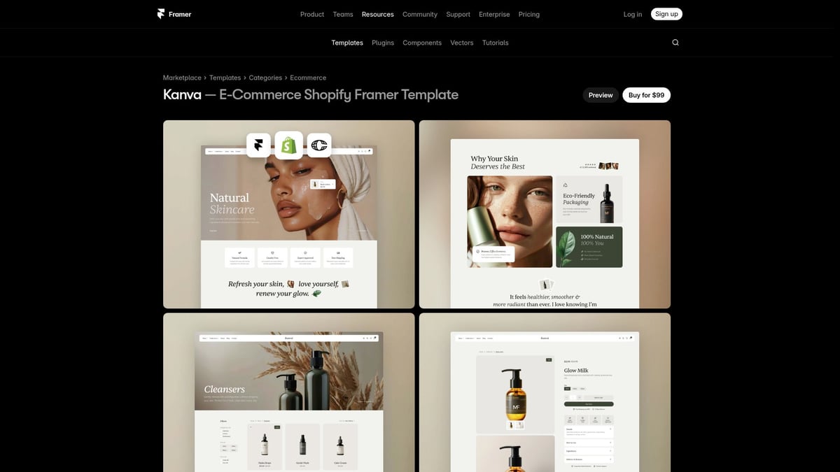
Simplified flows reduce cognitive load. Industry data shows an 18% lift in completed checkouts when stores streamline navigation and collapse multi-step forms. For broad catalogs or mobile-heavy audiences, this is non-negotiable.
However, over-simplifying can hide important information, so balance is crucial. AI analytics can rapidly test flow variants, spotlighting friction points. Treat navigation as a conversion engine, not just a menu.
Studio mindset: design modular navigation and checkout systems that adapt to catalog size, device, and user segment. This flexibility is the backbone of scalable framer ecommerce.
Dynamic Visual Hierarchy & Rhythm
Clarity and rhythm are the unsung heroes of framer ecommerce conversion. Sites like Boutiq use cinematic hero sections, modular grids, and bold whitespace to guide attention. This visual hierarchy creates flow, making products feel aspirational.
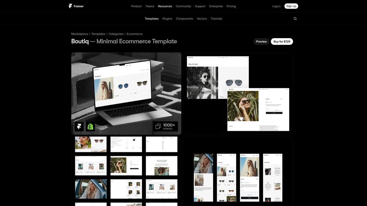
Data reveals that sites with strong hierarchy see 35% higher engagement. Why? Users instinctively follow patterns—repeated layouts create familiarity, while visual breaks draw focus to calls-to-action.
Too much animation or complexity, though, can distract. AI tools can suggest optimal layouts, but final judgment must reflect your brand’s voice.
Studio principle: treat hierarchy and rhythm as a living system, not a static grid. Repeat patterns to build trust, then break them for emphasis. That’s how you elevate the framer ecommerce experience.
Personalized, AI-Enhanced Merchandising
Personalization is no longer a luxury for framer ecommerce—it’s a necessity. Dynamic recommendations and real-time product carousels, as seen in Veonn, tailor the store to each user.
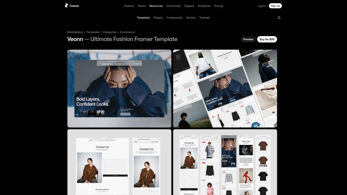
This approach drives relevance and increases upsell. Stats show that personalized recommendations can lift revenue by 20%. For stores with diverse catalogs or high repeat traffic, merchandising logic is critical.
But beware: poorly targeted suggestions can feel intrusive. Smart segmentation and data hygiene are essential. AI excels at real-time sorting and predictive merchandising, but always curate the results.
Studio thinking: build a logic layer for merchandising, not just static product lists. The best framer ecommerce stores feel like they “know” the shopper, without crossing privacy lines.
Seamless Shopify Integration & Headless Commerce Patterns
Scaling framer ecommerce brands need speed, flexibility, and reliability. Enter headless commerce, where design and backend are decoupled. Fjord’s Shopify-powered storefront is a model: real-time inventory sync, multiple payment gateways, and device-agnostic layouts.
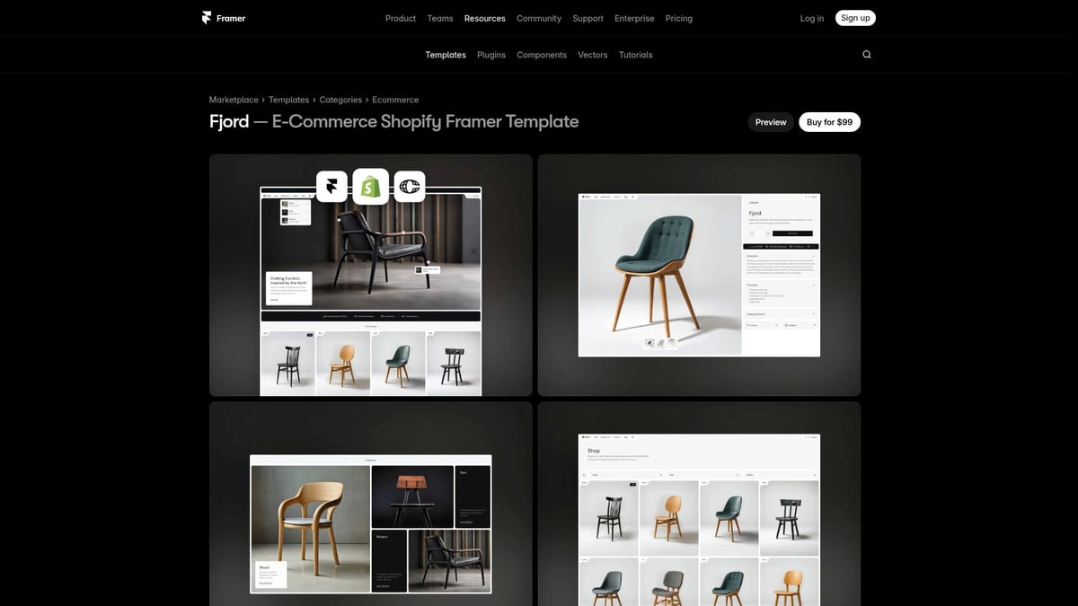
Headless adoption grew 25% last year, as brands pursued faster launches and future-proof tech stacks. This architecture enables rapid A/B testing and easy content updates.
The tradeoff? More technical setup. Not every team is ready for this complexity. AI can automate product data sync and inventory alerts, reducing manual overhead.
Studio strategy: architect your framer ecommerce with separation of content, commerce, and presentation. This ensures you can adapt quickly as the market and technology evolve.
Immersive Motion & Micro-Interaction Systems
Great framer ecommerce design feels alive. Subtle hover states, animated add-to-cart buttons, and smooth page transitions—like those in Axiom—signal quality and build trust.
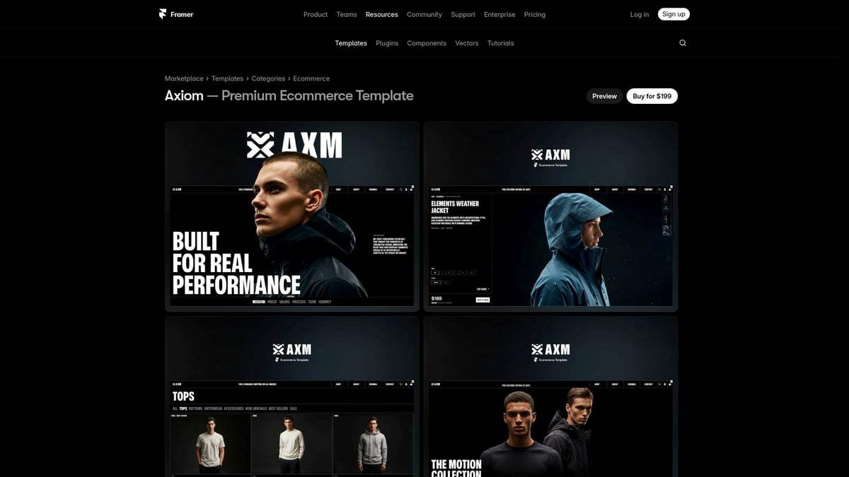
Micro-interactions increase perceived value and reduce bounce rates. For tech, electronics, or premium brands, these details create memorability. But overuse can hurt performance, so every animation must have a clear purpose.
AI can accelerate prototyping, offering quick variants of motion effects. Still, creative direction and timing are human-led.
Studio rule: systematize motion. Define when and how to animate, so users experience delight without distraction. Consistency in micro-interactions is what sets high-performing framer ecommerce sites apart.
Mobile-First, Accessibility-Driven Design
In 2026, over 65% of framer ecommerce traffic is mobile. Accessibility is not an add-on—it’s a growth lever. Aema’s minimalist, responsive layouts use large tap targets and high-contrast color schemes to welcome all users.
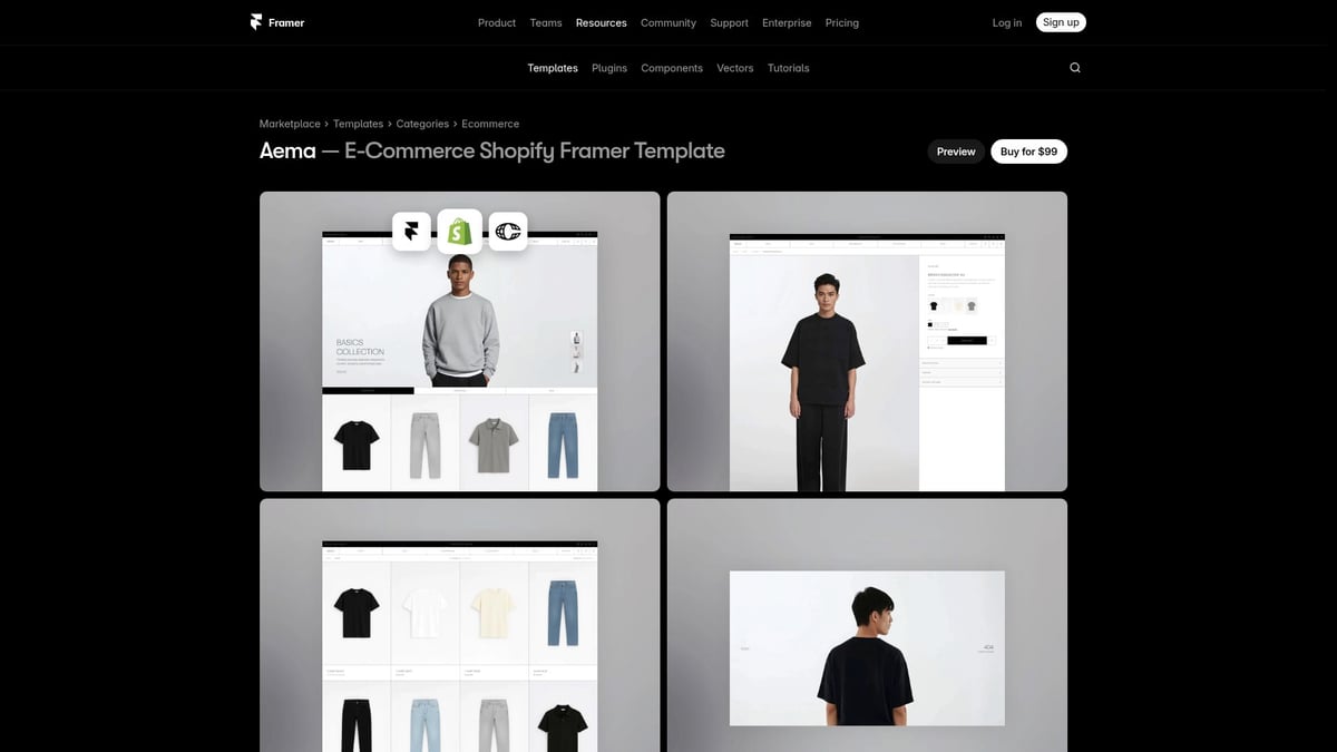
Accessible sites see 15% more conversions, according to industry studies. Designing for everyone expands your market and future-proofs your brand.
AI tools can flag accessibility issues, but manual review is vital for real-world usability. The challenge: accessibility requires ongoing iteration, not a one-time fix.
Studio philosophy: design with inclusion in mind from day one. Build mobile-first, accessible components as the foundation of your framer ecommerce system. This approach is not just ethical—it’s smart business.
How AI Accelerates—but Never Replaces—Creative Ecommerce Design
AI is everywhere in modern framer ecommerce, promising faster launches and smarter experiments. Yet, many brands fall into the trap of thinking automation alone will boost sales. The reality? Creativity, not just speed, is what drives conversion.
The core principle behind high-performing framer ecommerce stores is intentional design. AI can suggest layouts, automate image cropping, and even generate copy variants. But only a skilled designer can balance clarity, rhythm, and brand personality. For example, using AI to prototype multiple homepage flows is powerful, but human judgment is needed to decide which narrative best builds trust.
Consider this real-world scenario: A team uses Framer’s AI to create a dozen product page variants. AI highlights patterns, but designers spot which visual hierarchy actually guides attention. This blend of rapid iteration and thoughtful curation is the secret to scalable framer ecommerce. In the Razorpay Framer case study, AI-powered workflows cut project time, but conversion gains came from creative micro-interactions and meaningful storytelling.
Here’s how to harness AI without losing your creative edge:
- Use AI for repetitive tasks, like resizing assets or generating layout options.
- Let data-driven insights inform flow tweaks, but always review for clarity and intent.
- Build a system where designers focus on storytelling, not just screens.
For teams scaling framer ecommerce, systems thinking is essential. AI should amplify your creative process, not replace it. The most successful brands invest in frameworks that blend automation with human insight. If you want to dive deeper into expert-level strategies, the Framer experts in 2026 guide reveals how top studios leverage both AI and creative discipline.
As you build your next ecommerce system, remember: let AI handle the repetitive, so your team can focus on clarity, rhythm, and the kind of story that moves people to act. This is the philosophy behind our Embark Studio™ approach—scalable design systems that put creativity first, even as technology evolves.
Building Scalable Framer Ecommerce Systems for Long-Term Growth
Most ecommerce redesigns start strong, but quickly stall. Why? One-off screens might look polished, yet they rarely hold up as brands grow. The real problem is inconsistency—without a system, every update introduces new friction.
The answer is a scalable framer ecommerce system. Think of it as building with Lego, not clay. Start by creating modular components: navigation, product cards, and checkout flows. Assemble these into repeatable patterns, so every new page feels familiar and frictionless for shoppers. Test these flows with real users—watch where they stumble, then refine the system, not just the screen.
Let’s break down the process:
| Step | Action | Result |
|---|---|---|
| 1. Modular Design | Build reusable components in Framer | Consistency, speed |
| 2. Pattern Assembly | Create flows from modules | Easy updates, less rework |
| 3. Real Testing | Launch, observe, and gather user feedback | Rapid, data-driven iteration |
Brands using modular framer ecommerce architectures report launching updates twice as fast as those stuck in static templates. This agility means you can A/B test new ideas, respond to trends, and scale without sacrificing clarity or rhythm.
AI can help accelerate this workflow—auto-generating layout variants or flagging usability issues—but the human touch ensures the system feels intentional and on-brand. The secret isn’t more screens, but better systems.
For teams looking to master these methods, Master modern web design in Framer offers a deep dive into process-driven design systems and UI patterns.
Studio thinking? Invest in framer ecommerce systems, not just quick fixes. The future belongs to brands that ship, learn, and optimize at scale. Our Embark Studio™ approach builds clarity and adaptability into every layer—so your store grows as fast as your ambition.
After exploring how intentional design systems and smart AI workflows can transform your ecommerce results, you might be wondering how to put these ideas into action for your own brand. At Embark Studio™, we work alongside founders and product teams to turn conversion theory into growth reality—building scalable, high-performance Framer stores that adapt as you evolve. If you’re ready to move faster, reduce handoffs, and create a digital experience that truly sells, let’s connect and explore what’s possible together.
Discover 7 innovative Framer ecommerce design ideas for 2026 that boost sales by blending psychology, clarity, and advanced UI systems for lasting growth.
Get articles like this in your inbox
Practical design and growth insights for founders. No spam, unsubscribe anytime.


