
Most startups treat design as screens. They hire designers to push pixels, ship features, and chase aesthetic trends. Then growth stalls. Handoffs multiply. Every new feature requires rework. The problem isn't talent or tools. It's the absence of a system. Design systems transform how products scale, replacing chaos with clarity and enabling teams to move faster without breaking existing experiences. For investor-backed startups building in 2026, understanding design systems isn't optional. It's the foundation of sustainable product development.
Why Most Teams Misunderstand Design Systems
The misconception runs deep. Designers hear "design system" and think component library. Engineers picture a UI kit. Product leaders imagine brand guidelines. All three are fragments of the whole.
A design system is a living architecture that governs product decisions at scale. It's the shared language between design, engineering, and product strategy. It defines how interfaces behave, how users perceive consistency, and how teams ship without coordination overhead.
The real purpose is velocity through constraint. When every button, spacing value, and interaction pattern is predetermined, teams stop debating trivial decisions. They focus energy on solving user problems, not reinventing navigation patterns.
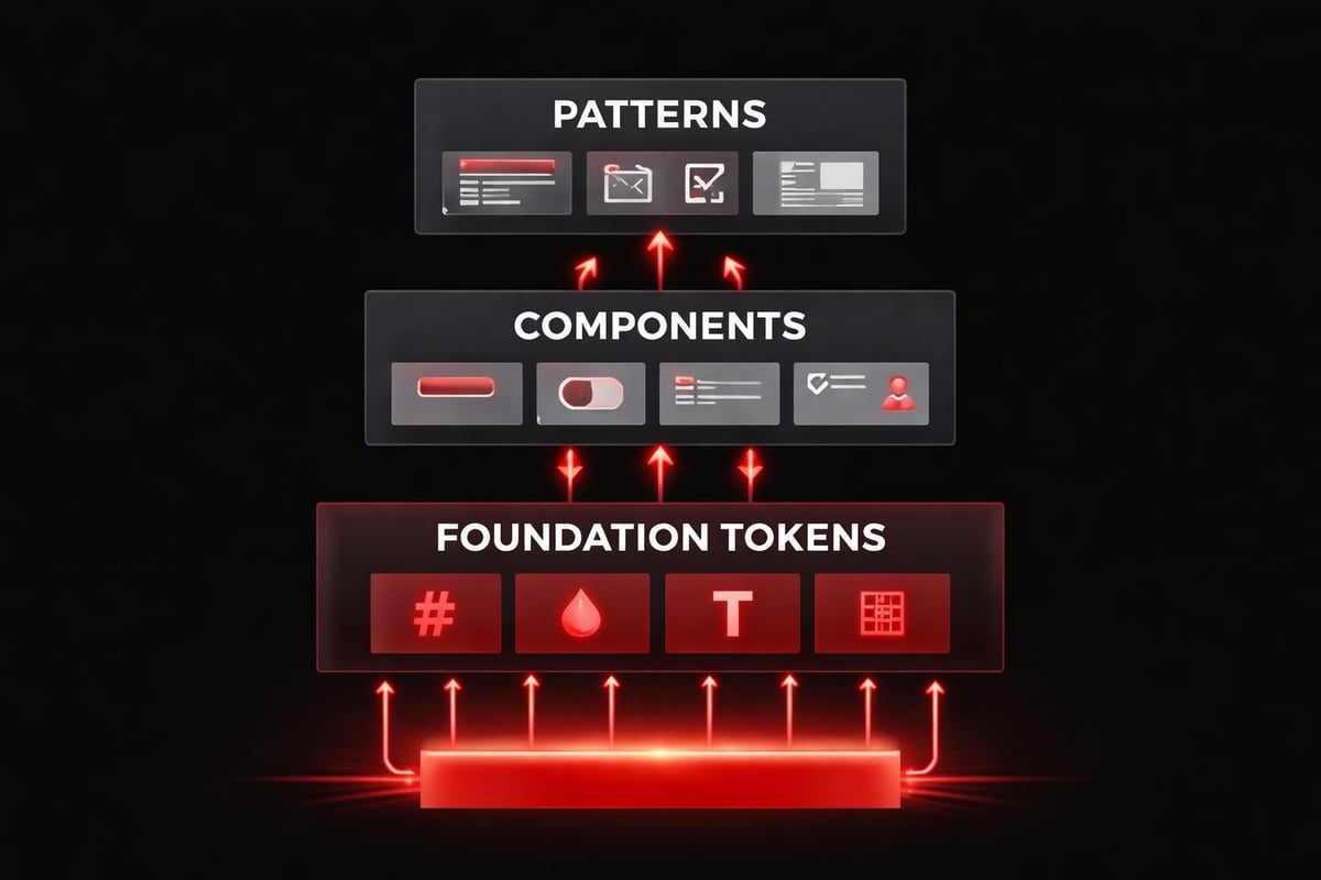
Consider three core layers:
- Foundation layer: Color tokens, typography scales, spacing systems, motion principles
- Component layer: Buttons, inputs, cards, modals built from foundation tokens
- Pattern layer: Compositions like forms, dashboards, onboarding flows that combine components
Each layer inherits from the one below. Change a color token, and every component updates. This cascading logic is what separates systems from style guides.
The Psychology Behind System-Driven Design
Users don't consciously notice good design systems. They feel them.
Cognitive fluency is the brain's preference for patterns it recognizes. When interface elements behave predictably (same button style triggers same action type, consistent spacing creates rhythm), users process information faster. Decision fatigue drops. Conversion improves.
This psychological principle explains why scalable design systems outperform fragmented interfaces in testing. Users trust patterns. They abandon experiences that require constant relearning.
| Psychological Principle | Design System Application | User Impact |
|---|---|---|
| Cognitive Fluency | Consistent component behavior | Faster task completion |
| Pattern Recognition | Repeated visual language | Reduced learning curve |
| Trust Through Consistency | Predictable interactions | Higher conversion rates |
The depth of a system reveals itself in edge cases. How does your button component handle loading states? Error states? Disabled states? Success feedback? A mature system answers these questions once, then applies the logic everywhere.
Rhythm matters as much as consistency. Spacing systems create visual breathing room. Type scales establish hierarchy without shouting. Motion curves guide attention without distraction. These aren't aesthetic preferences. They're functional decisions that reduce cognitive load.
Building Systems That Actually Scale
Most startups approach design systems backwards. They design screens, extract common patterns, then attempt to systematize. This creates systems built on compromises, not principles.
Start with decisions, not designs. Before touching interface tools, define your system's core constraints:
- Establish your spacing scale (typically 4px or 8px base unit)
- Define your type scale using mathematical ratios (1.25x, 1.5x, or golden ratio)
- Create semantic color tokens (not "blue-500" but "action-primary")
- Document motion principles (duration ranges, easing curves)
- Set breakpoint strategy for responsive behavior
These foundational decisions become your design DNA. Every subsequent component inherits this logic.
Token Architecture: The Invisible Backbone
Design tokens are the atomic units of your system. They're named variables that store design decisions: colors, spacing values, font sizes, shadow depths.
The naming matters more than most teams realize. Bad token names describe appearance ("red-dark"). Good token names describe purpose ("status-error"). When you refactor your brand colors next quarter, semantic tokens update globally without touching component code.
Successful systems use a three-tier token structure:
- Global tokens: Raw values (color-red-600, spacing-base-4)
- Alias tokens: Semantic mapping (color-status-error, spacing-component-gap)
- Component tokens: Contextual application (button-background-primary, card-padding)
This hierarchy lets you maintain consistency while enabling flexibility. Global tokens rarely change. Alias tokens evolve with brand strategy. Component tokens adjust for specific use cases.
Best practices for token organization emphasize minimal global sets and clear hierarchies. Overcomplicating token structures creates maintenance burden without adding value.
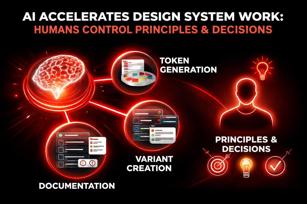
AI-Assisted System Workflows in 2026
AI doesn't replace the thinking behind design systems. It accelerates the execution.
Modern workflows use AI at three specific points:
- Token generation: AI analyzes your brand assets and suggests accessible color scales, type pairings, and spacing systems that maintain mathematical harmony
- Component variants: AI generates state variations (hover, focus, disabled) based on your base component design and documented patterns
- Documentation automation: AI drafts component usage guidelines, accessibility notes, and code examples from your Figma files
The critical distinction is control. You define the system's principles. AI handles repetitive application.
At Embark Studio™, we've integrated AI into our design system workflows without sacrificing craft. AI suggests spacing values based on optical weight. It identifies inconsistencies across component libraries. It generates responsive breakpoint previews. But the decisions about hierarchy, rhythm, and user psychology remain human.
AI in product design workflows works best when AI serves as an accelerator, not an author. Use it to eliminate grunt work. Keep creative direction under human control.
Component Design: Logic Over Templates
A button isn't just a rectangle with text. It's a decision tree.
Every component is a system of states and behaviors. When designing buttons for your design system, you're not creating one element. You're defining how all buttons across your product handle:
- Visual hierarchy (primary, secondary, tertiary, ghost)
- Size variations (compact, default, large)
- Interactive states (default, hover, active, focus, disabled)
- Loading states (spinner placement, text behavior)
- Icon integration (leading, trailing, icon-only)
- Responsive behavior (full-width on mobile?)
Document the logic, not just the appearance. "Primary buttons use action-primary color token and transform scale to 0.98 on active state" tells engineers how to build it correctly.
Real Application: Navigation Systems
Consider navigation design. Most startups build navigation ad-hoc for each screen. A systematic approach defines navigation as a set of composable patterns:
| Navigation Type | Use Case | Responsive Strategy |
|---|---|---|
| Top bar | Global actions, branding | Collapses to hamburger <768px |
| Sidebar | Section navigation | Off-canvas drawer on mobile |
| Tabs | View switching within page | Scrollable horizontal on mobile |
| Breadcrumbs | Deep hierarchy wayfinding | Show last 2 levels on mobile |
Each pattern inherits from your spacing system, typography scale, and interaction tokens. Build them once. Apply everywhere.
Framer design system features enable this kind of component architecture without engineering overhead. Components become reusable blocks with built-in logic and constraints.
Documentation: The System's Operating Manual
A design system without documentation is just a component library.
Documentation transforms components into shared understanding. Engineers need implementation specs. Designers need usage guidelines. Product managers need decision frameworks. Stakeholders need the "why" behind choices.
Effective documentation answers four questions for every component:
- When to use it: Specific scenarios and contexts where this pattern applies
- When not to use it: Anti-patterns and alternatives for edge cases
- How it works: Behavior specifications, state transitions, accessibility requirements
- Why it exists: The user problem this component solves and the principle it embodies
Skip the fluff. "This is a button component that users can click" helps no one. "Use primary buttons for the single most important action per screen. They draw focus through color contrast and scale. Use secondary buttons for supporting actions that shouldn't dominate visual hierarchy" provides decision criteria.
Common pitfalls in design system documentation include over-complication and under-explanation. Document the decisions that aren't obvious. Skip the ones that are.
Adoption: Systems Live Through Teams
The most elegant design system fails if teams don't use it.
Adoption isn't a launch problem. It's a culture problem. Successful system adoption requires:
- Executive sponsorship: Leadership must enforce system usage and allocate maintenance resources
- Embedded champions: Dedicated roles who support implementation and gather feedback
- Gradual migration: Incremental updates to existing products, not big-bang rewrites
- Clear success metrics: Measure design consistency, development velocity, and brand coherence
Strategies for design system adoption emphasize building empathy through team mapping and capability assessment. Understand where resistance emerges and address it with training, not mandates.
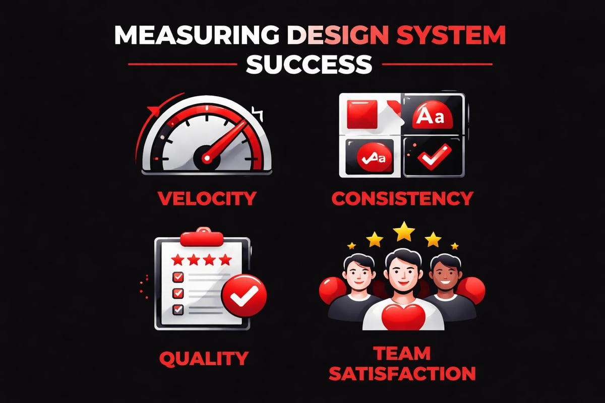
Measuring System Impact
Track metrics that matter:
| Metric Category | What to Measure | Why It Matters |
|---|---|---|
| Velocity | Time from design to production | Shows efficiency gains |
| Consistency | Component reuse percentage | Indicates system coverage |
| Quality | Accessibility audit pass rate | Reflects systematic standards |
| Satisfaction | Designer/developer NPS | Reveals adoption barriers |
Systems that accelerate shipping while maintaining quality deliver ROI. Systems that slow teams down get abandoned.
Governance: Evolution Without Chaos
Design systems must evolve. Markets shift. Brands mature. User needs change.
Governance determines whether evolution improves the system or fragments it. Establish clear processes for:
- Proposing new components: Template for requests with use case documentation
- Reviewing contributions: Regular design review cycles with cross-functional stakeholders
- Versioning strategy: Semantic versioning for breaking vs. non-breaking changes
- Deprecation protocols: How to sunset outdated patterns without breaking products
- Update communication: Changelog maintenance and team notification workflows
The goal is controlled flexibility. Teams should feel empowered to extend the system, not locked into rigid constraints.
Best practices from enterprise companies highlight distributed responsibility. Design systems work best when owned by a dedicated team but fed by contributions from product teams who encounter real-world edge cases.
System Thinking for Startup Speed
Startups resist systems because they assume systems slow them down. The opposite is true.
Systems eliminate repeated decisions. Every startup makes the same interface decisions hundreds of times: button hierarchy, form validation patterns, empty state messaging, loading indicators. Without a system, each instance requires debate, design time, and engineering implementation.
With a system, these decisions happen once. Teams ship faster because they're composing from tested patterns, not inventing from scratch.
The work we do at Embark Studio™ with investor-backed startups proves this repeatedly. Founders assume custom design for every screen equals differentiation. In practice, systematic foundations enable faster iteration on what actually differentiates: unique value propositions, novel features, and conversion optimization.
Framer as System Infrastructure
Modern tools changed system implementation. Framer's approach to design systems eliminates the design-to-development handoff entirely. Components built in Framer deploy directly to production. Changes propagate automatically. Variants handle state logic without custom code.
This doesn't replace system thinking. It removes friction from system execution.
The workflow becomes:
- Define system principles and token architecture
- Build components in Framer with variants for all states
- Compose pages from system components
- Publish updates that cascade through live sites
- Iterate based on performance data
AI assists at each step, but the systematic logic drives the decisions. AI-assisted workflows work because they operate within system constraints, not despite them.
The Compounding Returns of Systematic Design
Design systems aren't about perfection at launch. They're about compounding improvements over time.
Every component you systematize becomes an asset. Six months from now, when your team ships a new product feature, they won't redesign buttons. They'll reuse your button system and focus energy on the novel interface challenges specific to that feature.
This compounding effect separates high-velocity product teams from those perpetually caught in redesign cycles. Portfolio work from leading studios demonstrates how systematic approaches enable ambitious timelines without quality compromise.
The return on investment grows with product complexity:
- Month 1: System feels like overhead (building foundation)
- Month 3: Teams reference components occasionally (early adoption)
- Month 6: New features ship 40% faster (system maturity)
- Month 12: Brand updates propagate in hours, not weeks (systematic leverage)
By year two, teams without systems are drowning in inconsistency. Teams with systems are scaling products efficiently.
Building Your System Framework
Start small. Expand systematically.
Your first design system should include:
- Core spacing scale (6-8 values)
- Typography system (3-4 weights, 5-6 sizes)
- Color tokens (semantic naming for 8-10 use cases)
- 5 essential components (button, input, card, modal, navigation)
- Basic documentation templates
Launch this internally. Use it on one product area. Gather feedback. Expand based on real needs, not theoretical ones.
Government design system practices offer interesting perspectives on systematic design at scale. Even complex organizations start with fundamentals and grow deliberately.
The temptation is comprehensive systems on day one. Resist it. Collaborative adoption happens when teams experience quick wins, not when they're overwhelmed by massive component libraries.
The Living System Mindset
Think of your design system as product infrastructure, not project deliverable. Infrastructure requires:
- Ongoing maintenance budget
- Dedicated ownership (even part-time)
- Regular audits and updates
- User research with internal teams
- Clear roadmaps aligned with product strategy
Resources for systematic design include templates, audit frameworks, and implementation guides that reduce setup friction.
The studios building exceptional products in 2026 share one trait: they treat design systems as strategic investments, not design team hobbies. Leadership understands that systematic design directly impacts velocity, quality, and competitive advantage.
Systems Over Screens, Clarity Over Noise
The fundamental shift is perspective. Design isn't screen production. It's system creation.
Every interface decision either reinforces your system or fragments it. Every component either inherits from shared logic or introduces new complexity. Every pattern either scales with your product or creates technical debt.
Startups that embrace systematic thinking build faster, ship cleaner, and scale smoother. They reduce handoffs because design and development share a common language. They onboard faster because new team members learn patterns, not individual screens. They pivot efficiently because systematic foundations adapt to new strategies.
The best design systems feel invisible. Users don't notice them. Teams rely on them daily. Products scale because of them.
This is the work that matters in 2026. Not flashy animations. Not trend-chasing aesthetics. Systematic clarity that enables products to grow without breaking.
Your design system is your product's operating system. Invest in it deliberately, evolve it thoughtfully, and use it ruthlessly. Everything else is just screens.
Design systems separate startups that scale from those that stall. The systematic approach isn't about constraints. It's about channeling creative energy toward problems that actually differentiate your product. At Embark Studio™, we build design systems that accelerate investor-backed startups, integrating AI-assisted workflows with systematic design thinking to ship conversion-focused products faster. If you're ready to transform scattered screens into scalable systems, let's build something systematic together.
Get articles like this in your inbox
Practical design and growth insights for founders. No spam, unsubscribe anytime.


