
Most startups treat their brand website as a collection of pages. Navigation here. Hero section there. Footer at the bottom. This fragmented thinking creates digital experiences that feel disjointed, perform inconsistently, and fail to convert. A brand website isn't a pile of components. It's a unified system where every element reinforces your positioning, guides user behavior, and accelerates decision-making. The difference between a site that converts and one that confuses comes down to systematic thinking, not surface aesthetics.
Why Most Brand Websites Fail Before They Launch
The typical approach to building a brand website follows a predictable pattern. Stakeholders compile a list of "must-have" pages. Designers mock up screens in isolation. Developers build what they see. The result feels disconnected because it was designed disconnected.
This assembly-line mentality ignores how users actually experience digital products. They don't navigate page by page like reading a book. They scan, jump, backtrack, and form impressions in milliseconds. Your website functions as your business's source of truth, which means every interaction either builds confidence or introduces friction.
The Psychology of First Impressions
Research shows users form judgments about website credibility in 50 milliseconds. That's not enough time to read copy or evaluate features. They're responding to visual hierarchy, spatial rhythm, and brand coherence. Your brand website communicates trustworthiness before anyone reads a word.
This is where design systems separate high-performing sites from mediocre ones. A systematic approach ensures:
- Consistent visual language across every touchpoint
- Predictable interaction patterns that reduce cognitive load
- Hierarchical clarity that guides attention deliberately
- Emotional resonance through intentional typography and spacing
When these elements align, users process information faster and move through your conversion funnel with less resistance.
The Core System: Structure Over Decoration
A brand website built on systems thinking starts with structural decisions, not aesthetic ones. Before choosing colors or fonts, you need to map the user's mental model. What questions arrive first? What proof points remove objections? Where does uncertainty creep in?
This framework shapes everything:
- Information architecture based on user intent, not organizational chart
- Content hierarchy that answers questions in sequence
- Conversion pathways with clear next steps at decision points
- Trust signals positioned where doubt emerges
Designing Decision Trees, Not Pages
Every section of your brand website should move users toward clarity. Hero sections establish relevance. Feature blocks address specific concerns. Case studies provide social proof. CTAs offer low-friction next steps.
The best brand websites feel inevitable. Users move through them naturally because the design anticipates their thinking process. This requires understanding behavior patterns, not just following templates.
| Design Element | Weak Approach | Systems Approach |
|---|---|---|
| Navigation | All pages listed equally | Prioritized by user journey stage |
| Hero Section | Generic tagline + image | Specific value prop + next action |
| Features | Bullet list of capabilities | Problem-solution paired format |
| Social Proof | Testimonials at bottom | Strategically placed by objection |
| CTAs | "Contact us" everywhere | Context-specific micro-conversions |
The systems approach recognizes that branding consistency across all website elements reinforces recognition and builds cumulative trust.
AI-Assisted Workflows for Brand Websites
Artificial intelligence accelerates the mechanics of building brand websites, but it doesn't replace strategic thinking. The most effective AI integration happens at the execution layer, not the decision layer.
Here's how AI fits into a high-performance workflow:
- Content structure generation for consistent messaging frameworks
- Component variation testing to identify high-converting layouts
- Accessibility auditing for inclusive design compliance
- Performance optimization through automated asset compression
Where Human Judgment Remains Critical
AI can generate variations. It can't determine which variation aligns with your positioning. It can suggest layouts. It can't decide which emotional tone serves your audience. The designer's role shifts from pixel-pushing to strategic curation.
At Embark Studio™, we use AI to handle repetitive design tasks while focusing human creativity on the decisions that impact conversion. This hybrid approach delivers brand websites faster without sacrificing strategic depth.
Modern platforms like Framer enable this workflow by combining design flexibility with performance optimization. Understanding how Framer's pricing model supports growing teams helps startups scale their brand website infrastructure without platform constraints.

Conversion Architecture: Beyond Pretty Screens
A brand website exists to drive specific business outcomes. Lead generation. Product signups. Partnership inquiries. Whatever your goal, the site's structure should guide users toward it systematically.
The Three-Layer Conversion Model
Effective brand websites operate on three psychological layers:
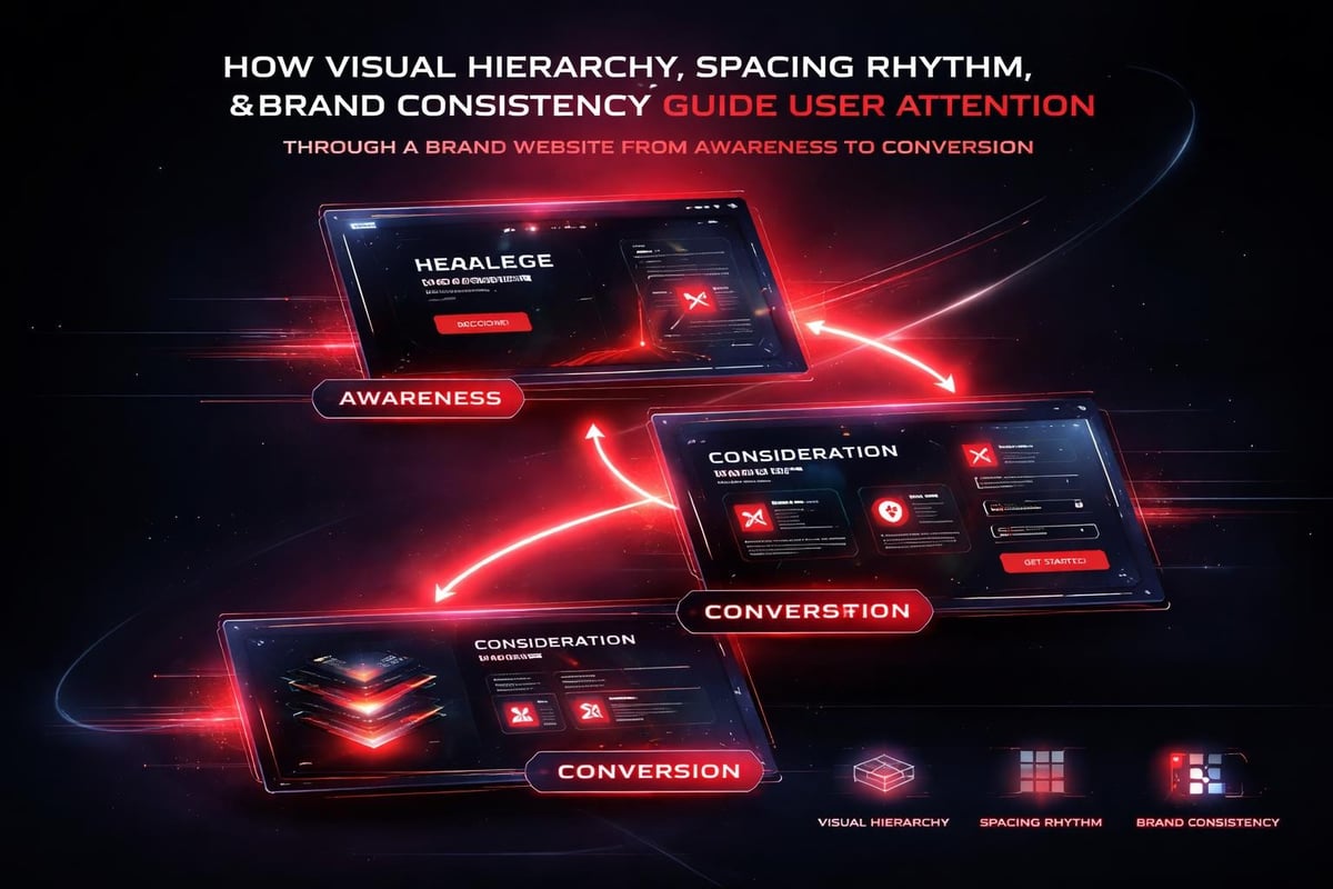
Awareness Layer: Establish relevance and credibility instantly. Hero sections, value propositions, and social proof live here. Users decide within seconds whether to invest attention.
Consideration Layer: Address specific objections and questions. Feature explanations, case studies, and detailed benefit breakdowns occupy this space. Users are evaluating whether you solve their problem better than alternatives.
Decision Layer: Remove final friction and provide clear next steps. Pricing transparency, demo access, and contact forms reduce the barrier to conversion.
Each layer requires different design treatments:
- Awareness: Bold typography, high-contrast visuals, immediate value clarity
- Consideration: Scannable content blocks, comparison tables, specific proof points
- Decision: Simplified forms, trust badges, clear expectation-setting
This layered approach prevents the common mistake of treating every page with equal intensity. Not every visitor is ready to convert. Your brand website should support users at multiple stages simultaneously.
Typography and Spatial Systems That Scale
Typography isn't decoration. It's the primary vehicle for information transfer on your brand website. A systematic approach to type ensures readability, hierarchy, and brand distinction across all contexts.
Building a Type Scale That Works
Start with these constraints:
- Base size: 16-18px for body text (accessibility minimum)
- Scaling ratio: 1.25 (major third) or 1.333 (perfect fourth)
- Line height: 1.5-1.6 for body, tighter for headings
- Measure: 60-75 characters per line for optimal reading
These technical parameters create rhythm. When users encounter consistent spacing and predictable hierarchy, they process content faster. This isn't aesthetic preference, it's cognitive efficiency.
The same principle applies to spatial systems. A consistent spacing scale (often based on 4px or 8px increments) creates visual relationships that feel coherent without requiring conscious analysis.
| Spacing Token | Value | Common Usage |
|---|---|---|
| XXS | 4px | Icon margins, tight layouts |
| XS | 8px | Component padding, label spacing |
| S | 16px | Paragraph margins, card padding |
| M | 24px | Section spacing, content blocks |
| L | 48px | Major section breaks |
| XL | 96px | Hero sections, dramatic separation |
Best practices in web design emphasize these foundational systems because they compound over time. Every new page inherits the clarity of the original system.
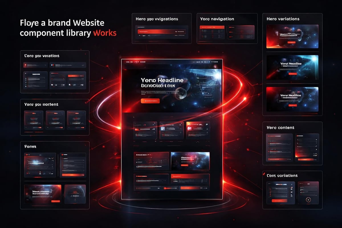
Component Libraries: The Infrastructure Advantage
A brand website built from reusable components scales efficiently. Instead of designing every page from scratch, you assemble variations from proven patterns.
This approach benefits startups in three ways:
Speed: New pages launch in days, not weeks. Marketing tests run faster. Product announcements deploy immediately.
Consistency: Every button, form, and card follows the same design language. Brand recognition strengthens with each interaction.
Maintainability: Updates cascade across the site. Fix spacing once, it corrects everywhere. Update brand colors, the entire site reflects it.
Designing Components, Not Templates
The distinction matters. Templates lock you into rigid layouts. Components provide flexible building blocks that adapt to different content contexts.
A well-designed component library for a brand website includes:
- Navigation systems (primary, secondary, mobile, footer)
- Hero variations (product launch, feature focus, social proof)
- Content blocks (text, image-text, quote, stats)
- Form elements (inputs, selects, checkboxes, submission states)
- Cards and listings (blog, case study, feature, team)
- CTAs and buttons (primary, secondary, tertiary, states)
Each component should handle multiple contexts without requiring custom code. This is where design systems excel at scale, enabling teams to build faster while maintaining quality.
Performance as Brand Experience
Speed is a design feature, not a technical afterthought. A brand website that loads slowly communicates disorganization, regardless of how polished the visuals appear.
User expectations in 2026:
- First Contentful Paint: Under 1.2 seconds
- Largest Contentful Paint: Under 2.5 seconds
- Time to Interactive: Under 3.8 seconds
- Cumulative Layout Shift: Under 0.1
These metrics directly impact conversion. Google research shows 53% of mobile users abandon sites that take longer than 3 seconds to load. Your brand website can't convert visitors who leave before seeing content.
The Design Decisions That Impact Speed
Performance optimization starts in the design phase:
- Image strategy: WebP format, responsive sizing, lazy loading
- Font loading: Subsetting, preloading, system font fallbacks
- Animation budget: CSS transforms over JavaScript libraries
- Component complexity: Minimal DOM nodes, efficient selectors
These technical considerations influence design choices. A 4MB hero image might look impressive in Figma, but it destroys mobile performance. Smart designers balance visual impact with load time constraints.
Modern tools like Framer handle many optimizations automatically, but strategic decisions still matter. Understanding corporate website development from a performance perspective helps startups avoid common bottlenecks.
Iteration Systems: Continuous Improvement
A brand website isn't a project with an end date. It's a system that evolves with your business. The best approach builds iteration into the operational model.
The Four-Week Improvement Cycle
Establish a rhythm:
Week 1: Analyze performance data (conversion rates, heat maps, session recordings)
Week 2: Identify specific friction points and hypothesize improvements
Week 3: Design and test variations (A/B tests, user testing, stakeholder review)
Week 4: Deploy winners, document learnings, plan next cycle
This cadence prevents the "set it and forget it" mentality that causes brand websites to stagnate. Markets shift. Competitors evolve. User expectations change. Your site should adapt continuously.
The data you track should connect to business outcomes:
| Metric | What It Measures | Action Threshold |
|---|---|---|
| Bounce Rate | First impression failure | >60% investigate messaging |
| Time on Page | Content engagement | <30s check clarity/relevance |
| Scroll Depth | Content consumption | <50% revisit structure |
| Form Abandonment | Conversion friction | >40% simplify requirements |
| Click-through Rate | CTA effectiveness | <3% test positioning/copy |
Each metric points to specific design interventions. This systematic approach to improvement separates high-performing brand websites from static ones.
The Brand Website as Growth Infrastructure
Thinking of your brand website as infrastructure rather than a marketing asset changes how you build it. Infrastructure scales. Infrastructure adapts. Infrastructure supports multiple business functions simultaneously.
Your brand website should enable:
- Sales teams to close deals with compelling product demonstrations
- Marketing teams to test messaging and positioning rapidly
- Product teams to validate concepts through early access signups
- Partnership teams to present credible, comprehensive capabilities
When designed systemically, a single brand website serves all these functions without fragmentation. The key is building flexible frameworks instead of rigid pages.
This infrastructure mindset also influences how you evaluate whether your business needs ongoing design support. Sites that drive growth require continuous attention, not one-time projects.
Mobile-First Reality in 2026
Mobile traffic accounts for 63% of all web visits in 2026. Yet many brand websites still treat mobile as an afterthought. Designing mobile-first isn't about small screens. It's about constraints that force clarity.
The Mobile-First Design Process
Start with the smallest viable screen:
- Identify core content that must appear (everything else is optional)
- Establish primary action users should take (single, clear CTA)
- Design vertical flow that works with thumbs, not cursors
- Test touch targets (minimum 44x44px for accessibility)
- Progressively enhance for larger screens
This approach eliminates bloat. When you can't hide complexity in sidebars or secondary columns, you're forced to simplify. That simplicity benefits desktop users too.
Common mobile mistakes to avoid:
- Hamburger menus hiding critical navigation (consider exposure over concealment)
- Forms requiring excessive typing (use smart defaults and autofill)
- Tiny text requiring zoom (respect minimum 16px for body copy)
- Hover-dependent interactions (design for tap, not cursor)
The constraint of mobile forces better design decisions. Every element must justify its presence. Understanding responsive design principles ensures your brand website performs across all contexts.
Brand Consistency Across Digital Touchpoints
Your brand website doesn't exist in isolation. Users encounter your brand across email, social media, product interfaces, and sales materials. Inconsistency across these touchpoints erodes trust.
A systematic approach ensures coherence:
- Visual language documentation: Color systems, typography scales, spacing rules
- Component sharing: Same patterns across website, product, and marketing
- Voice and tone guidelines: Consistent messaging regardless of channel
- Asset management: Centralized source of truth for logos, images, icons
When users transition from LinkedIn to your website to your product, they should feel they're interacting with the same entity. This continuity builds recognition and reinforces brand positioning over time.
The technical infrastructure that enables this consistency includes:
- Design tokens exported to multiple platforms
- Component libraries shared between web and product
- Content management systems that enforce brand guidelines
- Version control for design assets and documentation
These systems prevent the gradual drift that happens when different teams work independently.
Accessibility: Non-Negotiable Foundation
Accessibility isn't a feature you add at the end. It's a foundational constraint that improves design for everyone. A brand website built with accessibility in mind works better across all contexts.
Core Accessibility Principles
Perceivable: Information must be presentable to all users
Operable: Interface components must be navigable
Understandable: Content and operation must be comprehensible
Robust: Content must work across diverse technologies
Practical implementation:
- Color contrast: Minimum 4.5:1 for normal text, 3:1 for large text
- Keyboard navigation: All interactions accessible without mouse
- Alt text: Descriptive text for all meaningful images
- Semantic HTML: Proper heading hierarchy, landmark regions
- Focus indicators: Clear visual feedback for keyboard users
These standards aren't optional compliance boxes. They represent baseline usability that enhances brand visibility by making your content accessible to more people.
AI tools help audit accessibility automatically, but strategic decisions still require human judgment. Which images need descriptive alt text versus decorative treatment? Where should ARIA labels enhance semantic meaning? These questions demand understanding of user context and content purpose.
The Studio Approach: Systems Over Screens
The traditional agency model delivers projects. The studio model builds systems. This philosophical shift changes how you approach your brand website.
Projects have end dates. Systems evolve continuously.
Projects deliver fixed scope. Systems adapt to changing needs.
Projects optimize for launch. Systems optimize for performance.
Working with a product design studio means investing in infrastructure that supports long-term growth. Instead of redesigning your entire site every 18 months, you iterate components continuously. Instead of starting from scratch for new features, you extend existing patterns.
This approach reduces waste, accelerates deployment, and maintains consistency. It also aligns design investment with business outcomes rather than arbitrary timelines.
The toolkit perspective matters too. Rather than collecting random design assets, you build a coherent system of reusable patterns. Each new project strengthens the foundation instead of creating isolated artifacts.
A brand website built on systems thinking scales with your business instead of constraining it. The investment in foundational architecture, consistent design language, and continuous iteration creates compounding returns over time. At Embark Studio™, we partner with startups to build these conversion-focused systems using modern tools and AI-assisted workflows, helping founding teams move faster while maintaining strategic clarity. If your brand website needs to perform like infrastructure rather than just look polished, we should talk.
Get articles like this in your inbox
Practical design and growth insights for founders. No spam, unsubscribe anytime.


