
Most landing page design services promise results but deliver templates. They focus on superficial polish instead of structural clarity. The gap between a pretty page and one that converts isn't aesthetic-it's psychological, systemic, and architectural. In 2026, the best landing page design services understand that conversion begins with how attention flows, how trust builds, and how friction dissolves. This isn't about following trends. It's about building systems that guide behavior.
Why Most Landing Pages Fail Before They Load
Landing pages collapse under their own complexity. Too many messages compete for attention. Too many CTAs fracture intent. Too many sections dilute the core value proposition.
The problem isn't design skill-it's structural thinking. Most designers treat landing pages as single screens rather than behavioral systems. They add elements without understanding how each component affects cognitive load, trust signals, and conversion momentum.
Three common structural failures:
- Multiple conversion goals competing for the same attention span
- Value propositions buried beneath feature lists and jargon
- Visual hierarchy that fights the natural reading flow instead of guiding it
When you commission landing page design services, you're not buying a layout. You're investing in a persuasion architecture. Every element should either advance the visitor toward conversion or be removed. This ruthless clarity separates high-performing pages from digital brochures.
The Core Principle: Momentum Over Perfection
Great landing pages create momentum. They move visitors from curiosity to consideration to action in a single unbroken flow.
This momentum depends on three psychological layers:
Clarity establishes what the page offers in under three seconds. No ambiguity. No clever wordplay. Just immediate comprehension of value.
Depth proves the claim through evidence, specificity, and demonstration. This is where trust builds-not through testimonials alone, but through showing how the solution works in concrete terms.
Rhythm manages cognitive load by varying information density. Dense sections alternate with breathing room. Complex ideas are followed by simple visual anchors.
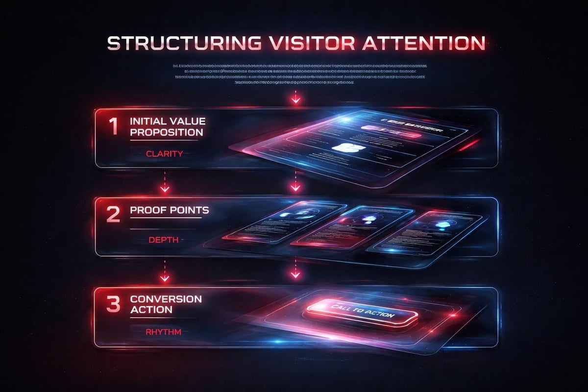
These layers work together systemically. Clarity without depth feels shallow. Depth without rhythm overwhelms. Rhythm without clarity confuses. Professional landing page design best practices recognize this interdependence.
Application: Designing for Investor-Backed Startups
Consider a B2B SaaS landing page for a Series A startup. The product automates compliance workflows for financial services. The visitor is a VP of Operations evaluating solutions during a compressed buying cycle.
First screen (above fold):
The headline doesn't announce the product category. It states the outcome: "Compliance workflows that run themselves." Subhead adds specificity: "Automated audit trails, real-time monitoring, zero manual reporting." CTA is direct: "See it work."
No company history. No mission statement. Just the transformation and how to experience it.
Proof section (mid-page):
Instead of generic testimonials, show specific before/after metrics. "Manual audit prep: 47 hours/quarter. With automation: 12 minutes." Include the company name, role, and specific workflow improved.
Add a brief video (15-30 seconds) showing the actual interface in action. Not a product tour-a single workflow completing automatically. This demonstrates rather than describes.
Conversion architecture (bottom third):
The page doesn't end with "Learn More." It offers a specific next step aligned with buying stage. For early-stage evaluation: "Get workflow analysis." For active comparison: "See custom demo." For ready buyers: "Start trial."
Each CTA leads to a different experience, but only one appears based on visitor behavior and source. This is where AI-assisted workflows become powerful-dynamic content that adapts without manual variant creation.
How AI Accelerates Landing Page Development
AI doesn't design landing pages. It accelerates the iteration cycles that make great design possible.
Three workflow enhancements:
- Copy variation testing - Generate 20 headline variations instantly, then test top performers with real traffic data within hours instead of weeks
- Visual consistency - Maintain design system adherence across rapid iterations without manual component checking
- Behavioral prediction - Analyze heatmaps and session recordings to identify friction points before they tank conversion rates
The creative decisions-what to emphasize, how to structure proof, where to place trust signals-remain human. AI simply removes the mechanical barriers to testing those decisions quickly.
Modern landing page design services integrate these tools into delivery workflows. When Embark Studio™ builds conversion-focused pages, AI handles variant generation while designers focus on psychological architecture and visual hierarchy.
Structural Elements That Drive Conversion
High-performing landing pages share common structural DNA. These aren't design trends-they're behavioral constants.
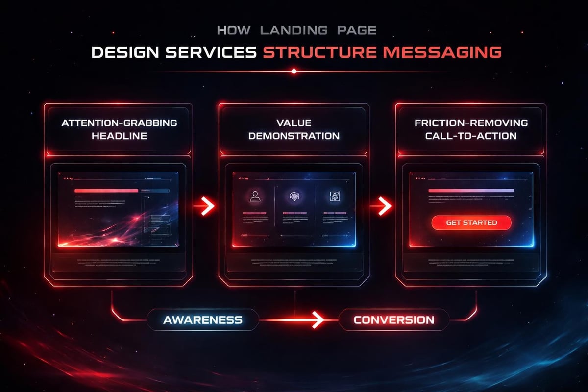
The Hero Section
This isn't decoration. It's a compression of your entire value proposition into 3-5 seconds of comprehension.
| Element | Purpose | Common Mistake |
|---|---|---|
| Headline | State the transformation | Describing what you do instead of what changes |
| Subhead | Add specificity | Generic benefits instead of concrete outcomes |
| Visual | Show the result | Stock photos instead of actual product/outcome |
| CTA | Remove friction | Generic "Learn More" instead of specific next step |
Your hero section should work without reading anything below it. If visitors scroll, they're seeking proof-not clarity.
Social Proof Architecture
Testimonials fail when they're interchangeable. "Great product!" could apply to anything. Effective social proof is specific, attributed, and outcome-focused.
Structure each testimonial around:
- Specific problem solved
- Measurable outcome achieved
- Concrete detail about the experience
- Full attribution (name, role, company, photo)
Better yet, show proof through demonstrated results. If you increased conversion rates, show the analytics. If you reduced costs, show the calculation. As HubSpot's landing page research demonstrates, specificity builds credibility faster than volume.
The Conversion Gradient
Not every visitor arrives ready to buy. Your landing page should offer multiple engagement depths:
- High-commitment CTA - Trial start, demo booking, purchase
- Medium-commitment CTA - Case study download, webinar registration
- Low-commitment CTA - Newsletter signup, resource access
Present the primary CTA prominently, but provide alternative paths for those not ready. This increases overall conversion by capturing visitors at different decision stages.
Why Single-Purpose Pages Outperform Multi-Offer Layouts
Every additional element on a landing page introduces decision fatigue. When visitors face multiple choices, conversion rates drop proportionally.
The math is psychological:
A page with one clear CTA converts at a baseline rate. Add a second CTA, and you split attention-each CTA receives less focus. Add navigation links, and you provide exits. Add sidebar offers, and you create competing priorities.
Professional landing page design services recognize that constraints drive performance. Effective landing page layouts eliminate everything that doesn't advance the single conversion goal.
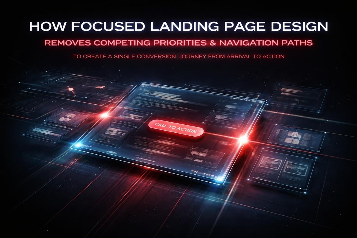
This doesn't mean minimalist design. It means purposeful design where every element serves the conversion architecture.
Mobile-First Is Table Stakes, Not Strategy
In 2026, mobile optimization isn't a feature-it's a baseline expectation. Over 60% of B2B research now happens on mobile devices, even for enterprise software with complex implementation.
Mobile conversion optimization requires:
- Hero content comprehensible without zooming
- CTA buttons sized for thumbs (minimum 44x44 pixels)
- Forms pre-filled with intelligent defaults
- Proof sections that work in vertical scroll flow
- Load times under 2.5 seconds on 4G connections
But mobile-first thinking goes deeper than responsive layouts. It's about information architecture that works in constrained attention spans. Every screen on mobile should answer one question or accomplish one task. No exceptions.
High-performance website development treats mobile as the primary experience, then scales up for desktop-not the reverse.
The Role of Visual Hierarchy in Conversion Flow
Visual hierarchy isn't about making things pretty. It's about controlling the sequence of attention.
Hierarchy decisions that impact conversion:
- Size - Larger elements capture attention first
- Contrast - High contrast creates focal points
- Position - F-pattern and Z-pattern reading flows are real
- Whitespace - Isolation emphasizes importance
- Color - Saturation draws eye movement
Your landing page should have an intentional reading order. First the headline, then the subhead, then the CTA, then the proof. If your analytics show visitors missing critical elements, your hierarchy is broken.
Professional landing page design services use visual hierarchy principles to create that reading path deliberately, not accidentally.
Testing Methodology: Systems Over Guesswork
A/B testing landing pages without a hypothesis is expensive randomness. Effective testing starts with understanding why current performance falls short.
Systematic testing process:
- Identify friction - Where do visitors hesitate or abandon?
- Form hypothesis - What specific change would reduce that friction?
- Design variant - Create one focused change, not a redesign
- Define success - What metric improves and by how much?
- Run test - Collect statistically significant data
- Implement or iterate - Apply learnings systematically
The best landing page design services build testing into the delivery process. They don't hand off a static page-they deliver a conversion system with ongoing optimization.
Understanding multivariate landing page optimization allows you to test multiple elements simultaneously, but only after you've validated core assumptions through simpler A/B tests.
Copy That Converts: Specificity Over Cleverness
Landing page copy fails when it prioritizes brand voice over clarity. Visitors don't care how you sound-they care whether you solve their problem.
High-converting copy characteristics:
- Concrete - "Reduce compliance prep by 75%" beats "Streamline workflows"
- Outcome-focused - What changes, not what you provide
- Jargon-free - Unless technical terms signal expertise to your exact audience
- Scannable - Short sentences, clear structure, visual breaks
The headline does the heaviest lifting. It should communicate value in under ten words. If you need a paragraph to explain what you do, your positioning isn't clear enough.
Subheads add necessary context. Body copy proves the claim. CTAs remove friction. Each element serves a specific purpose in the persuasion architecture.
Form Design: The Conversion Chokepoint
Your form is often the final barrier to conversion. Poor form design can destroy an otherwise perfect landing page.
Form optimization principles:
| Element | Optimization | Impact |
|---|---|---|
| Field count | Minimum required fields only | 3-field forms convert 50% better than 7-field |
| Labels | Clear, specific instructions | Reduces completion errors by 40% |
| Validation | Real-time, helpful error messages | Decreases abandonment mid-form |
| Privacy | Visible security signals | Increases trust, especially for email/phone |
| Submission | Immediate confirmation | Prevents duplicate submissions |
Every field you add increases friction. Ask yourself: do we need this information before conversion, or can we collect it later? Progressive profiling-gathering data over multiple interactions-often performs better than lengthy upfront forms.
For enterprise buyers especially, conversion-focused design recognizes that trust precedes information sharing.
Loading Speed as Conversion Factor
A landing page that loads slowly is a landing page that doesn't convert. Every second of delay correlates with measurable abandonment.
Performance benchmarks for 2026:
- Under 1.5 seconds: optimal
- 1.5-3 seconds: acceptable
- 3-5 seconds: significant drop-off begins
- Over 5 seconds: majority abandon before rendering
Speed optimization isn't just technical-it's strategic. Compress images without quality loss. Lazy-load below-fold content. Minimize third-party scripts. Prioritize critical rendering path.
Modern frameworks like Framer enable fast loading natively, but design decisions still matter. A page filled with unoptimized assets will lag regardless of platform. When you work with Embark Studio™ on high-performance websites, speed optimization is embedded in the design system itself.
Campaign-Specific Pages vs. Reusable Templates
Generic landing pages underperform because they try to serve multiple audiences simultaneously. Campaign-specific pages convert better because they match message to source precisely.
When to create dedicated pages:
- Different audience segments with distinct pain points
- Paid campaigns with specific ad messaging
- Partner referrals requiring custom proof points
- Event-driven promotions with time-sensitive offers
- A/B testing major positioning shifts
You don't need 50 unique pages. You need systematic variation. Start with a core landing page template, then create focused variants that maintain brand consistency while adapting messaging and proof points.
This is where design systems become invaluable. They enable rapid variant creation without sacrificing quality or consistency.
The Studio Approach: Systems Over Screens
Professional landing page design services don't deliver isolated pages. They deliver conversion systems.
What systematic thinking looks like:
- Reusable components that maintain consistency across variants
- Documented decision rules for when to use which layout patterns
- Testing frameworks built into the delivery process
- Performance monitoring integrated from launch
- Iteration protocols for continuous improvement
This shifts landing pages from one-time deliverables to evolving assets. As you learn what converts, the system adapts. As campaigns change, variants deploy quickly. As products evolve, messaging updates systematically.
When Embark Studio™ builds landing pages, we're building the infrastructure for ongoing optimization-not just the initial design. The page is the output. The system is the product.
Trust Signals Beyond Testimonials
Social proof matters, but testimonials are just one trust mechanism. High-converting landing pages layer multiple credibility signals.
Additional trust elements:
- Security badges - SSL, compliance certifications, payment security
- Client logos - Recognizable brands that validate your solution
- Usage metrics - "Join 10,000+ teams" provides social proof through scale
- Media mentions - Third-party validation carries more weight than self-promotion
- Guarantees - Money-back, performance promises, risk reversal
The key is relevance. For enterprise buyers, compliance certifications matter. For consumer products, user numbers and reviews drive trust. Match trust signals to buyer psychology.
Understanding what converts visitors into customers requires knowing what concerns prevent conversion in your specific market.
The CTA: Engineering Clarity, Not Creativity
Your call-to-action should never require interpretation. Clever CTAs ("Embark on Your Journey!") create friction. Clear CTAs ("Start Free Trial") remove it.
Effective CTA characteristics:
- Action-oriented - Start with a verb (Get, Start, Download, Request)
- Value-explicit - What happens when clicked (See Pricing, Watch Demo)
- Friction-reducing - Address concerns (Free, No Credit Card, Instant Access)
- Visually distinct - High contrast, prominent placement, adequate size
Button copy matters more than color. "Get Started" performs differently than "Try Free for 30 Days." Test copy variations before testing design elements.
Place CTAs where momentum peaks-after compelling proof points, not randomly throughout the page. Some pages benefit from multiple CTA placements, but each instance should use identical copy and lead to the same destination.
Analytics That Matter: Beyond Bounce Rate
Tracking landing page performance requires more than standard metrics. Conversion rate tells you what happened-behavioral analytics tell you why.
Critical metrics to monitor:
| Metric | What It Reveals | Action Threshold |
|---|---|---|
| Time to first scroll | Headline engagement | Under 5 seconds ideal |
| Scroll depth | Content resonance | 75%+ reaching proof sections |
| Form starts vs. completions | Form friction | <20% gap acceptable |
| Click rage events | Broken elements or confusion | Investigate any occurrence |
| Exit points | Where persuasion breaks down | Address top 3 exit sections |
Use heatmaps to understand attention patterns. Session recordings reveal usability issues analytics miss. Both inform iteration priorities.
When building conversion-focused experiences, data guides design decisions-but human judgment interprets what the data means.
Integration: Landing Pages Within the Conversion Ecosystem
Landing pages don't exist in isolation. They're entry points into larger conversion systems.
Integration considerations:
- CRM connection - Leads flow automatically to sales systems
- Email sequences - Post-conversion nurture begins immediately
- Analytics platforms - Full-funnel tracking from ad to customer
- A/B testing tools - Systematic optimization infrastructure
- Chat systems - Real-time engagement for high-intent visitors
A landing page that doesn't integrate seamlessly with downstream systems creates manual work and data gaps. Professional landing page design services account for these technical requirements during planning-not after launch.
The page itself is just the visible layer. The underlying system determines whether conversions translate into business outcomes.
When to Invest in Custom vs. Template Solutions
Template landing pages work for straightforward use cases-lead magnets, event registrations, simple product launches. Custom development makes sense when:
- Your value proposition requires unique demonstration methods
- You're testing fundamentally new positioning
- Integration requirements exceed template capabilities
- Brand differentiation demands custom visual systems
- Scale requires systematic variant generation
The decision isn't about budget alone. It's about strategic importance. A template page for a low-stakes test makes sense. A custom system for your primary acquisition channel is an investment in competitive advantage.
High-end web design services deliver custom solutions when strategic value justifies the investment-and recommend efficient alternatives when it doesn't.
The Evolution of Landing Page Design Services
Landing page design services in 2026 look fundamentally different than five years ago. The shifts aren't aesthetic-they're architectural.
What's changing:
- AI-assisted iteration enables daily testing instead of monthly campaigns
- Personalization systems deliver dynamic content without manual variant creation
- Performance monitoring happens in real-time, not quarterly reviews
- Design systems enable consistent quality at scale
- Behavioral prediction identifies friction before it impacts conversion
The barrier to entry has lowered for basic landing pages. Anyone can launch a decent-looking page in hours. But the gap between decent and high-performing has widened. Professional services provide the systematic thinking, testing infrastructure, and continuous optimization that templates can't.
Working with specialists like Embark Studio™ means accessing not just design execution, but strategic frameworks for conversion architecture.
Landing page design services that drive measurable growth don't chase trends or optimize for aesthetics alone-they build behavioral systems that guide visitors from curiosity to conversion through clarity, depth, and momentum. Whether you're launching a new product, scaling acquisition, or rebuilding your conversion infrastructure, the landing page is where strategy becomes tangible. At Embark Studio™, we partner with investor-backed startups to design, build, and continuously improve conversion-focused landing pages that perform from day one and evolve based on real behavior, not assumptions. Ready to build a landing page system that actually converts? Work with Embark Studio™ to transform your acquisition strategy.
Get articles like this in your inbox
Practical design and growth insights for founders. No spam, unsubscribe anytime.


