
Why do so many promising products stumble at launch? The answer is rarely the idea itself—instead, most design launch efforts falter due to unclear vision and rushed execution.
A successful design launch in 2026 demands more than beautiful screens. It requires understanding user psychology, orchestrating seamless sequences, and building trust from the first interaction.
In this guide, you’ll uncover the steps and strategies that transform a design launch into a cinematic, system-driven event. Discover how to define vision, build clarity, accelerate with AI, and set a launch rhythm that resonates.
For those seeking clarity, depth, and real momentum, let’s explore what makes a design launch unforgettable.
1. Reframing the Design Launch: From Screens to Systems
Most teams think a design launch is about dazzling users with a bold splash screen. In reality, users judge your product in the first five seconds. The science is clear: first impressions shape trust, and disjointed launches can break it instantly.
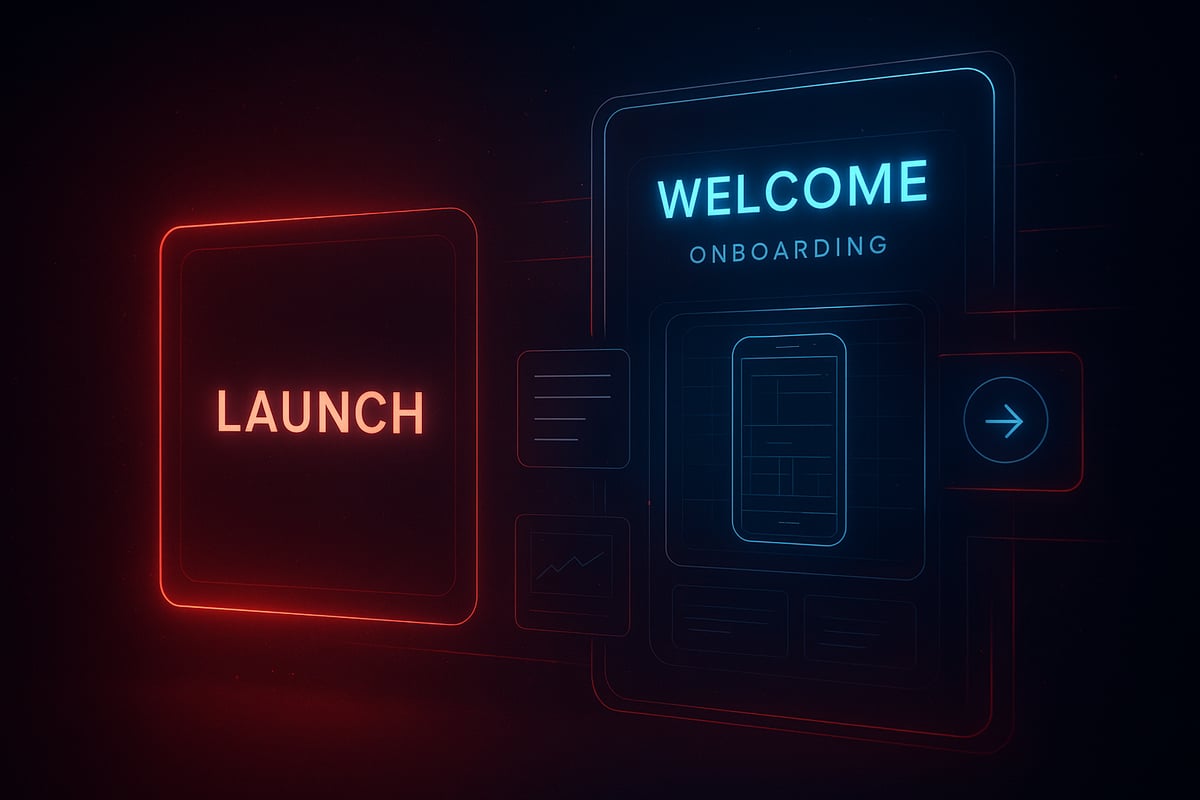
Understanding Launch Psychology and User Expectations
The heart of a successful design launch is not the "big reveal" but the rhythm of anticipation. Most products lose 80 percent of new users after one use if the design launch feels clunky or disconnected, according to recent industry studies. Why? Because users form lasting opinions almost instantly.
Consider Apple’s approach: instead of a single flashy moment, their launches use seamless transitions and subtle onboarding cues. When you open an Apple app, the interface restores your previous state, instantly signaling continuity and respect for the user’s time. This clarity and rhythm set expectations and build trust.
The myth of the big reveal often leads to overdesigned splash screens and underwhelming follow-ups. Instead, an orchestrated sequence—where the design launch is a journey, not a point—keeps users engaged. Rhythm matters. Each screen and transition must feel like part of a larger system, not just isolated visuals.
As you plan your next design launch, ask: does every interaction feel intentional and connected? Are you guiding users, or leaving them in the dark? The difference is psychological and practical, and it shows up in your retention metrics.
The Shift: Designing for Continuity, Not Just Impact
A modern design launch avoids empty spectacle. Flashy intros may impress for a moment, but users crave substance and speed. Trust is built when onboarding and launch screens blend seamlessly, reducing friction and conveying readiness.
Smart teams now downplay launch screens, focusing instead on perceived speed and immediate value. For example, many apps now show an empty state or a gentle guide as the first experience, rather than a static logo. This signals that the system is prepared for real use, not just show.
The secret is system-level thinking. Every cue, transition, and micro-interaction is part of a resilient design launch system, not a one-off event. This approach scales, adapts, and builds long-term trust—qualities explored in the Essential Guide to Systems in Design.
In the studio, we treat design launch as an orchestrated process, where clarity always wins over noise. We question: does each step serve the user’s journey, or just the brand’s ego? By focusing on continuity, your design launch becomes the opening chapter in a lasting product story.
2. Step 1: Defining a Launch-Ready Product Vision
Launching a product without a clear story is like premiering a film with missing scenes. Most teams rush to the finish line, but overlook the one element that shapes every moment after: a unified product vision. A successful design launch starts long before the first pixel ships. It is built on psychological clarity, shared narrative, and a system that guides every decision.
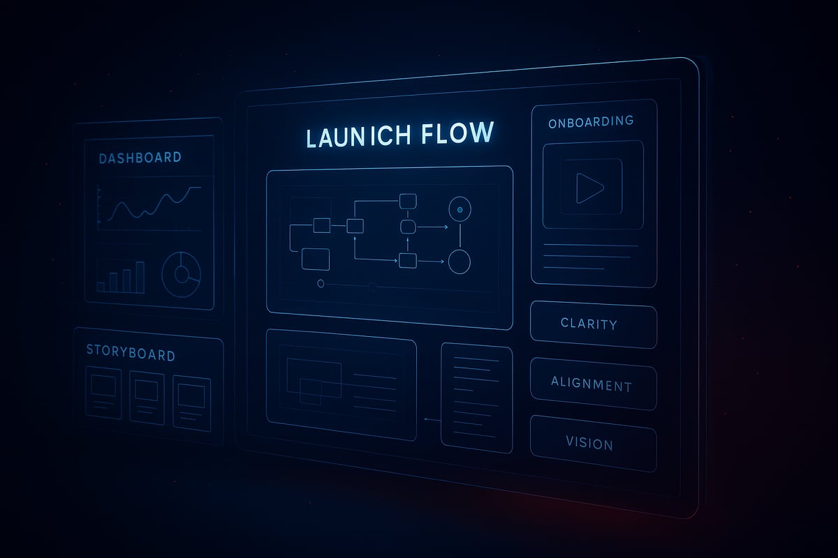
Creating Clarity and Alignment Before Anything Ships
The biggest pitfall for any design launch is skipping the foundational vision. When teams lack a documented narrative, features feel scattered and users sense the disconnect within seconds. A launch-ready product vision is more than a mission statement. It is a living map that details the user journey from first touch to habit, aligning founders, designers, and engineers around a tangible definition of launch success.
- Define the Product Narrative
- Visualize the Journey
- Build Stakeholder Alignment
- Design for Anticipation
Documented visions pay off. Products with a clear launch roadmap see 30 percent higher retention after launch, as users experience consistency at every touchpoint. For more on building systems that scale with your product vision, see the Scalable Design Systems Guide.
Application: Real UI Scenario
Consider a SaaS dashboard preparing for its first design launch. The empty state is not just a placeholder, but a canvas for clarity. A well-crafted empty state welcomes users, sets expectations, and signals readiness. Instead of overwhelming the user with features, the initial view introduces only the essentials, making the interface feel approachable and focused.
Decision logic is crucial here. Which features appear at launch? Which are reserved for onboarding? The goal is to avoid noise. For example, surfacing a guided tour in the empty state helps users find their first win quickly, building trust and confidence.
A cinematic design launch blends anticipation with clarity. The onboarding sequence continues the story started on the launch screen, ensuring the user never feels lost. Every transition, tooltip, and prompt is orchestrated to reinforce the product vision.
Studio thinking means treating the launch as a system, not just a screen. By prioritizing clarity and rhythm over flash, you create an experience that feels both premium and personal. Want to go deeper? Stay tuned for our evolving Embark Studio toolkit, designed for launch clarity at scale.
3. Step 2: Building Momentum with Prototypes, Previews, and Stakeholder Buy-In
Most teams assume a design launch is about perfection at first sight, but the real power lies in building momentum before the curtain rises. The misconception? That prototypes are just throwaway previews. In reality, they are the heartbeat of a cinematic, successful design launch.
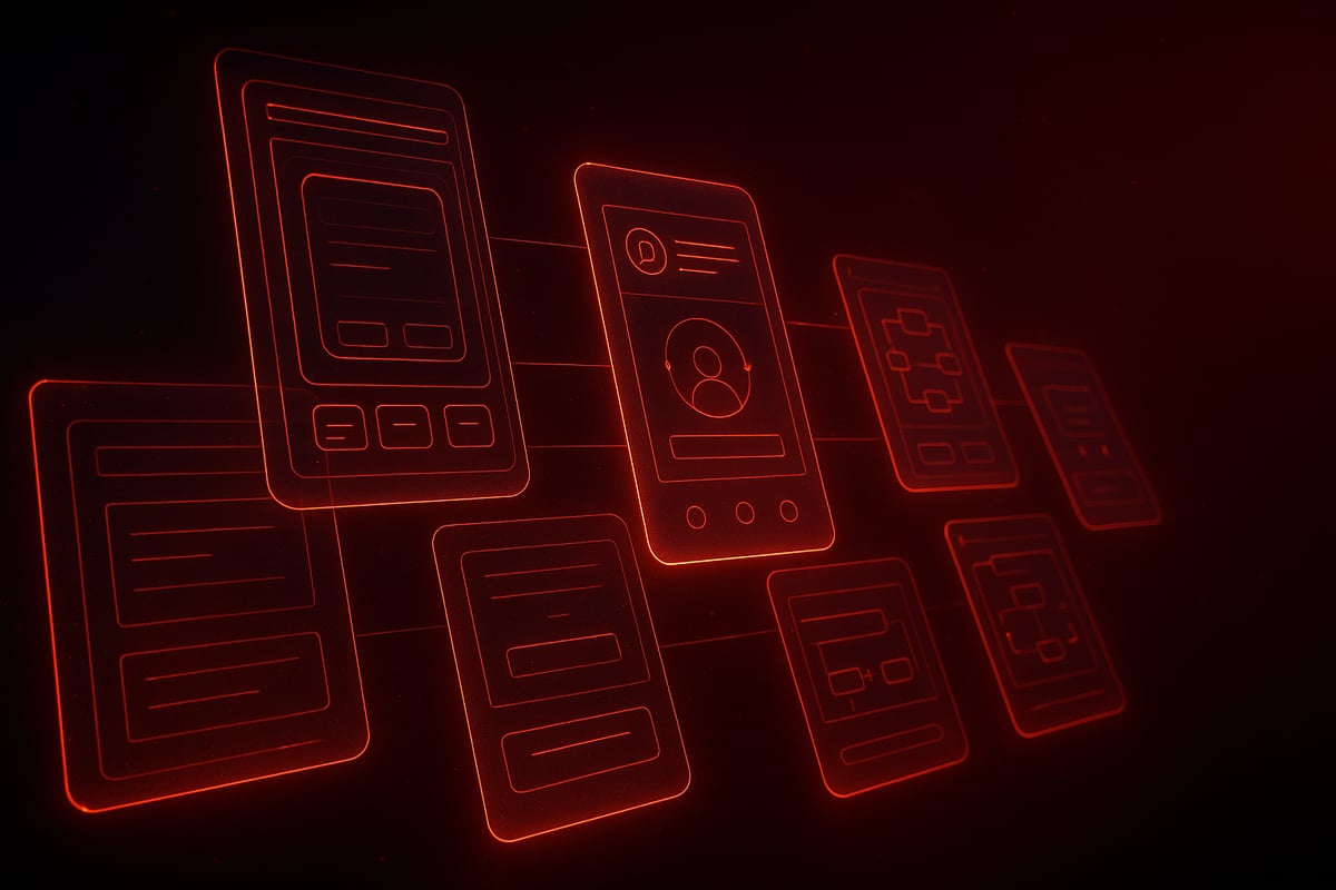
The Rhythm of Reveal: Iteration, Feedback, and Internal Launches
Why do so many products stumble at the finish line? It usually starts with skipping the rhythm of reveal. A design launch, at its core, is a story told in chapters, not a single big reveal. Interactive prototypes let teams move from rough sketches to immersive flows, mimicking the real experience users will have.
What does this look like in practice? Consider a fintech app that builds its onboarding journey as an interactive prototype. Early feedback from internal previews uncovers awkward transitions and missing clarity—issues that would have caused user drop-off at launch. By running at least two rounds of internal previews, teams see up to 40 percent fewer post-launch bugs.
Here’s a simple process to maximize your design launch momentum:
- Draft low-fidelity sketches focusing on core flows.
- Evolve into interactive prototypes that tell a narrative.
- Invite stakeholders for internal “soft launches.”
- Capture feedback and adjust before shipping.
Apple’s own approach emphasizes launch details, right down to device orientation and seamless onboarding cues. Their secret? Every design launch is orchestrated as a sequence, not a single moment.
AI Angle: Augmenting, Not Automating, the Creative Process
AI can accelerate the design launch process, but it must be directed with intent. Consider using AI to generate multiple layout variations or onboarding flows. However, it’s the designer who curates, refines, and ensures each prototype fits the brand’s rhythm.
For example, AI might quickly surface three onboarding journeys, but only a human can select the one that feels cinematic and clear. The best teams use AI to support rapid iteration, not to replace creative judgment. For a deeper dive into AI’s role in accelerating product design and the design launch workflow, see AI in Product Design Innovation.
Studio thinking is clear: a successful design launch means clarity over noise, systems over isolated screens. Prototypes aren’t just for usability—they’re for building narrative, trust, and momentum with every stakeholder.
For more on our Embark Studio™ cinematic frameworks and design launch toolkits, stay tuned.
4. Step 3: Orchestrating a Cinematic Launch Experience
The biggest misconception in product launches? That a great design launch is just about a flashy splash screen or a branded animation. In reality, the difference between a memorable launch and one that fades instantly comes down to rhythm, clarity, and seamless transitions.
When users open your app for the first time, every second is a frame in your cinematic story. The goal is not just to impress, but to bring users into your world with confidence, speed, and trust.
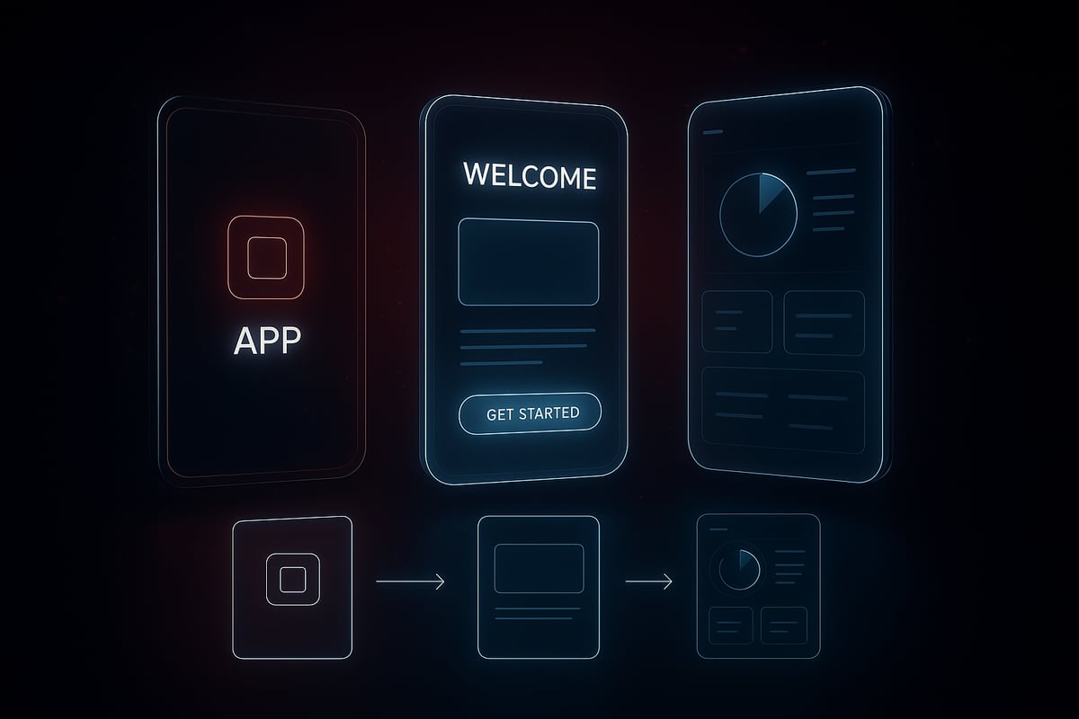
Crafting the Sequence: From Splash to Onboarding to First Win
First impressions set the tone, and in a design launch, rhythm is everything. Think like a film editor: every screen transition should feel intentional, fluid, and invisible. Users judge the experience subconsciously in the first few seconds, so launch screens must prioritize perceived speed and readiness.
Downplaying the launch screen is now a best practice. Instead of using this moment for heavy branding, design teams focus on minimizing friction. Apple’s guidance is clear: match your launch and first screen visuals, avoid abrupt jumps, and restore the previous state whenever possible. This creates a sense of continuity, not interruption.
Consider a fintech app. The splash screen is nearly invisible, fading into onboarding with subtle motion and no jarring color shifts. The user is guided seamlessly from first tap to their first win—a completed profile, a successful transfer, or a personalized dashboard. According to industry data, 70% of users trust apps more when they launch instantly and remember where they left off.
For more on these evolving best practices, check out the Top 10 UI/UX Design Trends 2026 which highlights the shift toward clarity, speed, and ethical user experience. This approach is at the core of every successful design launch.
Application: Real UI Scenario
How do you decide between a splash screen and a launch screen? It starts with intent. If your product needs to load data or set up the user environment, a minimal splash can provide feedback without slowing the flow. Otherwise, skip straight to the launch screen and let users engage immediately.
Here’s a quick table to clarify:
| Screen Type | When to Use | Studio Tip |
|---|---|---|
| Splash Screen | Heavy setup, data loading | Keep minimal, avoid branding |
| Launch Screen | Instant readiness, continuity | Match first UI, restore state |
For example, a SaaS dashboard might skip the splash entirely, showing users their last active workspace as soon as possible. If onboarding is required, blend it with the launch so users never feel lost or delayed.
Studio thinking is simple: clarity always beats noise. Every transition in your design launch must serve the user, not your brand ego. By orchestrating each step like a film sequence, you create trust, momentum, and the foundation for lasting engagement.
For deeper system-level frameworks and cinematic launch strategies, our Embark Studio™ toolkit is always evolving.
5. Step 4: Leveraging AI to Accelerate, Not Replace, Human Creativity
AI is often seen as the shortcut to a flawless design launch, but that’s a misconception. The true power of AI lies in how it accelerates the process, not in how it replaces the vision or clarity that only humans provide. Teams that treat AI as an autopilot risk losing the psychological depth and cinematic rhythm that define a memorable launch.
Integrating AI into the Launch Workflow
Rushing to automate every step of a design launch with AI can backfire. Instead, the smartest teams use AI as a powerful assistant that streamlines asset creation, content localization, and device adaptation. For instance, AI can generate onboarding copy in multiple languages in seconds, but the final tone and message must always be refined by human designers.
Consider a SaaS dashboard prepping for its design launch. AI tools quickly create layout variations and generate UI assets, giving teams more time to focus on the user journey’s narrative flow. However, it’s the designer who curates these outputs, ensuring every element fits the brand’s rhythm and clarity.
This principle is at the heart of Human-Centered AI Design Principles, where AI augments workflow without dictating it. The result: a launch that feels both fast and intentional.
Application: Building Feedback Loops
How do you keep the design launch process agile while ensuring quality? The answer is rapid feedback loops powered by AI analytics. Imagine launching a fintech app. AI-powered tools surface real-time drop-off points during onboarding, highlighting friction areas that need improvement. Yet, the decision to iterate and the direction of change always remain with the design team.
Here’s how to build this feedback-driven system:
- Set up AI-assisted user testing as part of your launch sequence.
- Review analytics to identify weak spots in the onboarding flow.
- Curate changes, always prioritizing clarity and continuity over flashy features.
AI can reveal what’s working and what’s not, but the human touch ensures each iteration aligns with your vision for the design launch.
Studio thinking treats AI as a co-pilot, not the director. By keeping creative control in human hands, you build resilience and scalability into your system. For more insights on how AI is reshaping the creative workflow, see AI Design in 2026: How Artificial Intelligence Is Redefining Creativity, Branding, and the Role of Designers.
Want to go deeper? Our Embark Studio™ toolkit is evolving to help you orchestrate your next cinematic design launch—where AI accelerates, but never overshadows, human creativity.
6. Step 5: Measuring, Iterating, and Sustaining Launch Success
Most teams treat the design launch as a finish line. In reality, it is just the first scene of a much longer story. The biggest misconception: if you ship a great interface, users will stick around. In practice, retention drops sharply for products that stop evolving after launch. The real work starts by measuring what matters, learning from every interaction, and building a system that adapts to user needs.
Post-Launch: Turning Momentum into Lasting Growth
To sustain momentum, you need a clear measurement strategy from day one. Start by defining success metrics for your design launch. These typically include:
- Retention: How many users return after their first interaction?
- Activation: Are users achieving their first “win” quickly and smoothly?
- User Sentiment: What feedback do users share about their initial experience?
Instrument analytics early. Track key moments in the onboarding flow, feature adoption, and drop-off points. Teams that measure these signals during the design launch can identify friction before it becomes churn.
Apps that iterate onboarding based on real data see up to 25% higher retention. For example, adaptive onboarding flows that respond to user behavior—guiding novices differently than power users—create a sense of momentum and clarity. Apple’s best practices emphasize restoring users to their last state, making every return feel seamless and intentional.
If you want to dive deeper into how evolving UX trends are shaping these expectations, 9 UX Design Shifts That Will Shape 2026 provides fresh insights on dynamic interfaces and continuous onboarding.
Application: Real UI Scenario
Picture a SaaS dashboard after its design launch. The first-time user lands on an empty state that explains core features and invites action. As users engage, analytics reveal which steps confuse them or where they drop off. The team then adapts the onboarding sequence—surfacing tips for stuck users, skipping steps for experts. This approach turns static onboarding into a living, responsive system.
AI-powered analytics now accelerate this process. By surfacing behavioral patterns, teams can rapidly test changes and measure impact. According to the Generative AI In Product Design Market 2026, AI is transforming how designers identify friction and optimize flows in real time.
Remember, a design launch is never just a moment—it is the foundation of a system. The most resilient products iterate relentlessly, restoring user state and refining onboarding as user needs evolve. Launch is not an endpoint, but the start of a cinematic, adaptive journey.
For a deeper dive into system-level launch frameworks, keep an eye on our evolving Embark Studio™ toolkit—where clarity and rhythm define every successful design launch.
We’ve covered how a design launch in 2026 isn’t just about making a splash—it’s about building systems, clarity, and momentum that last beyond launch day. If you’re ready to move from theory to action, let’s team up and put these strategies to work on your own product. Whether you’re a founder aiming for speed or a product lead focused on impact, we’re here to help you design, build, and sustain conversion-focused experiences with the latest tools and AI workflows. Curious how this might look for your startup? Book a Free Discovery Call and let’s map out your launch together.
Get articles like this in your inbox
Practical design and growth insights for founders. No spam, unsubscribe anytime.


