
Conversion website design isn't about making your site look better. It's about engineering every pixel to drive specific business outcomes. Every layout decision, every headline, every button placement either moves visitors toward action or away from it. There's no middle ground. For startups and growth-stage companies, the difference between a site that converts at 2% versus 5% can be the difference between struggling for traction and scaling with confidence. This article breaks down exactly how to build websites that turn traffic into revenue.
Why Most Websites Fail to Convert
Most websites are designed for approval, not performance. They're built to impress stakeholders in presentation meetings, not to guide real users toward real outcomes. The result? Beautiful pages that generate zero business value.
The core problem: designers treat websites as digital brochures instead of conversion engines. They pack homepages with every feature, every client logo, every possible message. They create navigation menus with twelve items because every department needs representation. They bury the call-to-action because it feels too "salesy."
This approach fails because it misunderstands how people actually use websites. Visitors don't read. They scan. They don't explore. They search for one specific thing. They don't appreciate complexity. They abandon sites that make them think.
The Business Cost of Poor Conversion Design
Let's make this concrete with numbers. A B2B SaaS company drives 10,000 monthly visitors to their site. With a 2% conversion rate, they get 200 leads. At a 20% close rate, that's 40 new customers. If average contract value is $5,000, monthly revenue is $200,000.
Now optimize conversion design to 4%. Same traffic, 400 leads, 80 customers, $400,000 in monthly revenue. That's $2.4 million in additional annual revenue from the same marketing spend.
The math gets even more compelling when you factor in acquisition cost. If you're paying $50 per website visitor through ads, that 2% site is spending $2,500 per customer. The 4% site? $1,250. Half the CAC with zero change to ad strategy.
| Metric | Poor Design (2%) | Optimized Design (4%) | Impact |
|---|---|---|---|
| Monthly Visitors | 10,000 | 10,000 | Same traffic |
| Leads Generated | 200 | 400 | +100% |
| New Customers (20% close) | 40 | 80 | +100% |
| Monthly Revenue ($5K ACV) | $200,000 | $400,000 | +$200K |
| Annual Revenue | $2.4M | $4.8M | +$2.4M |
| Cost per Customer | $2,500 | $1,250 | -50% |
The Foundation: Conversion Website Design Principles
Effective conversion website design starts with understanding that your site has one job: move visitors from awareness to action. Everything else is noise.
Single Primary Goal Per Page
Every page needs exactly one primary conversion goal. Not two. Not three. One. This doesn't mean you can't have secondary actions, but there should be zero confusion about what matters most.
Homepage goal: get qualified visitors to start a free trial or book a demo. Pricing page goal: select a plan and start checkout. Product page goal: understand the value and move to pricing. Blog post goal: consume content and subscribe for more.
High-converting websites focus relentlessly on guiding attention toward that single goal. When you try to optimize for multiple outcomes simultaneously, you optimize for none of them.
How to implement this:
- Identify the one action that matters most for business outcomes
- Make that action the visual and hierarchical focus of the page
- Remove or significantly de-emphasize competing calls-to-action
- Test conversion rate on that single metric, ignore vanity metrics
Visual Hierarchy That Guides Behavior
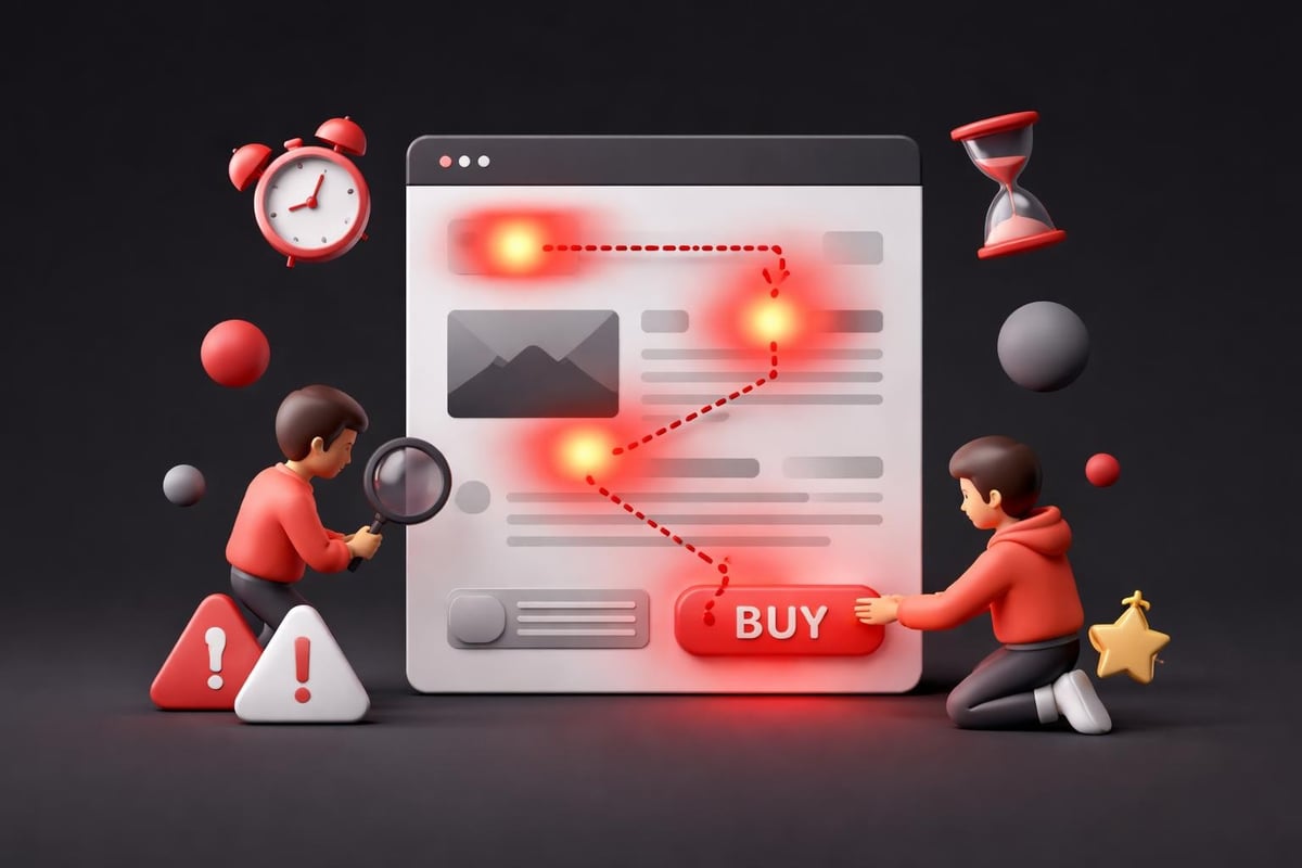
Visual hierarchy isn't about making things pretty. It's about controlling eye movement and decision flow. Your design should create a clear path from landing to action.
Most sites fail here by treating all elements as equally important. Every section gets the same weight. Every message competes for attention. The result is visual noise that forces visitors to work too hard.
Strong hierarchy uses size, contrast, spacing, and position to create a reading order. The most important element dominates. Secondary elements support. Tertiary elements fade into the background.
Hierarchy toolkit:
- Size: primary CTA should be 2-3x larger than secondary actions
- Contrast: use brand accent color exclusively for conversion elements
- Spacing: surround key actions with whitespace to create focus
- Position: place primary goals above the fold and at natural scroll stopping points
Friction Reduction as Strategy
Every form field is a conversion killer. Every navigation option is a potential exit. Every piece of unnecessary copy is friction that slows momentum toward action.
Conversion-focused design treats friction like a leak in your revenue pipeline. You can't eliminate it entirely, but you can minimize it ruthlessly. This means questioning every element on the page: does this move visitors toward the goal or away from it?
Forms are the biggest friction point. Research shows each additional form field reduces conversion by an average of 5-10%. An eight-field form converts at roughly half the rate of a three-field form. Yet companies still ask for job title, company size, phone number, and other data they don't need at the first touchpoint.
Building High-Converting Page Structures
The structure of your pages matters more than the content on them. You can have the best copy in the world, but if it's organized poorly, nobody will read it.
Above-the-Fold Architecture
The above-the-fold area is your only guaranteed real estate. Approximately 80% of visitors never scroll past it. This means your hero section has to accomplish four critical jobs in under three seconds:
- Clarity: what does this company do?
- Relevance: is this for me?
- Value: why should I care?
- Action: what should I do next?
The formula that works: clear value proposition headline, supporting subheadline that adds context, visual that demonstrates the product or outcome, and prominent CTA button. Nothing else. No lengthy paragraphs. No corporate mission statements. No walls of features.
Conversion-focused website design structures hero sections to answer visitor questions in order of importance. The headline addresses the core problem or promise. The subheadline qualifies or quantifies. The visual proves it's real. The CTA makes the next step obvious.

The Feature-Benefit Framework
Most product pages list features. "Real-time collaboration. Advanced analytics. Cloud storage." This fails because features aren't motivating. Benefits are. Outcomes are. Results are.
The conversion framework flips this. Start with the outcome the customer wants. Connect it to the specific feature that delivers it. Prove it with data or examples.
Feature-first approach (weak): "Advanced AI-powered recommendation engine with machine learning algorithms"
Benefit-first approach (strong): "Customers find what they need 3x faster. Our AI learns from every interaction to surface relevant products before they search."
The second version tells you what you get (faster product discovery), quantifies the impact (3x), and explains how it works. The first version is just jargon.
Social Proof Placement Strategy
Social proof works, but only when positioned strategically. Random testimonial sections that visitors never see add zero value. Social proof needs to appear at decision points, exactly when doubt enters the equation.
Strategic placement map:
- Homepage hero: customer logos to establish credibility immediately
- Above pricing CTA: testimonial highlighting ROI to overcome cost objection
- Pricing page: case study links showing results at each tier
- Signup form: security badges and user count to build trust
- Product pages: specific feature testimonials proving capability
| Social Proof Type | Best Use Case | Conversion Impact | Placement |
|---|---|---|---|
| Customer Logos | Build credibility fast | +15-25% | Hero section |
| Testimonials | Overcome specific objections | +20-35% | Near CTAs |
| Case Studies | Prove ROI for high-ticket | +30-50% | Pre-demo |
| Usage Statistics | Create FOMO | +10-20% | Signup flows |
| Security Badges | Reduce form anxiety | +15-25% | Form pages |
Conversion-Driven Navigation and User Flow
Navigation is where most conversion strategies fall apart. Companies treat main navigation like a sitemap instead of a conversion tool. They add every page, every product, every resource. The result is decision paralysis.
Minimize Navigation Options
The paradox of choice is real. More navigation options correlate directly with lower conversion rates. Jakob's Law applies: users spend most of their time on other sites, so they expect yours to work the same way. But "the same" doesn't mean comprehensive, it means simple.
High-converting navigation principles:
- Limit main navigation to 5-7 items maximum
- Use clear, specific labels (not "Solutions" or "Platform")
- Hide secondary pages in footer navigation
- Make CTA button visually distinct from navigation links
- Consider removing navigation entirely on high-intent landing pages
Some of the highest-converting sites we've built have zero traditional navigation on their landing pages. When someone arrives from a specific ad campaign, they don't need to explore the entire site. They need to make one decision. Navigation just creates exits.
Click Depth and Conversion Correlation
Every click is a conversion opportunity lost. The more clicks between landing and action, the lower your conversion rate. This is measurable and predictable.
Research shows conversion rates drop approximately 20-30% with each additional click required to complete a goal. A three-click conversion flow will convert at roughly half the rate of a one-click flow. Yet companies routinely bury their signup forms three or four levels deep.
The solution: bring conversion opportunities up in the hierarchy. If your goal is demo bookings, the calendar should be embedded on the homepage. If it's trial signups, the form should appear above the fold. Waiting until someone "learns more" before showing the path to conversion costs you half your potential customers.
Design Elements That Drive Action
Conversion website design succeeds in the details. Button color matters. Headline word choice matters. Image selection matters. Small changes compound into significant conversion lifts.
CTA Button Optimization
Buttons are where intention becomes action. A poorly designed button can cut conversion in half. A well-designed button can double it.
Button optimization checklist:
- Size: large enough to tap on mobile (minimum 44x44 pixels)
- Color: high contrast with background, matches brand accent
- Copy: action-oriented and specific ("Start Free Trial" not "Submit")
- Position: appears at natural decision points, not just end of page
- Quantity: one primary CTA per viewport
The conversion-centered design approach focuses on making the desired action unavoidable without being aggressive. This means repeating primary CTAs at logical intervals, not hiding them until the bottom of the page.
Button copy deserves special attention. Weak copy uses generic verbs: "Submit," "Continue," "Click Here." Strong copy reinforces value and reduces friction: "Get My Free Audit," "Start Building Now," "See Pricing." The button should tell visitors exactly what happens when they click.
Color Psychology for Conversions
Color isn't decoration. It's direction. Used strategically, color guides attention and triggers specific psychological responses that influence behavior.
The mistake: using too many colors or applying brand colors randomly. The strategy: reserve your highest-contrast color exclusively for conversion elements. If your brand uses blue and orange, make orange the conversion color. Every orange element on the page should be clickable and drive the primary goal.
Color conversion framework:
- Primary CTA color: brand accent, used nowhere else on page
- Secondary CTA color: neutral (gray, white, outline)
- Background colors: low contrast, don't compete with CTAs
- Text colors: high readability, black/dark gray on white
- Accent usage: sparingly, only for key data points or highlights
The most effective websites from professional designers like Cam Gomersall Design use color as a conversion weapon, not an aesthetic choice.
Image Selection and Conversion Impact
Images do three things: create emotion, demonstrate value, or waste space. Most sites choose the third option with stock photos of people in conference rooms or generic product shots.
High-converting sites use images that prove the product works or show the outcome customers want. Screenshots of the actual product. Graphs showing real results. Photos of real customers using the solution. Visuals that answer "what does success look like?"
The data is clear: relevant product images increase conversion by 25-40% compared to generic stock photos. Face shots of happy people doing nothing add zero value. A well-annotated screenshot showing exactly how your product solves the customer's problem can double conversion on that page.
Building Trust Through Design
Conversion requires trust. Design either builds it or destroys it. Every visual choice signals professionalism or amateurism, credibility or risk.
Visual Consistency as Trust Signal
Inconsistent design creates doubt. When fonts change randomly, when spacing feels off, when colors don't match, visitors subconsciously question whether they should trust this company with their money or data.
Design systems solve this. A proper design system defines every visual element once and uses it consistently everywhere. Button styles, typography scale, color palette, spacing units, icon style. No exceptions.
This isn't just aesthetic preference. Studies show visually consistent sites convert 25-35% better than inconsistent ones. Consistency signals professionalism, which builds trust, which reduces purchase anxiety.
Trust-building design elements:
- Consistent typography hierarchy across all pages
- Unified color system with clear usage rules
- Standardized component library (buttons, forms, cards)
- Cohesive photography or illustration style
- Professional polish in micro-interactions and transitions
Speed as Conversion Factor
Site speed isn't a technical concern. It's a conversion concern. Research from Google shows a one-second delay in page load time reduces conversions by 7%. Three seconds costs you 20-30% of potential conversions. Five seconds and half your visitors are gone.
Best practices for conversion optimization always include speed as a primary factor. This means optimizing images, reducing JavaScript bloat, using modern hosting, and choosing platforms that prioritize performance.
For startups, this is where Website Design built on Framer provides significant advantage. Framer sites load in under 1.5 seconds on average because the platform handles optimization automatically. You don't fight the technology, you leverage it.
Mobile Conversion Optimization
Mobile isn't the future. It's the present. Over 60% of website traffic comes from mobile devices. If your conversion rate on mobile is half your desktop rate, you're losing the majority of potential customers.
Touch Target Sizing
Desktop users click with precision. Mobile users tap with thumbs while walking, on trains, in bed. Your design needs to account for this reality.
Apple's Human Interface Guidelines recommend minimum touch targets of 44x44 points. Google's Material Design suggests 48x48 density-independent pixels. Yet countless sites have 30-pixel buttons that require three attempts to tap successfully. Every missed tap is frustration. Frustration kills conversion.
Mobile touch optimization:
- Minimum 44px height for all interactive elements
- 8px minimum spacing between adjacent touch targets
- Larger targets for primary CTAs (60-70px)
- Avoid placing important buttons near screen edges where thumbs slip
- Test on actual devices, not desktop browser resize
Mobile Form Simplification
Forms are painful on mobile. Small keyboards. Autocorrect failures. Switching between keyboard types. Every field is 3x harder to complete than on desktop.
The solution isn't better form design. It's fewer forms. The mobile conversion strategy is radical simplification. Ask for email only. Add a "Continue with Google" button. Split multi-step forms across separate screens with progress indication. Anything to reduce friction.
| Desktop Form | Mobile Optimization | Conversion Lift |
|---|---|---|
| 8 fields, single page | 3 fields, single page | +85% |
| Multi-column layout | Single column, large inputs | +40% |
| Manual entry only | Social login options | +60% |
| No keyboard optimization | Input type attributes | +25% |
| Small buttons | 60px touch targets | +35% |
Testing and Iterating for Higher Conversions
Conversion website design isn't a one-time project. It's a system of continuous improvement. The sites that convert best are the ones that test relentlessly.
What to Test First
Don't test randomly. Test the elements with highest potential impact first. The 80/20 rule applies: 20% of changes drive 80% of conversion improvement.
High-impact test priorities:
- Value proposition headline: often 40-100% conversion impact
- Primary CTA copy and design: 25-50% impact
- Hero section layout and visual: 20-40% impact
- Form field reduction: 15-35% impact per field removed
- Social proof positioning: 15-25% impact
Start with headline variations. Test 3-5 different value propositions that emphasize different benefits. Run the test until you have statistical significance. Then move to CTA optimization. Then hero layout.
The sites that see dramatic conversion improvements follow this methodical approach instead of testing random elements.
Quantitative vs. Qualitative Data
Analytics tell you what's happening. Heatmaps and session recordings tell you why. You need both.
Quantitative data shows conversion rates, bounce rates, time on page. This tells you where problems exist. A 70% bounce rate on your pricing page is a clear signal. But it doesn't tell you what's wrong.
Qualitative data fills the gap. Session recordings show you watching real users struggle with your form. Heatmaps reveal that nobody scrolls past your feature section. User testing surfaces confusion about unclear copy.
Complete testing stack:
- Analytics: Google Analytics 4 or Plausible for traffic and conversion metrics
- Heatmaps: Hotjar or Microsoft Clarity for scroll depth and click patterns
- Session Recording: Hotjar or FullStory to watch actual user behavior
- User Testing: UserTesting.com for qualitative feedback
- A/B Testing: VWO, Optimizely, or native platform testing
Common Conversion Design Mistakes
Even experienced teams make predictable mistakes that tank conversion rates. Knowing what to avoid is as valuable as knowing what to implement.
Mistake 1: Designing for Everyone
The biggest conversion killer is trying to appeal to everyone. Generic messaging that could apply to any company in any industry. Feature lists that try to satisfy every possible use case. Design that offends nobody and excites nobody.
High-conversion design requires specificity. Speak directly to your ideal customer. Ignore everyone else. This feels risky but it's essential. A message that resonates deeply with 30% of visitors converts better than a message that sort-of-appeals to 100% of them.
Mistake 2: Over-Designing
Complexity kills conversion. Animation that distracts. Custom interactions that confuse. Artistic layouts that make content hard to find. These elements might win design awards but they lose customers.
The best converting sites often look simple. Because they are. They don't use design to impress. They use design to guide. Every element serves the conversion goal or doesn't exist.
Mistake 3: Hiding Pricing
"Contact us for pricing" is conversion poison for most businesses. It adds friction. It creates doubt. It forces visitors to invest time before knowing if your product is even in their budget.
Transparent pricing builds trust and qualifies leads. If someone sees your pricing and it's too high, they weren't a qualified lead anyway. If they see pricing and convert, they're pre-qualified and less likely to churn.
When to show pricing:
- SaaS products with standard tiers: always
- Service businesses with predictable scope: show starting prices
- Custom enterprise solutions: still show starting point or typical range
- High-ticket consulting: show process and investment framework
Mistake 4: Ignoring Load Speed
Beautiful design that takes five seconds to load converts worse than ugly design that loads instantly. Speed is invisible when it's fast and catastrophic when it's slow.
The typical mistakes: unoptimized images, render-blocking JavaScript, too many third-party scripts, slow hosting. Following best practices means ruthlessly optimizing for speed before adding any non-essential elements.
Advanced Conversion Techniques
Once you've mastered fundamentals, these advanced techniques can push conversion rates even higher.
Dynamic Personalization
Showing different content to different visitor segments can double conversion rates. Someone coming from a paid search ad for "enterprise project management" should see different hero copy than someone coming from a blog post about freelance productivity.
Personalization strategies that work:
- Industry-specific landing pages with relevant case studies
- Geographic customization (showing local customer examples)
- Referral source matching (ad copy matches landing page headline)
- Behavior-based CTAs (return visitors see "Continue where you left off")
- Device optimization (mobile traffic sees mobile-specific benefits)
This requires technical implementation but the conversion impact justifies the effort. Companies using strategic personalization see 25-40% conversion improvements.
Micro-Commitments and Progressive Disclosure
Instead of asking for a demo immediately, ask for something smaller first. Download a resource. Take a quiz. Try a limited feature. Each small commitment increases the likelihood of the larger one.
This is the progressive disclosure strategy. Start with low-commitment actions. Gradually increase the ask. By the time you request the demo booking, they've already said yes three times.
Progressive commitment funnel:
- Read blog post (zero commitment)
- Download related resource (email only)
- Join webinar or take assessment (15 minutes)
- Book consultation (30 minutes, calendar commitment)
- Start trial or sign contract (full commitment)
Each step should have 40-60% conversion rate. The compound effect turns 10,000 blog readers into 400+ qualified leads.
Conversion Copywriting Framework
Words matter more than design. A poorly designed page with strong copy converts better than a beautifully designed page with weak copy.
The formula: problem → agitation → solution → proof → call-to-action. Start with the customer's pain point. Make it visceral. Present your product as the solution. Prove it works. Tell them exactly what to do next.
Weak copy: "Our platform helps teams collaborate better."
Strong copy: "Your team wastes 12 hours per week switching between tools. [Product] brings everything into one workspace. Companies using [Product] ship 40% faster. Start your free trial today."
The second version quantifies the problem (12 hours), presents the specific solution (one workspace), proves the outcome (40% faster), and includes a clear CTA. Every element drives conversion.
The ROI of Conversion Design Investment
Investing in proper conversion website design isn't an expense. It's a revenue multiplier. The math is simple but the impact is dramatic.
Take a startup spending $20,000 monthly on paid acquisition driving 5,000 website visitors. With a 2% conversion rate, that's 100 leads and roughly $50,000 in pipeline value (assuming $500 average deal size and 1:1 lead-to-opportunity ratio).
Investing $25,000 in conversion design optimization that improves conversion to 4% means 200 leads and $100,000 in monthly pipeline. The design investment pays back in one month. Every month after is pure leverage.
Over a year, the properly designed site generates an additional $600,000 in pipeline from the same marketing budget. The ROI on the design investment is 2,300%. Show me another investment with that return profile.
This is why growth-stage startups treat conversion design as strategic infrastructure, not a nice-to-have. It's the difference between burning cash to scale and scaling profitably.
Implementation: Where to Start
You understand the principles. You see the value. Now what? Start with the highest-impact changes that require the least effort.
90-day conversion optimization roadmap:
Month 1: Foundation
- Audit current conversion rates by page and traffic source
- Implement analytics and heatmap tracking
- Simplify primary navigation to 5 items maximum
- Rewrite homepage hero section with clear value proposition
- Create one primary CTA and remove competing calls-to-action
Month 2: Optimization
- A/B test headline variations (run until significance)
- Reduce form fields to absolute minimum
- Add social proof at key decision points
- Optimize mobile experience and touch targets
- Improve page load speed to under 2 seconds
Month 3: Scaling
- Build conversion-optimized landing pages for top traffic sources
- Implement dynamic personalization based on referral source
- Create progressive commitment funnel
- Test CTA copy and button designs
- Document winning variations in design system
This roadmap prioritizes speed-to-impact. By month two, you should see measurable conversion improvements. By month three, you're building on proven patterns.
Conversion website design transforms how your business grows. The principles are clear: singular focus, strategic hierarchy, relentless friction reduction, and continuous testing. The ROI is measurable: every percentage point of conversion improvement compounds directly into revenue growth. For startups ready to turn their website from a cost center into a growth engine, Embark Studio™ builds conversion-focused sites on Framer that scale with your business. Let's build something that actually converts.
Get articles like this in your inbox
Practical design and growth insights for founders. No spam, unsubscribe anytime.


